 VIA Studio
The Belvedere You Knew is Brand New
The Situation
The Belvedere sits at the crossroads of Louisville's past, present, and future.
For decades, it has served as one of the city's most recognizable public spaces, a terrace overlooking the Ohio River and connecting downtown to the waterfront below. But over time, it became something of a contradiction: a place that is both impossible to miss and surprisingly easy to overlook. Vast and open, yet disconnected from everyday life.
Now, that is about to change.
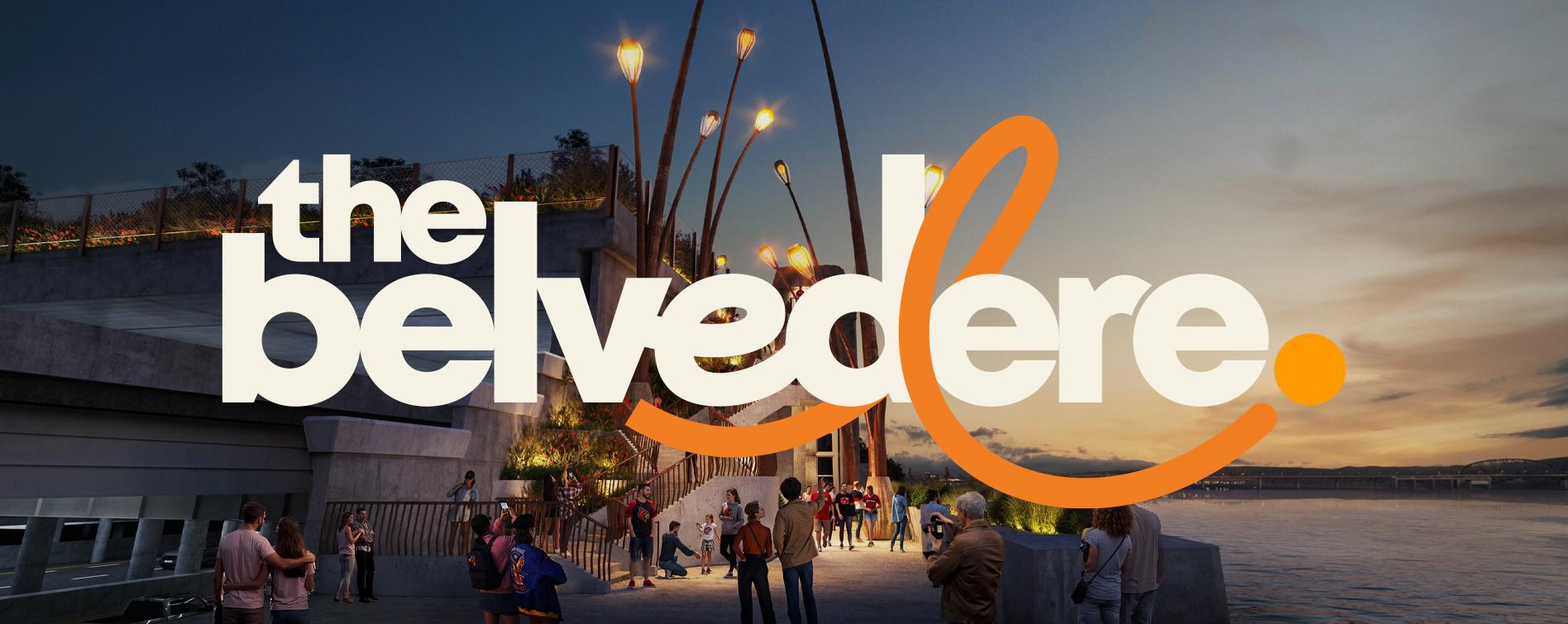
The New Space
Kentuckians understand beauty in a way many places have forgotten.
From rolling hills and limestone springs to neighborhood traditions, front porches, and lightning bug filled evenings, we're surrounded by it. Yet too often, our downtown spaces feel like they belong to someone else.
Enter Heatherwick Studio.
Known for creating bold, sculptural, and deeply human-centered spaces, their vision for The Belvedere transforms it from a concrete overlook into something much more magical: a hidden garden of curiosity in the heart of downtown Louisville.
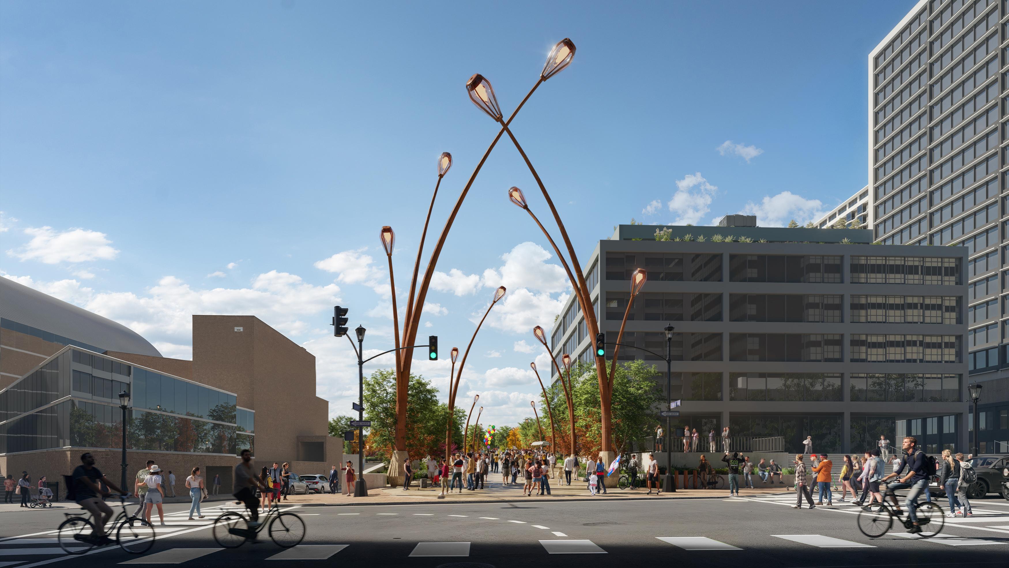
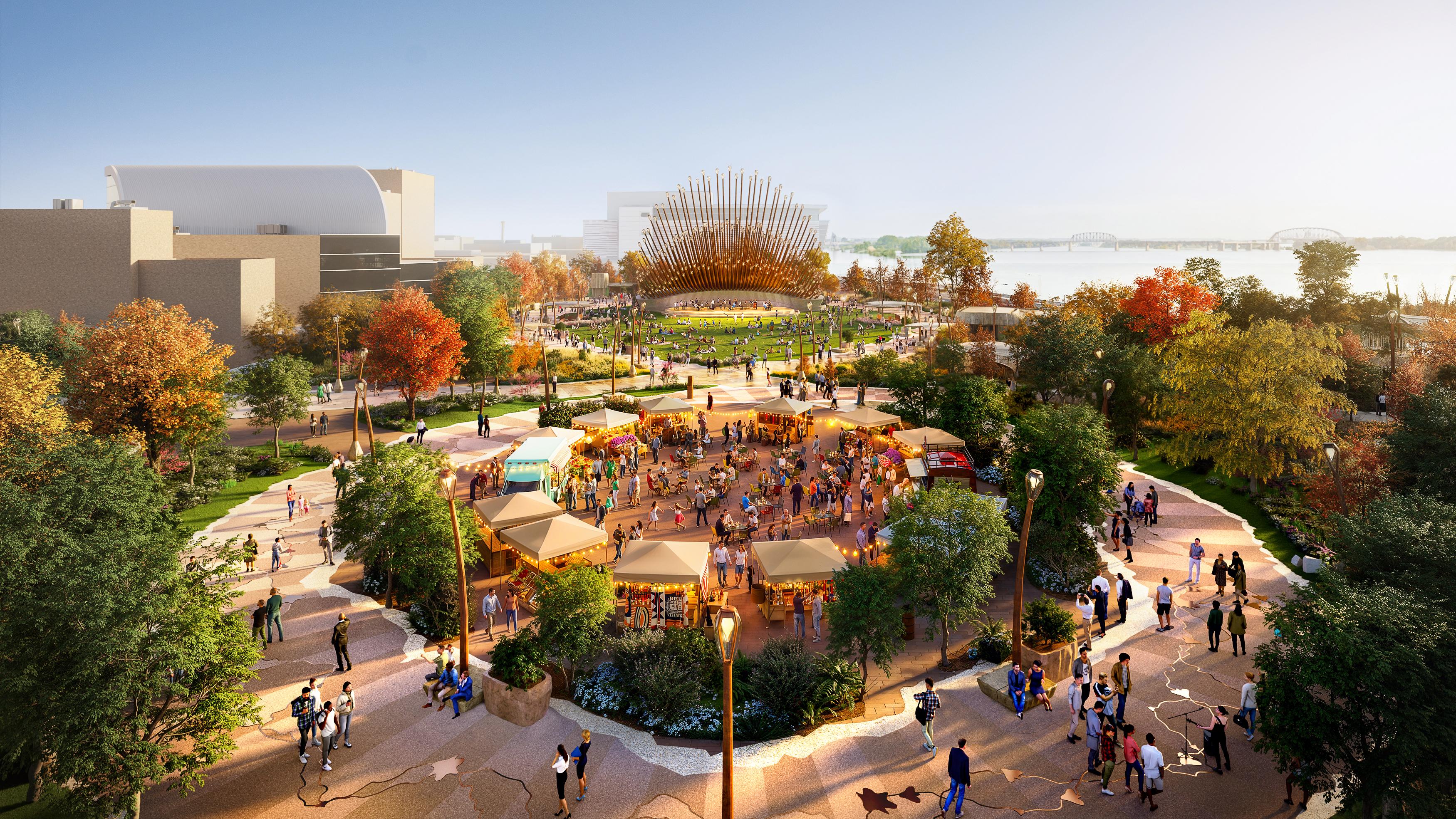
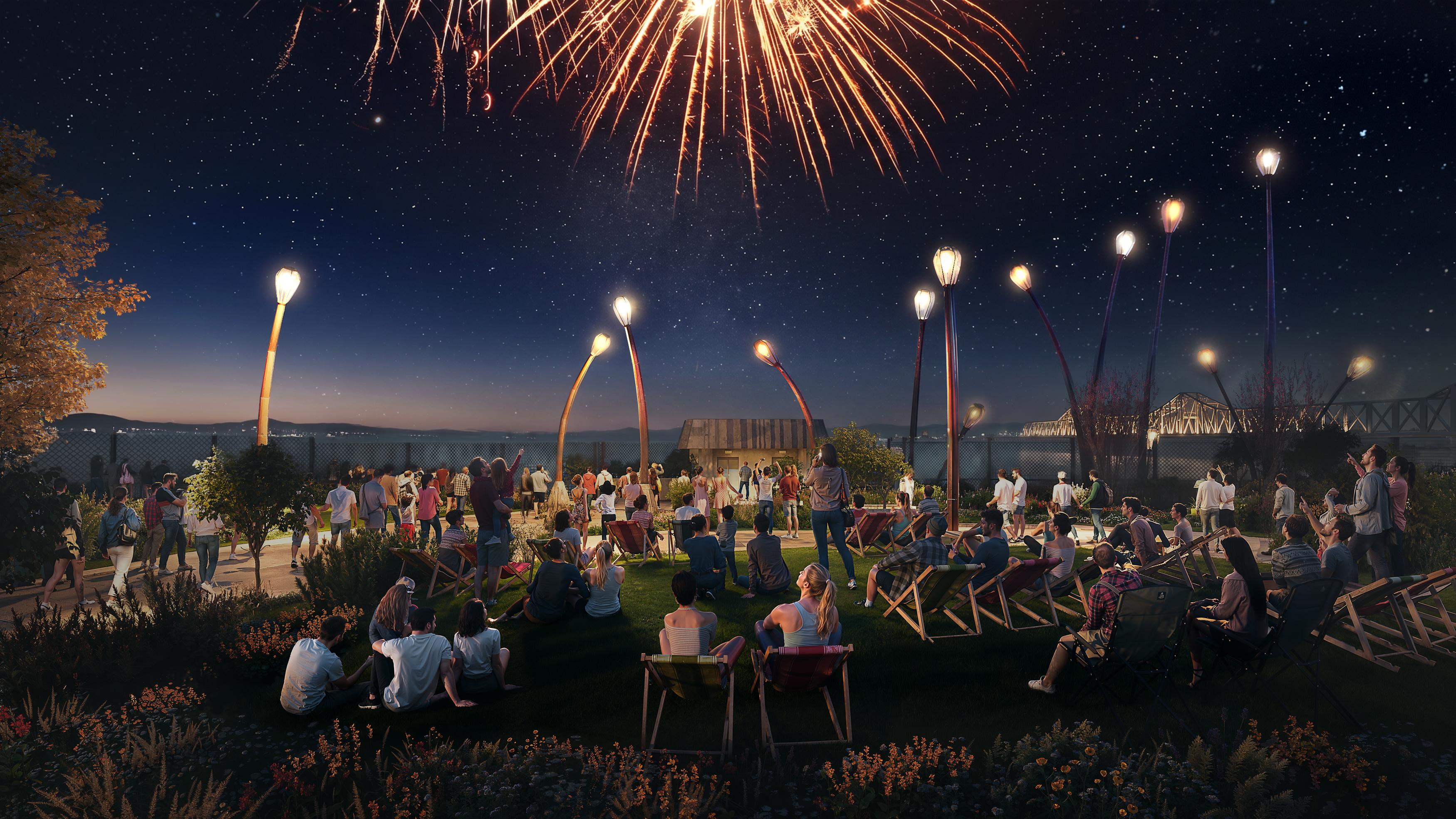
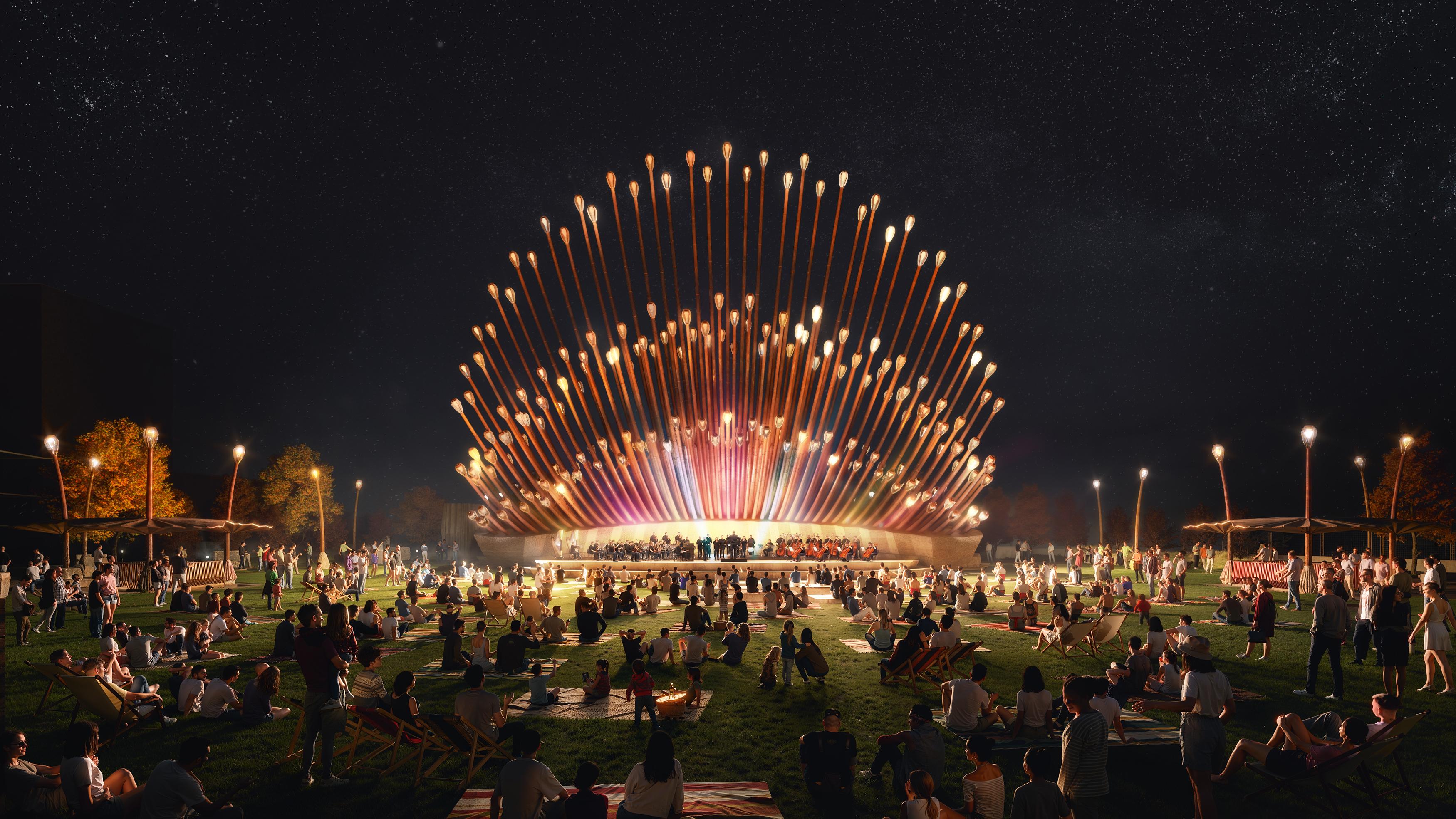
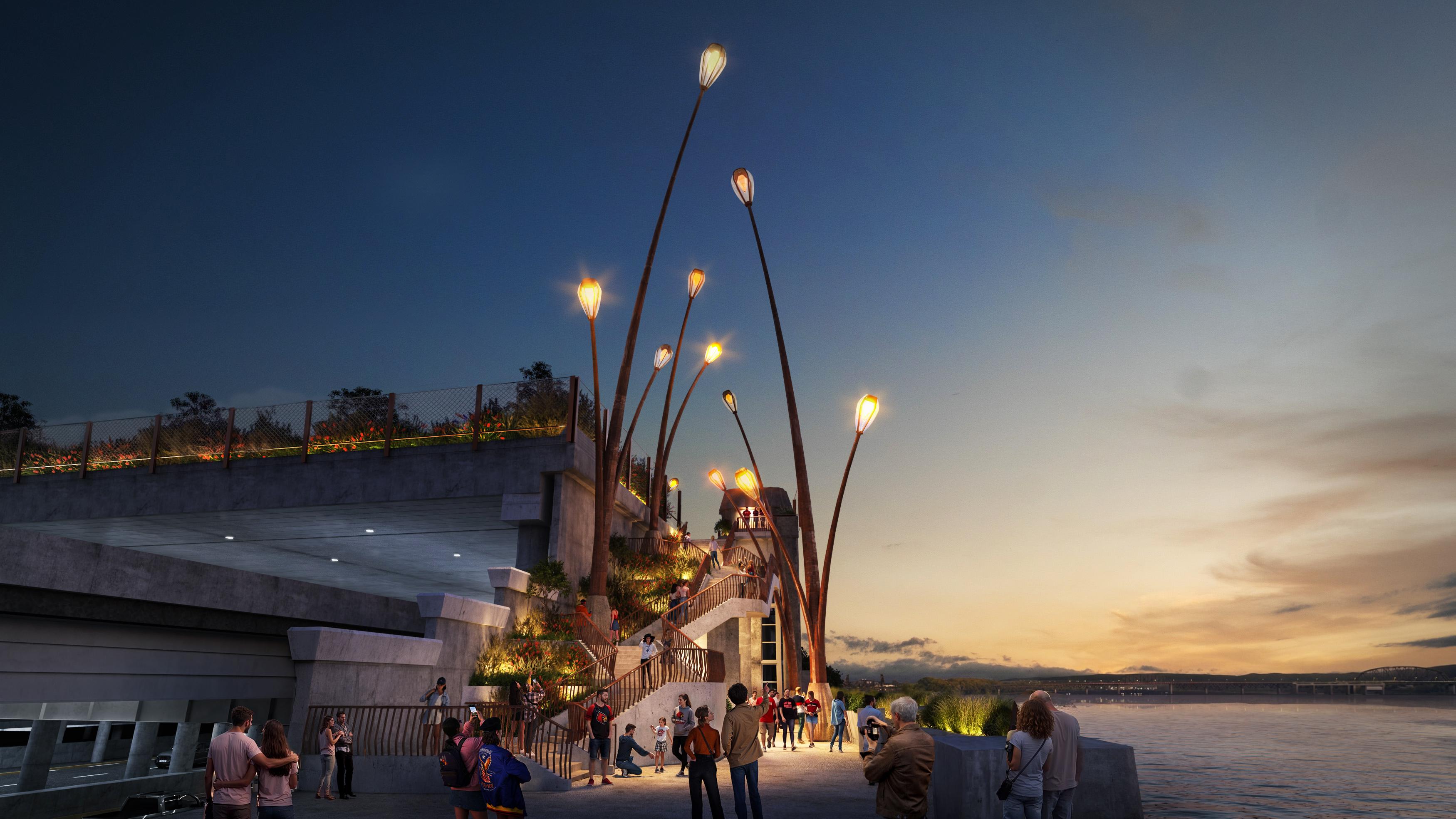
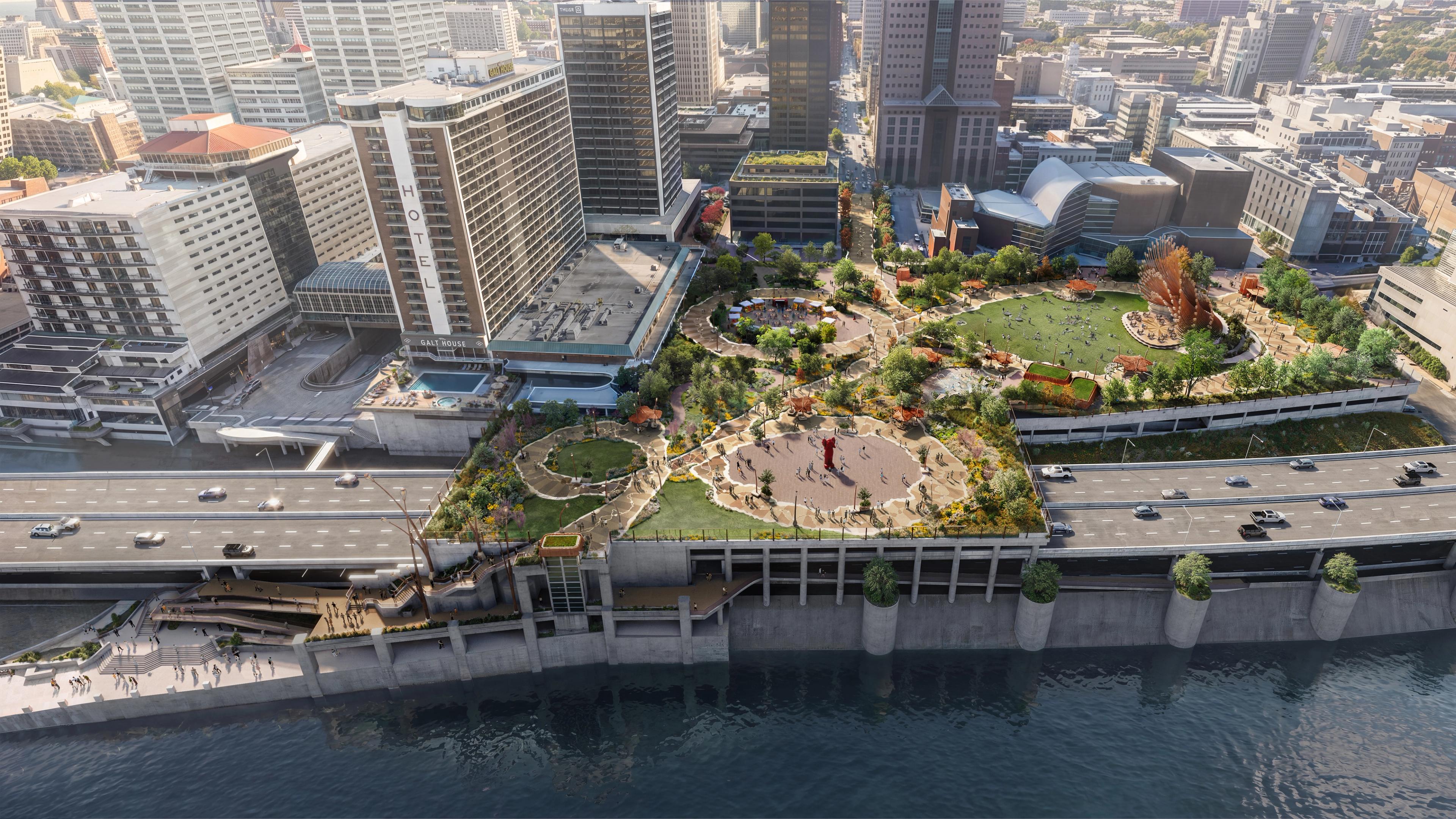
This is a place designed for wandering, discovering, gathering, and lingering. A place where everyday life and wonder coexist. Winding pathways, native landscapes, public art, food, music, and moments of unexpected delight all come together beneath the gentle glow of firefly-inspired trails of light leading visitors toward the river.
And it's going to be incredible.
The Logo
The Belvedere's identity is built around the same idea that drives the space itself: Discovery.
At first glance, the wordmark feels clean, bold, civic, and straightforward. But like the park, it rewards a closer look.
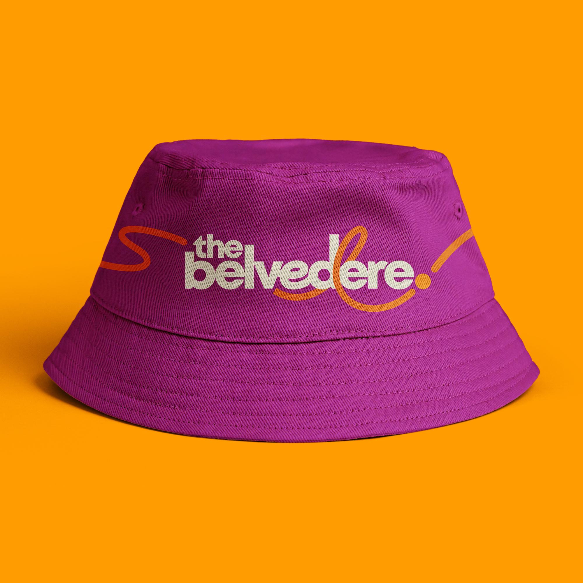
The ascenders in the letters of the wordmark have been extended skyward to represent the buildings that comprise downtown Louisville. At the heart of the logo is a custom looping "e" that represents The Belvedere itself: A moment of curiosity and enchantment woven into the heart of the city. It's unexpected, playful, and distinctly ownable.
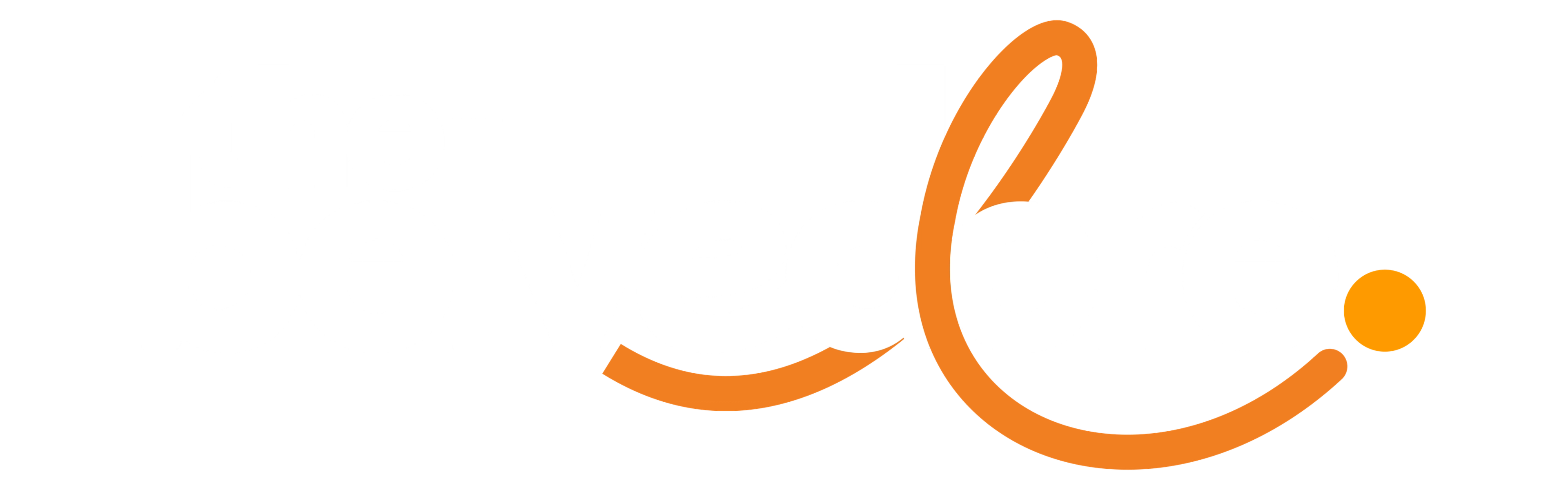
Moving through and around the wordmark is a trail of light inspired by the whimsical flight of a firefly. The path loops around the logo before culminating in a single glowing point that serves as both the firefly itself and a period of declaration. A simple statement that says: This is The Belvedere. Louisville's place to be.
The Path of the Firefly
The architecture and landscape design of The Belvedere are incredible. It’s going to be breathtaking and unlike any other space we have in Louisville. It deserves the spotlight. Our goal wasn't to compete with that experience; it was to support it.
The brand needed to feel like a natural extension of the park itself, carrying the story forward in a way that is flexible, recognizable, and full of personality.
Turns out the answer was already built into the space.



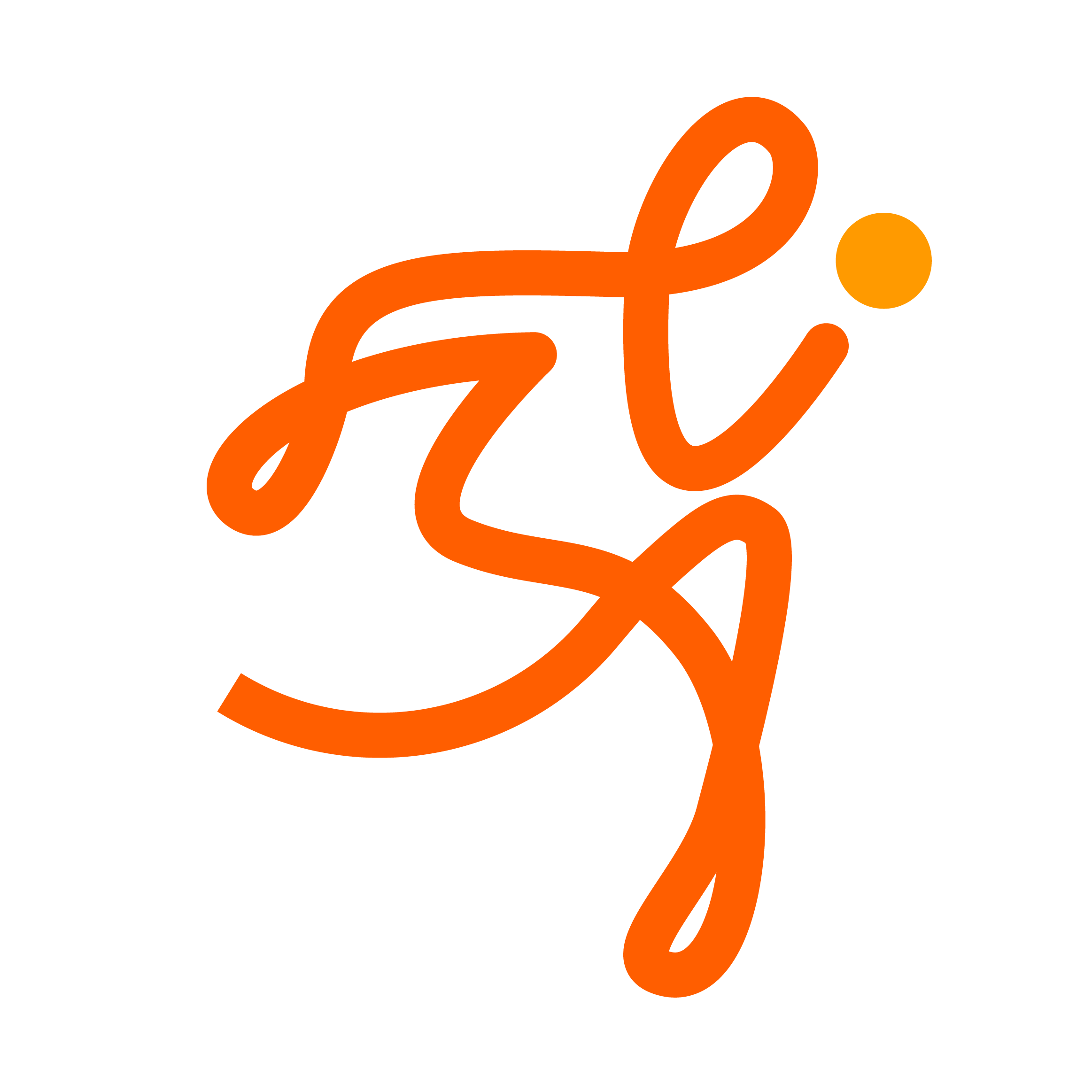
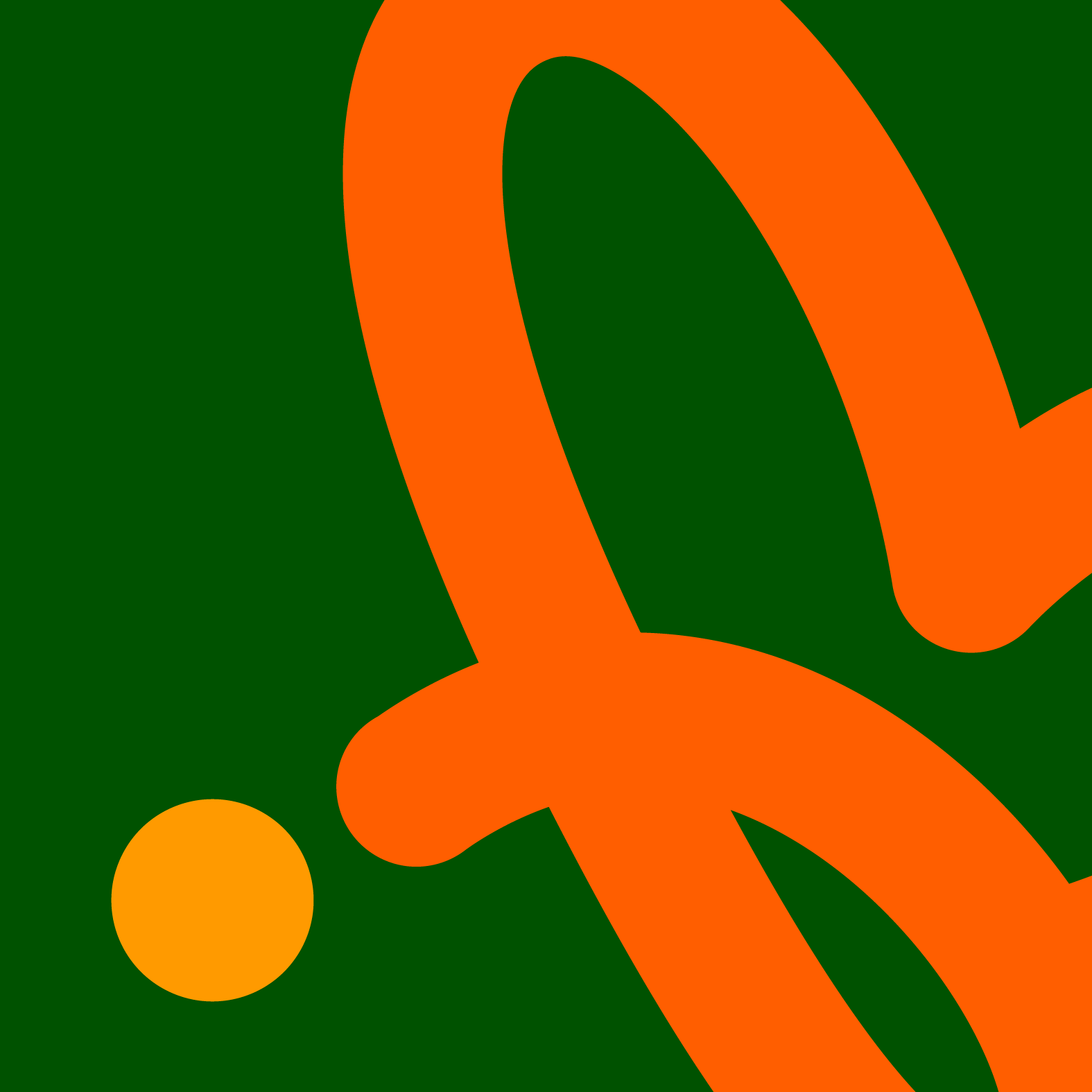
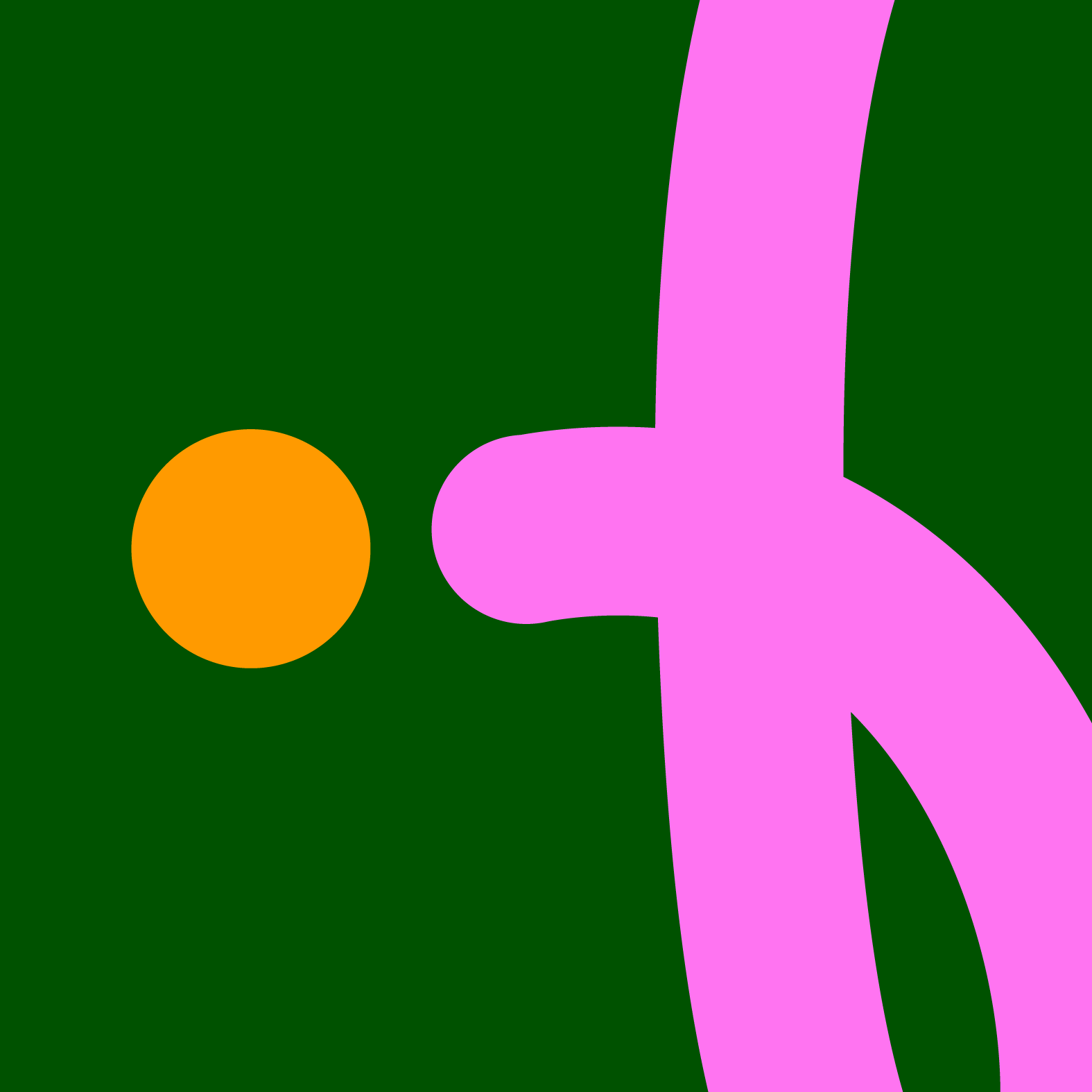
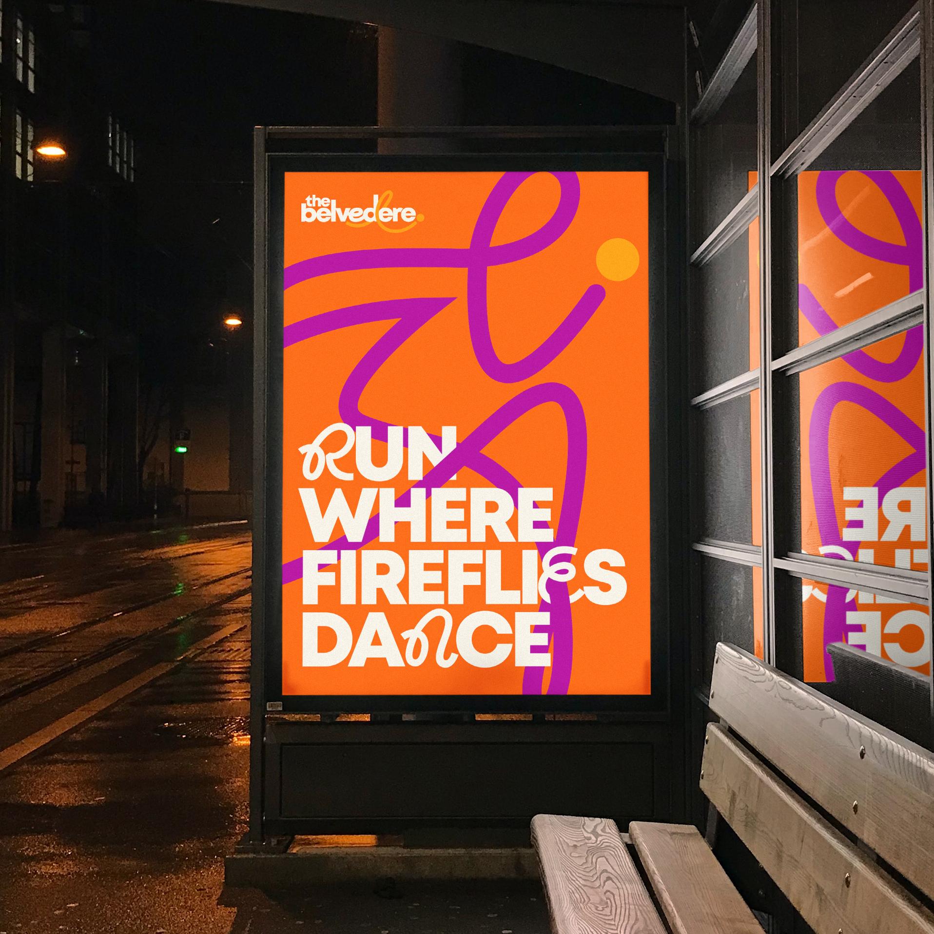
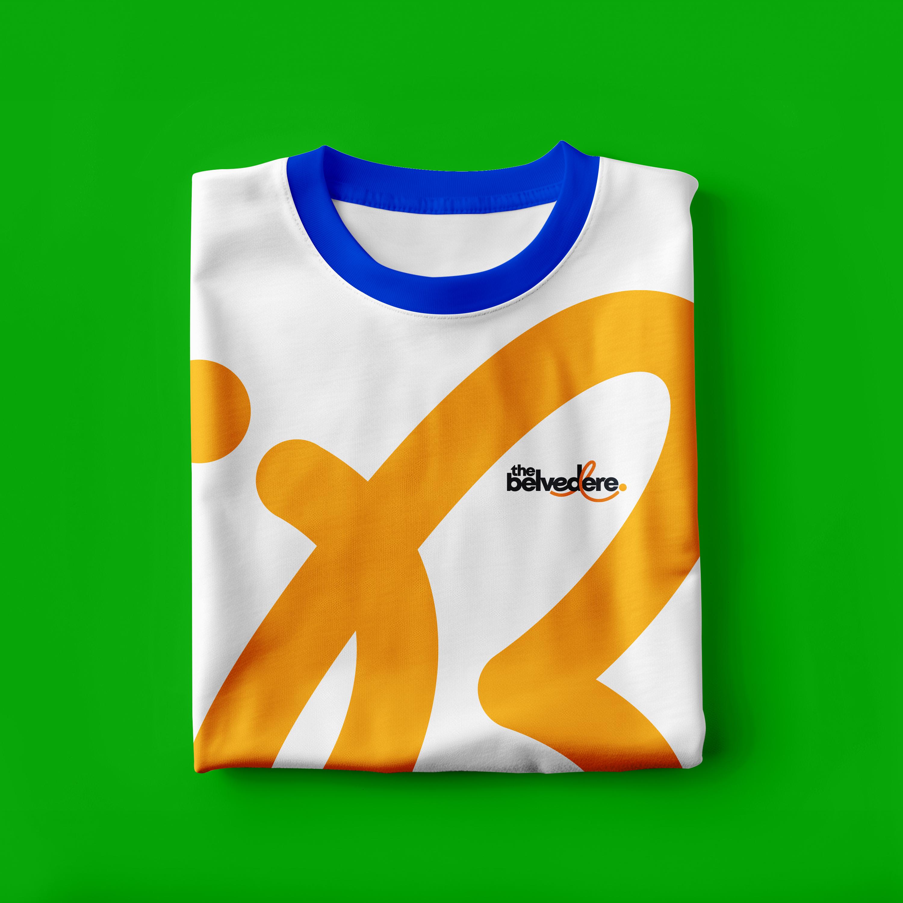
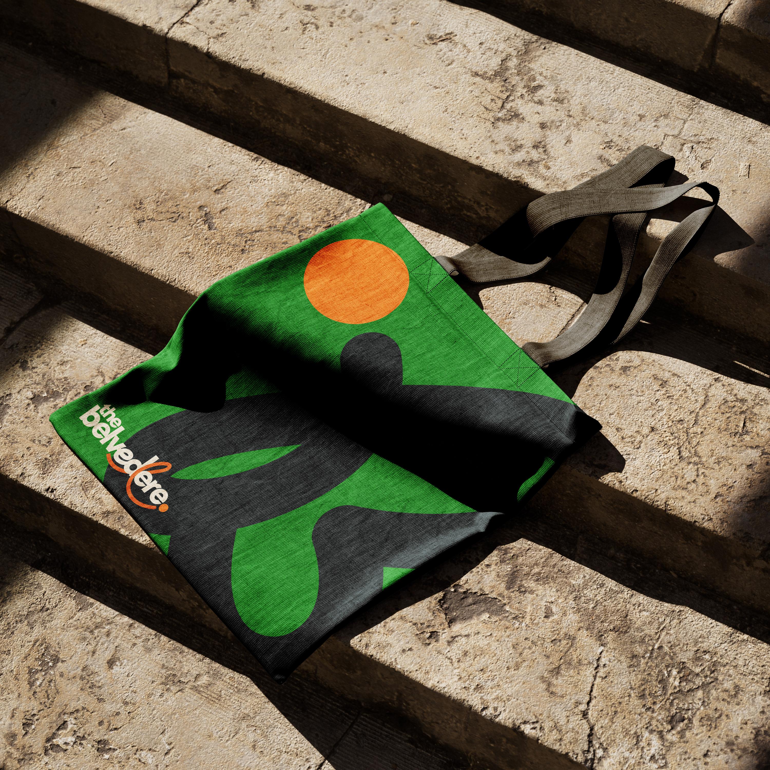
Inspired by the winding paths, firefly lights, and sense of discovery woven throughout the park, we developed a visual language centered around movement. The firefly and its path became the foundation of the system.
The firefly path serves as both a guide and a storyteller, leading the eye across signage, marketing materials, and digital experiences while transforming into illustrations that capture everything from concerts and festivals to quiet jogs along the river. Simple enough to be iconic and flexible enough to tell countless stories, it creates a brand that feels welcoming, magical, and unmistakably Louisville while giving The Belvedere a visual identity that can grow alongside the space for years to come.




Typography with a Sense of Place
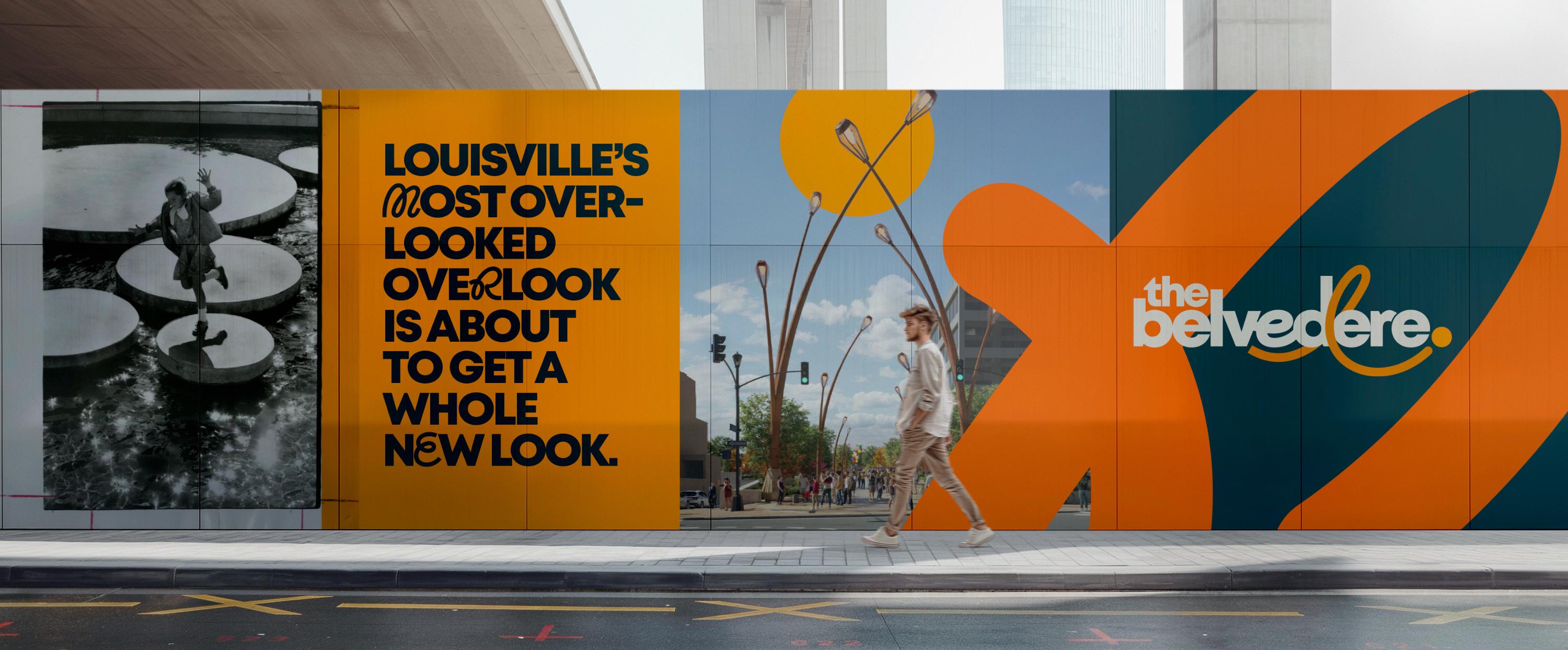
The Belvedere is a civic brand, which means it has to work everywhere from event posters and social media to public communications, wayfinding, and future initiatives that don't exist yet. Our goal was to create a typography system that felt memorable and full of personality while remaining flexible, legible, and easy for city teams to use every day.
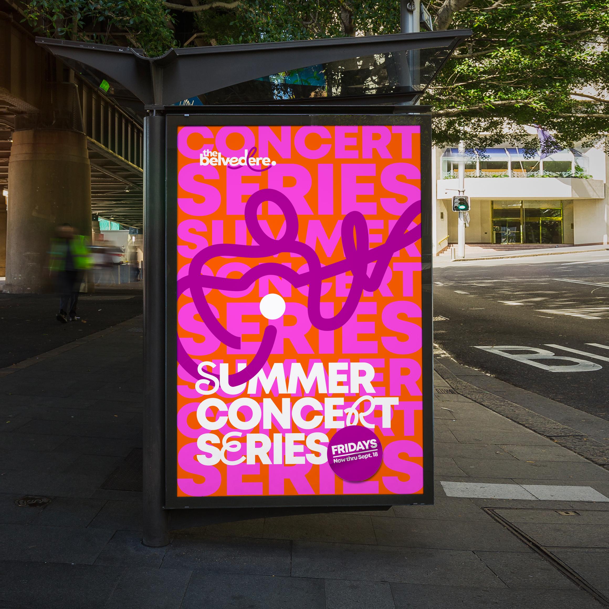
Inspired by the winding paths and firefly trails woven throughout the park, we introduced subtle looping letterforms into select headlines and messages. Used strategically, these moments create small surprises that add a sense of wonder without sacrificing clarity.
Colors with a Sense of Home
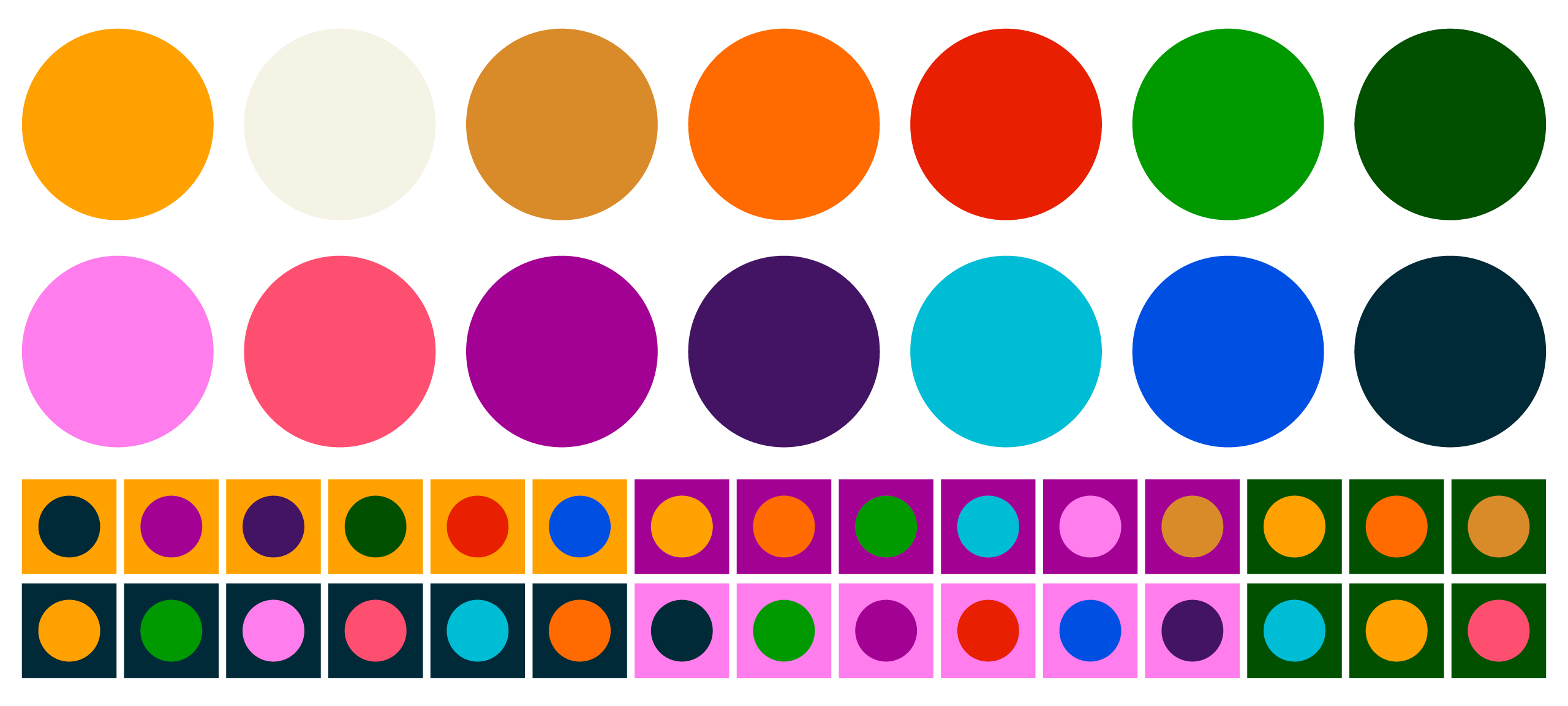
The Belvedere color palette is as bold as the design of the space itself. It reflects The Belvedere’s role as both a civic landmark and a living green space. It pulls from colors you’ll recognize across Kentucky: warm bourbon tones, fertile greens, summer skies, firefly evenings, and bold moments of celebration, and anchors them with gold and navy inspired by the Kentucky state flag. The result is a palette that feels optimistic, welcoming, and rooted in place. It’s vibrant enough to bring energy to downtown Louisville, yet natural enough to feel at home along the riverfront and among the landscape.
The Website
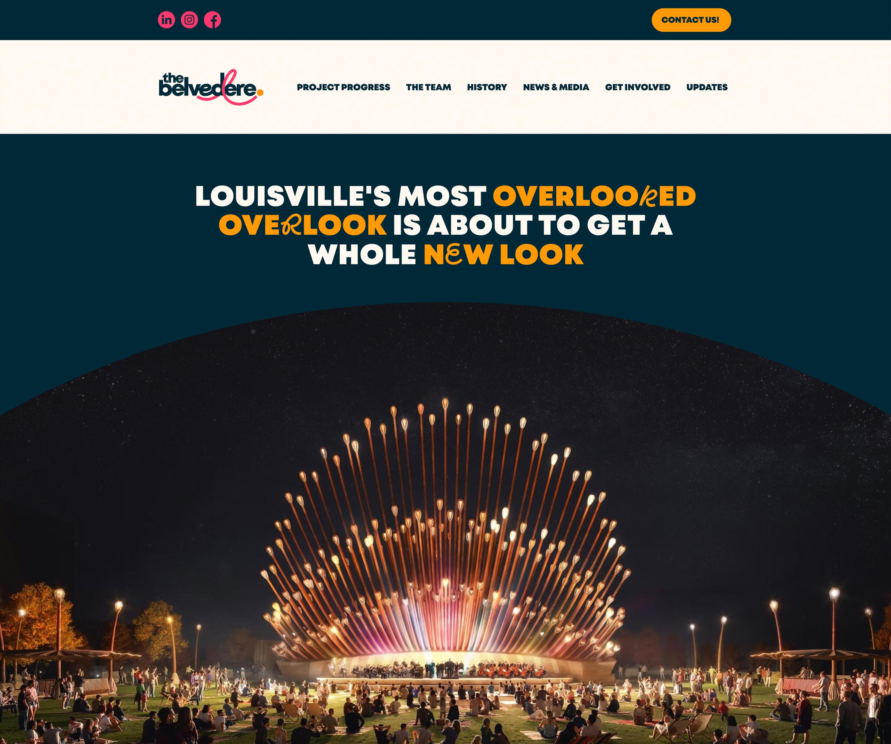
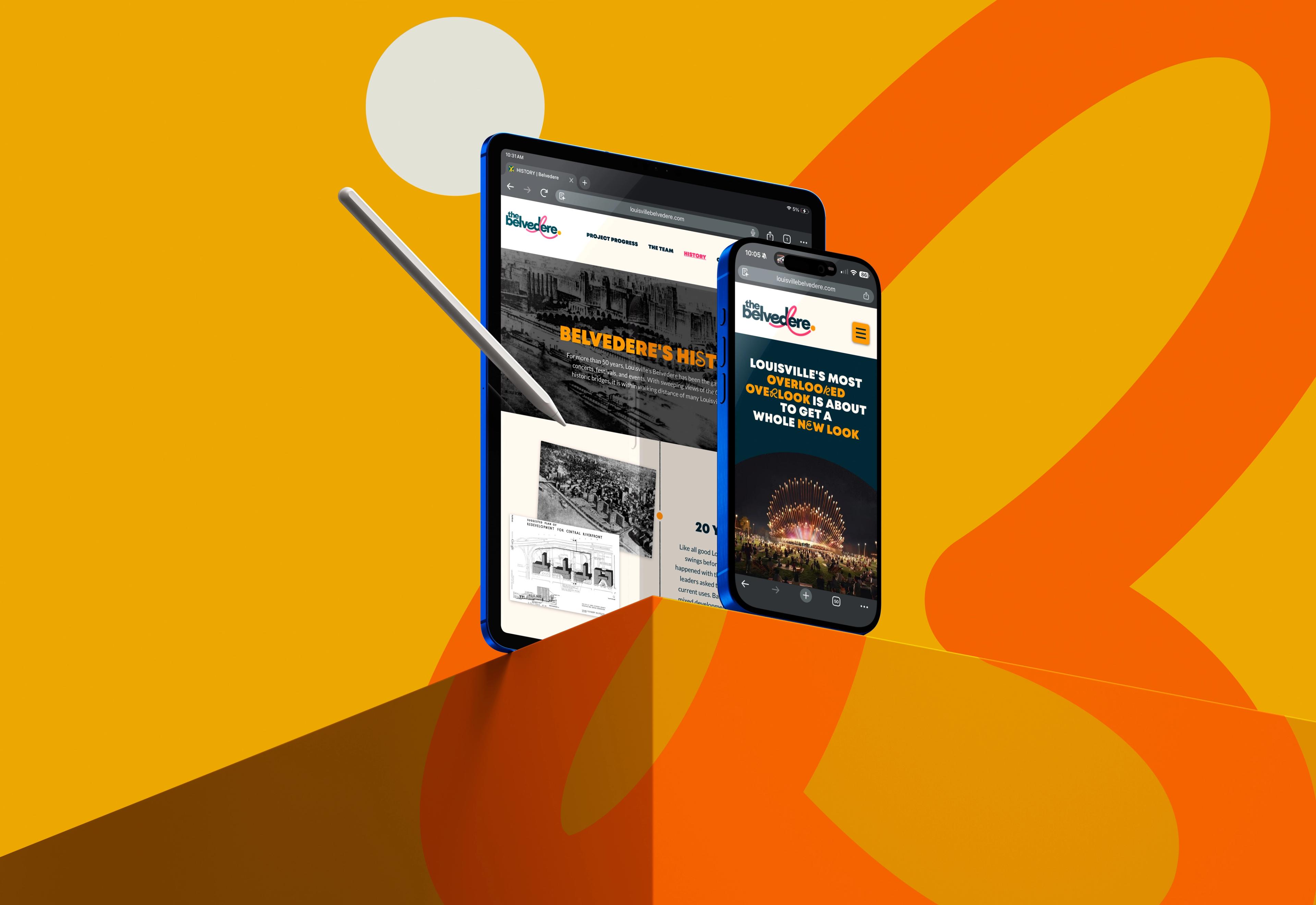
The Belvedere website serves as the digital home for the project and creates a place where visitors can explore its history, follow project updates, discover upcoming events, and stay connected to everything happening within the space. More than an information hub, it acts as a bridge between the Belvedere's past, present, and future.
Just as importantly, we wanted the website to extend the brand experience into the digital world. Through the use of the firefly path, immersive imagery, and moments of discovery woven throughout the interface, the site captures the same sense of curiosity, wonder, and exploration that defines the experience of visiting The Belvedere itself.
More than a Public Space
At the end of the day, this project was really about helping tell the story of a place that will soon become one of Louisville's most important public spaces.
The new Belvedere has the potential to reconnect our city to the river, create new traditions, inspire exploration, and give residents and visitors alike a reason to experience downtown in a new way. Our role was to build a brand that could support that vision and grow alongside the space itself.
We’d love to do the same for your brand. Give us a shout and let’s see what we can do!
Let's Talk!All renders© NOD 2026
One of my earliest tasks with the Belvedere project was to develop branding and build a new website. Lots of people can build websites, but not everyone has the creative expertise to really deliver a world-class brand identity. VIA Studio worked with our team to create a brand that reflects the new design of the Belvedere, is as joyful as the space will be, and flexible enough to be used in a variety of ways. The brand guidelines not only helped shape our visual identity, but also included inspirational language and our new tagline. They were a dream to work with!
