 VIA Studio
Redesigning Wayfinding in Downtown Louisville
We may be biased, but we think Louisville is one of the greatest cities in the country. We’ve got it all: music, food, art, college sports, pro soccer, and whiskey for days. It’s a great place to live and an even better place to explore.
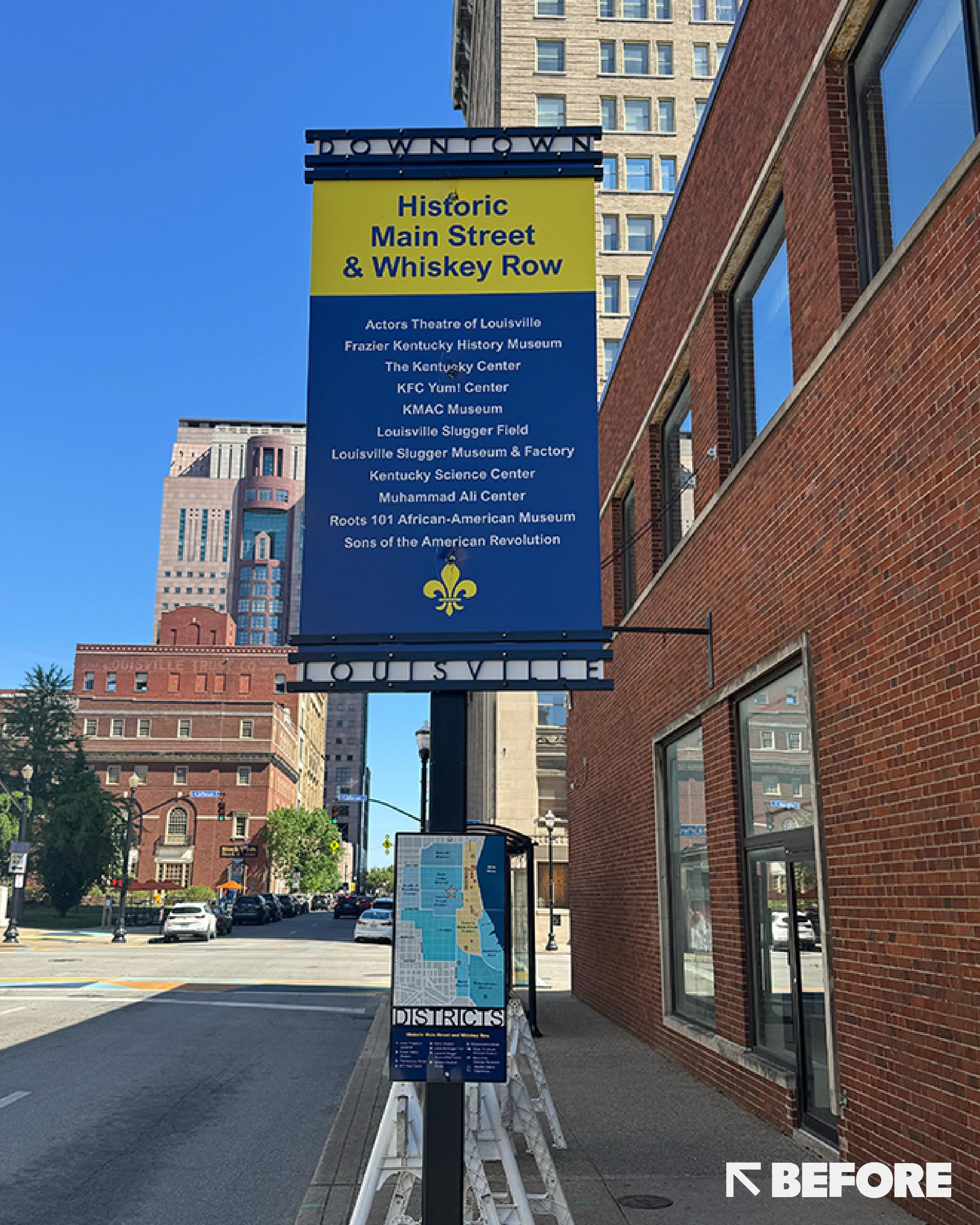
There’s a lot to see and do downtown, but finding your way around could be easier. That’s where Louisville Downtown Partnership (LDP) saw an opportunity. They came to Tectonic to rethink the existing wayfinding system and make it clearer, more legible, and more useful for people exploring downtown on foot.
Finding Our Bearings
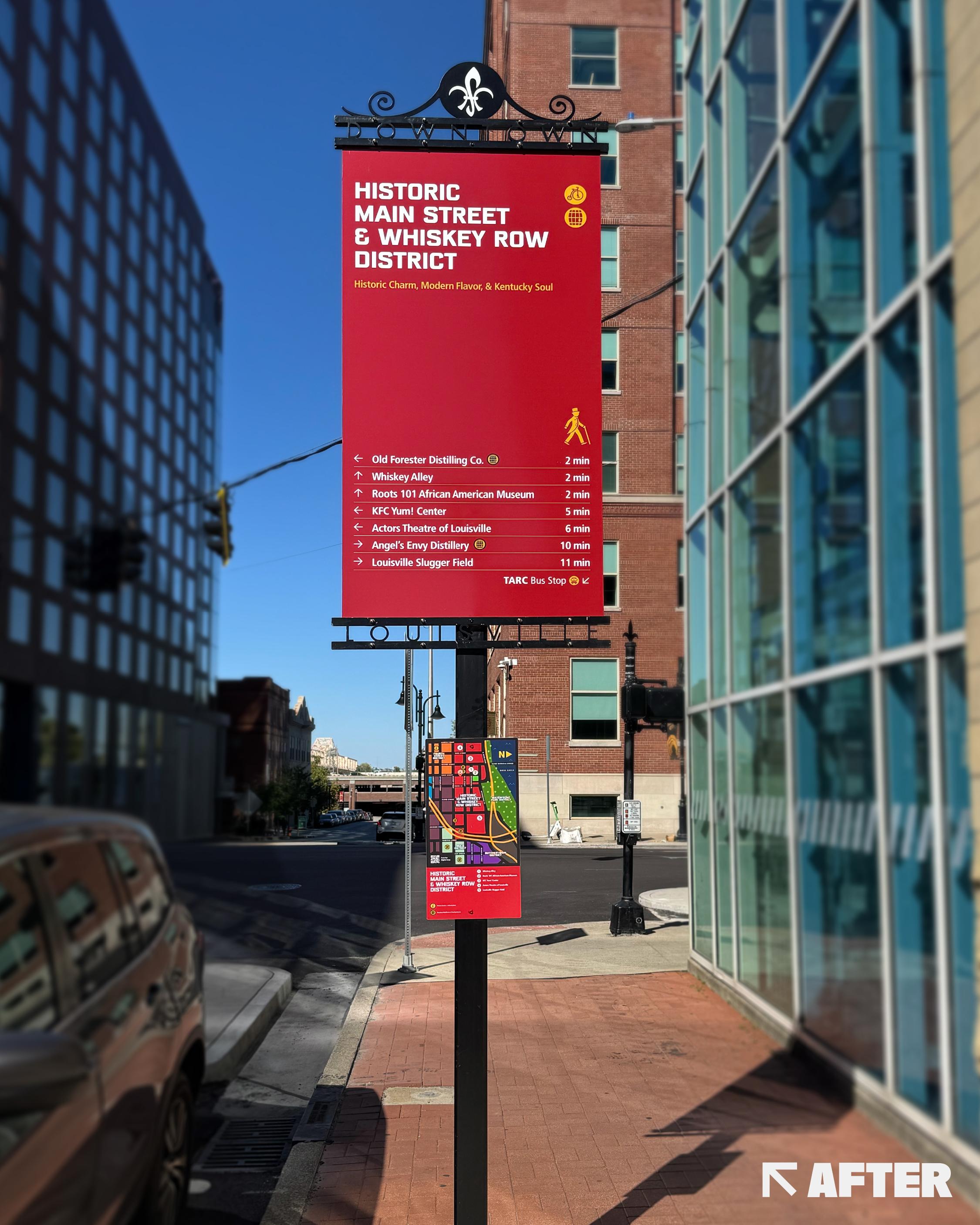
The existing system had served downtown well, but it was largely designed around drivers. Our opportunity was to rethink it from a pedestrian’s perspective, making destinations easier to find, information quicker to scan, and the overall experience more intuitive.
At a high level, the goals were:
- Audit 18 existing sign locations
- Redesign the existing wayfinding signage
- Improve typography, hierarchy, color, and iconography
- Simplify information so it can be understood at a glance
- Strengthen district identities while keeping downtown cohesive
- Work within the existing sign architecture
- Test for real-world sightlines, accessibility, and usability
- Create a flexible system that could expand over time
On paper, fairly straightforward. In reality, across 18 locations there are 36 individual signs, each with its own content, surroundings, sightlines, and quirks.
A Better Way to Find Your Way
Our question quickly became: How do we create a better experience for pedestrians?
As we looked at how people actually move through downtown, a pattern emerged. Most visitors don’t explore Louisville block by block. They arrive somewhere first (a hotel, parking garage, museum, Whiskey Row, the waterfront, convention center, or government building) and explore outward from there.
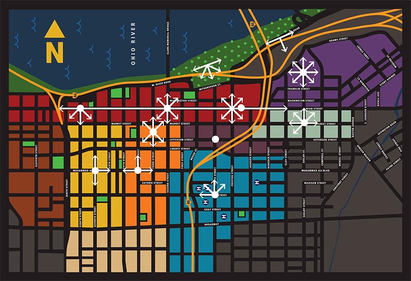
Those “Arrival Zones” are also where people tend to stop and ask a few simple questions: Where am I? What district am I in? What’s nearby? How far away is it? And where should I go next?
But with a limited number of signs spread across downtown, we couldn’t guide people through every block. Each sign needed to do more with less: orient visitors, introduce the district, show what was within walking distance, and provide enough context to understand what was around them.
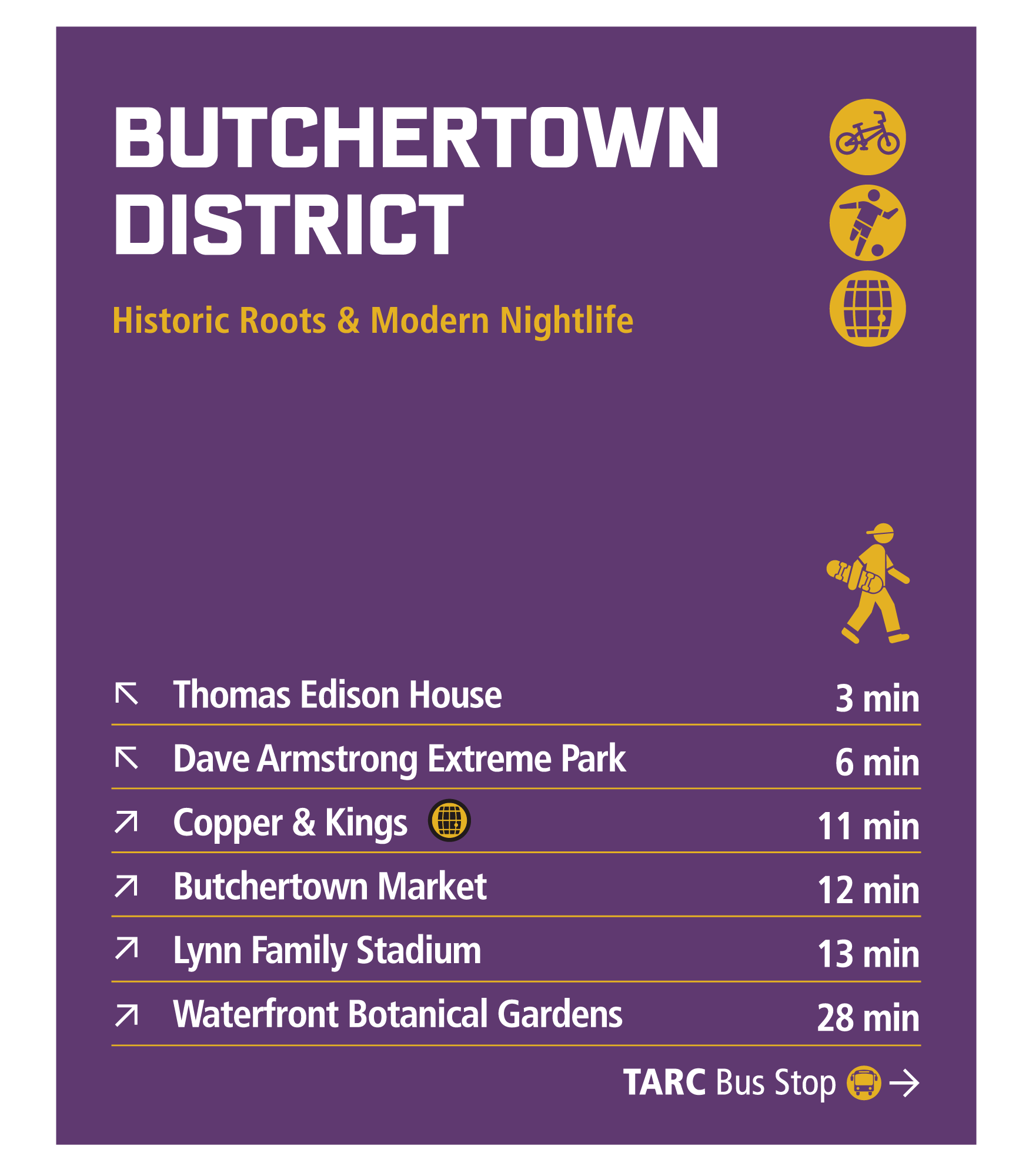
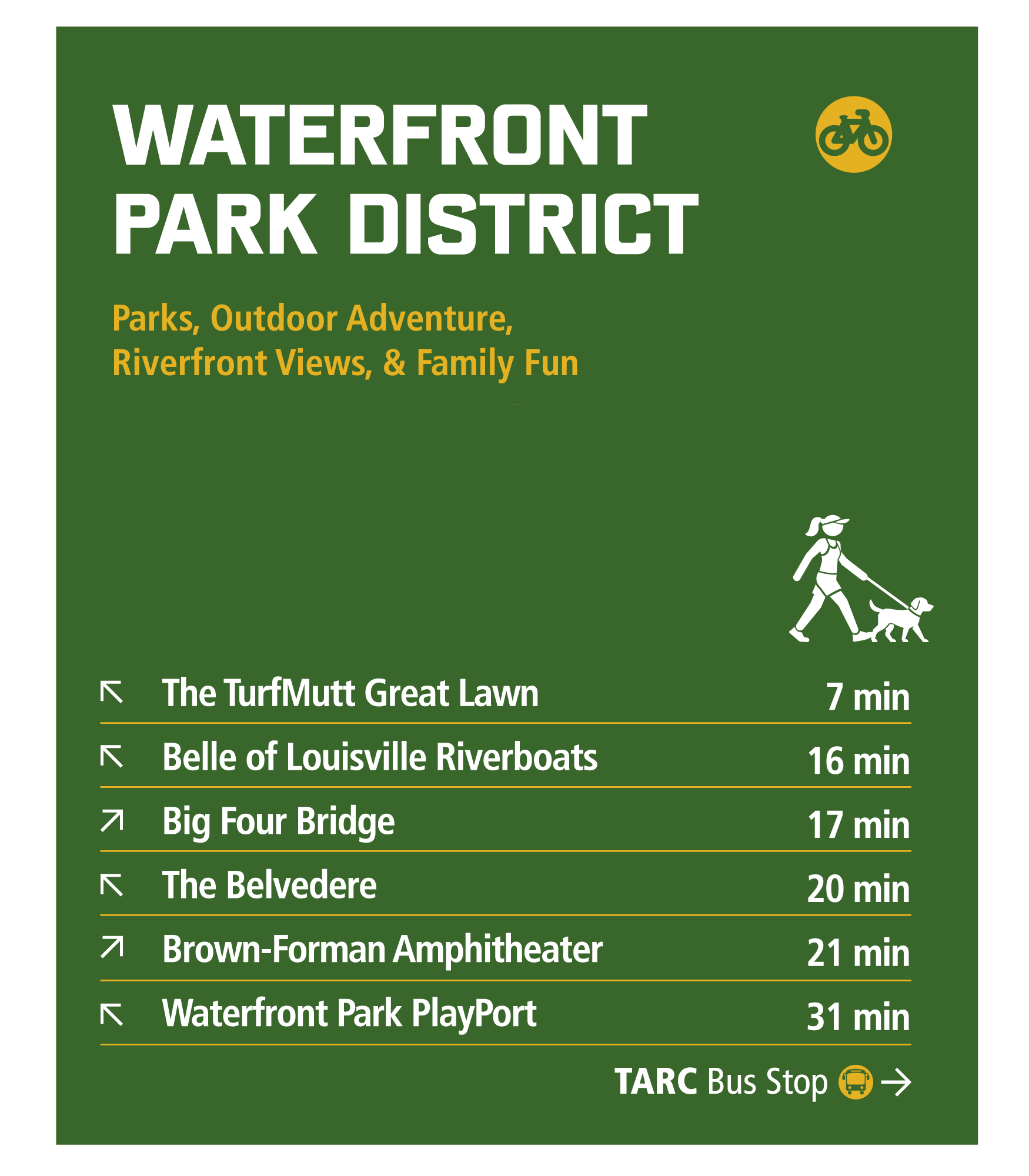
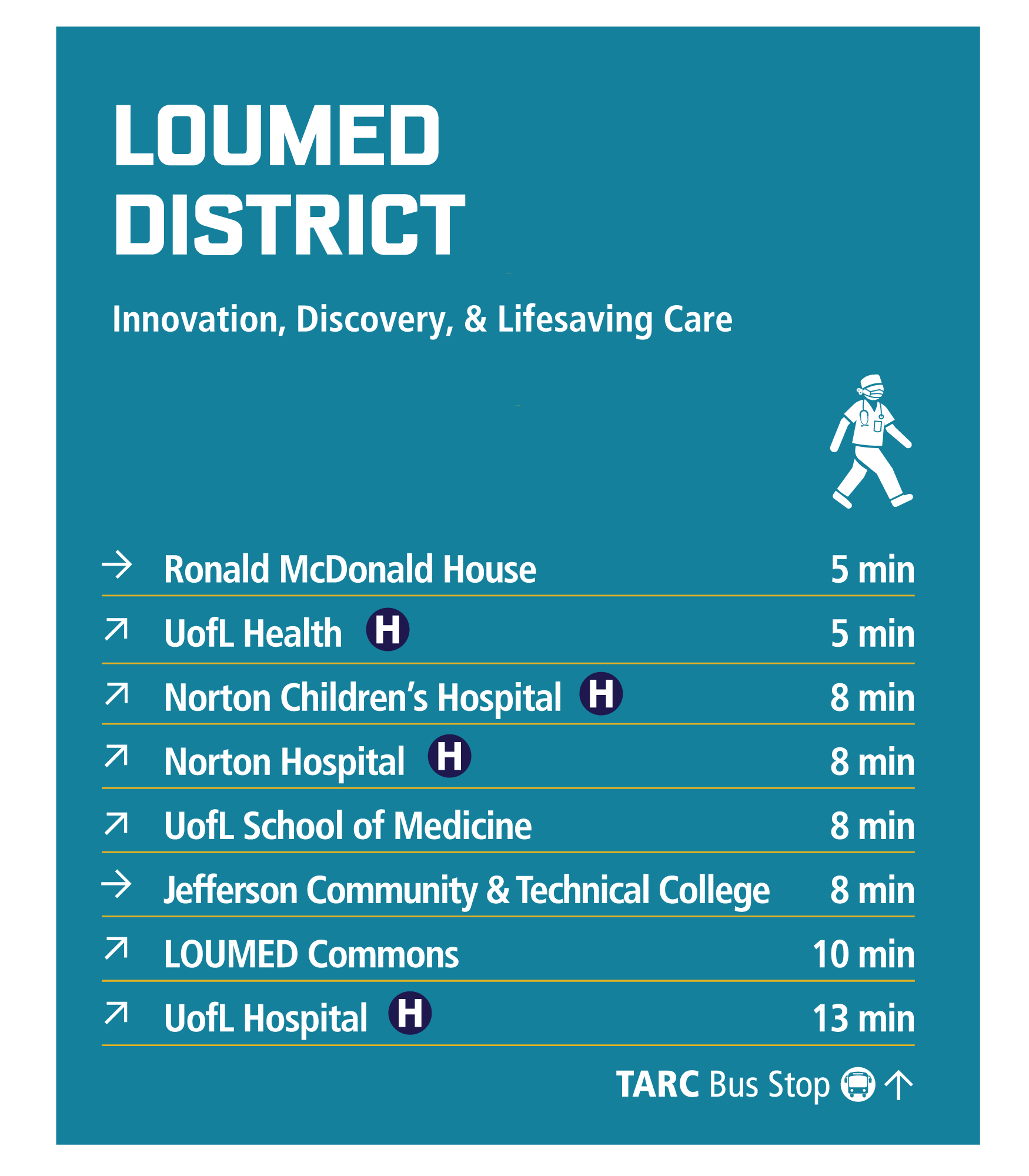
Attractions
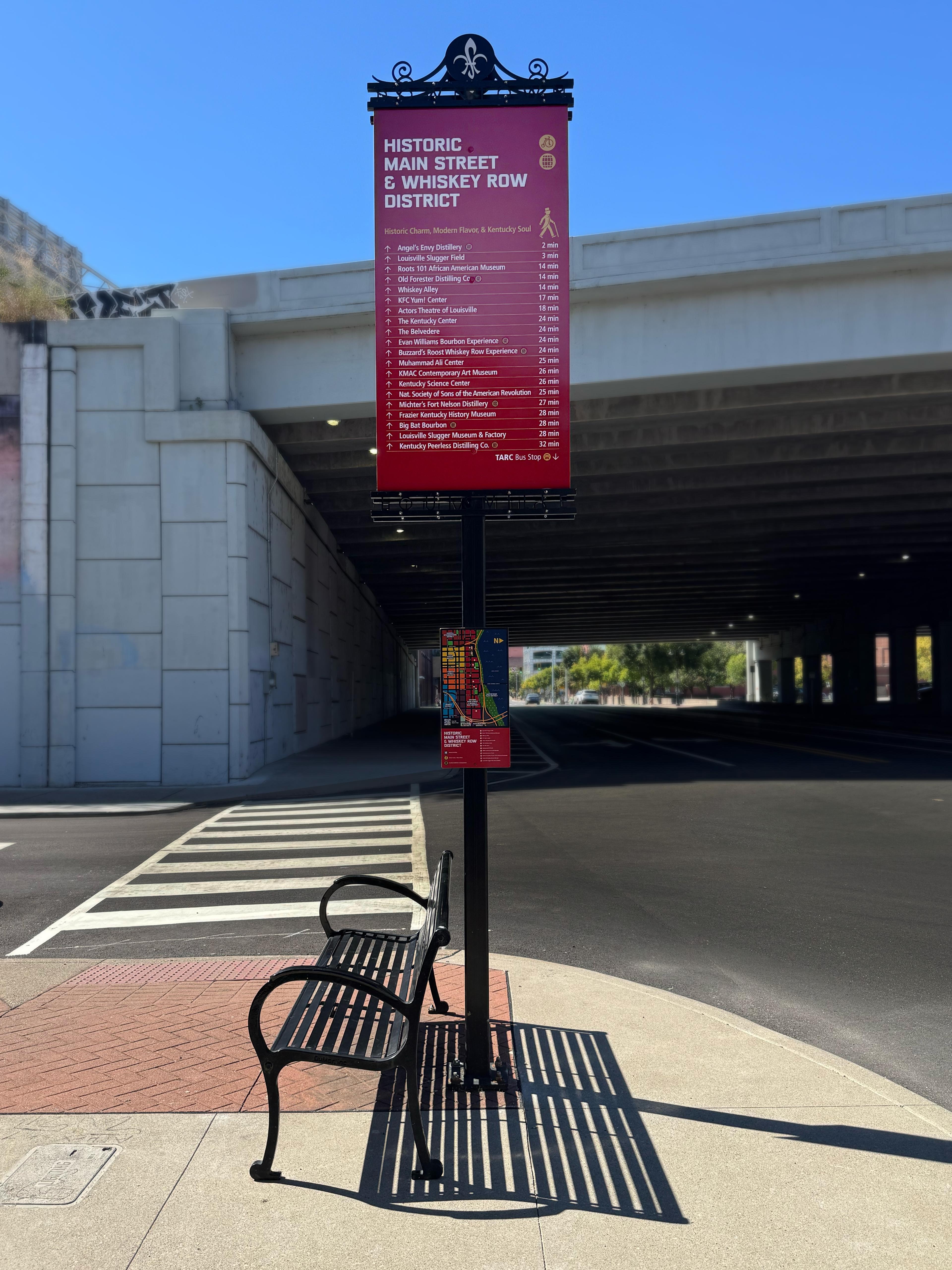
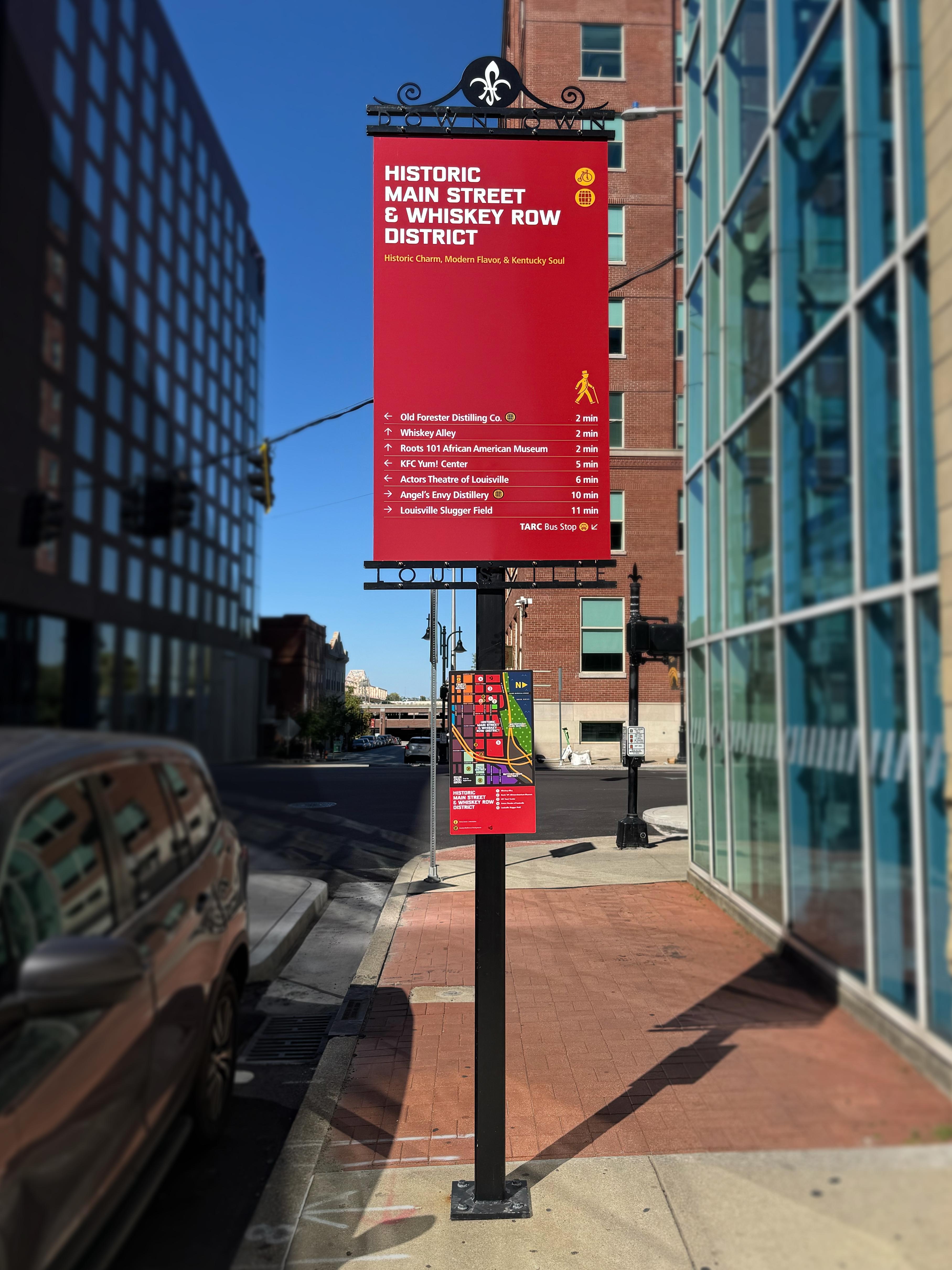
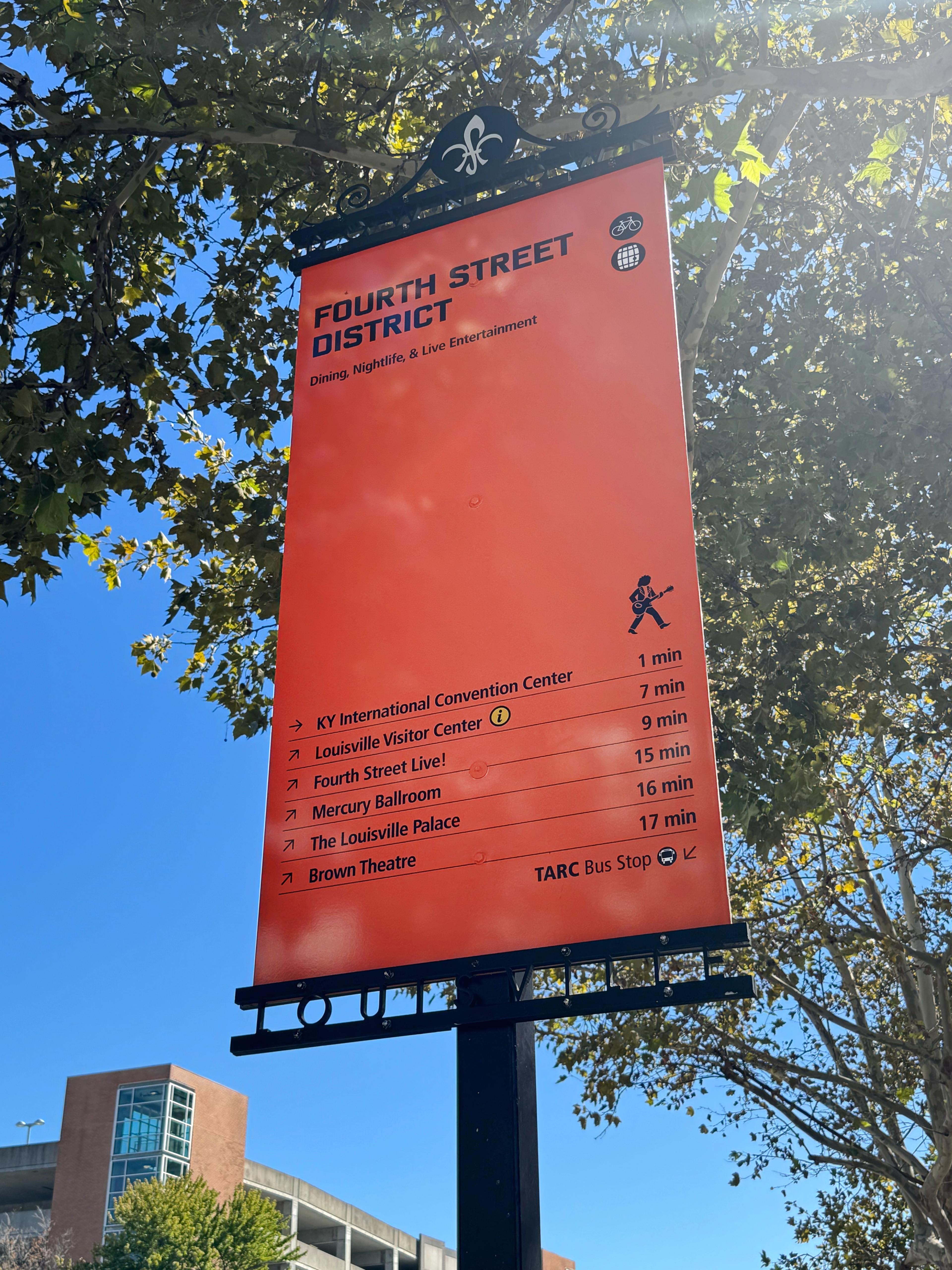
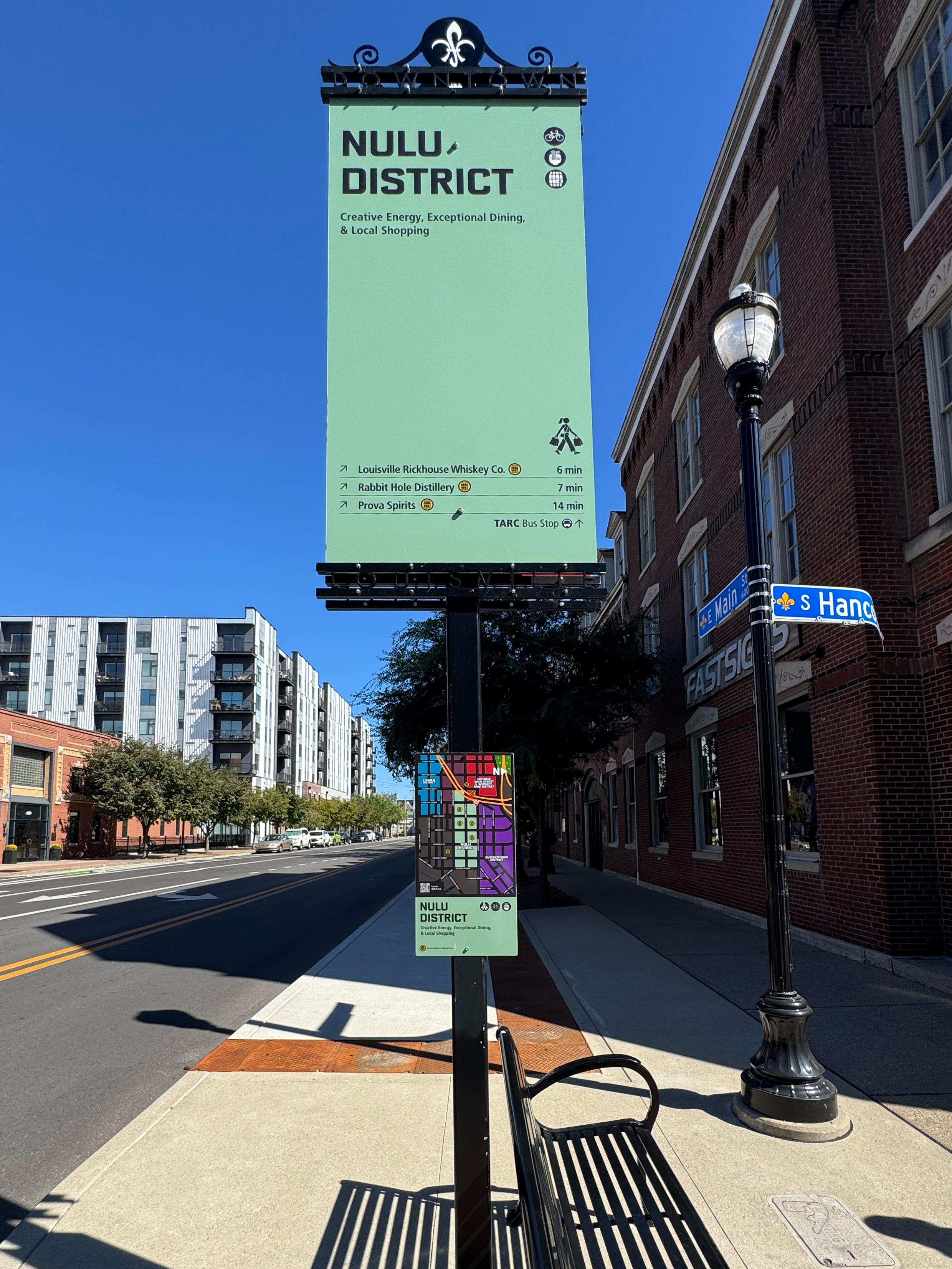
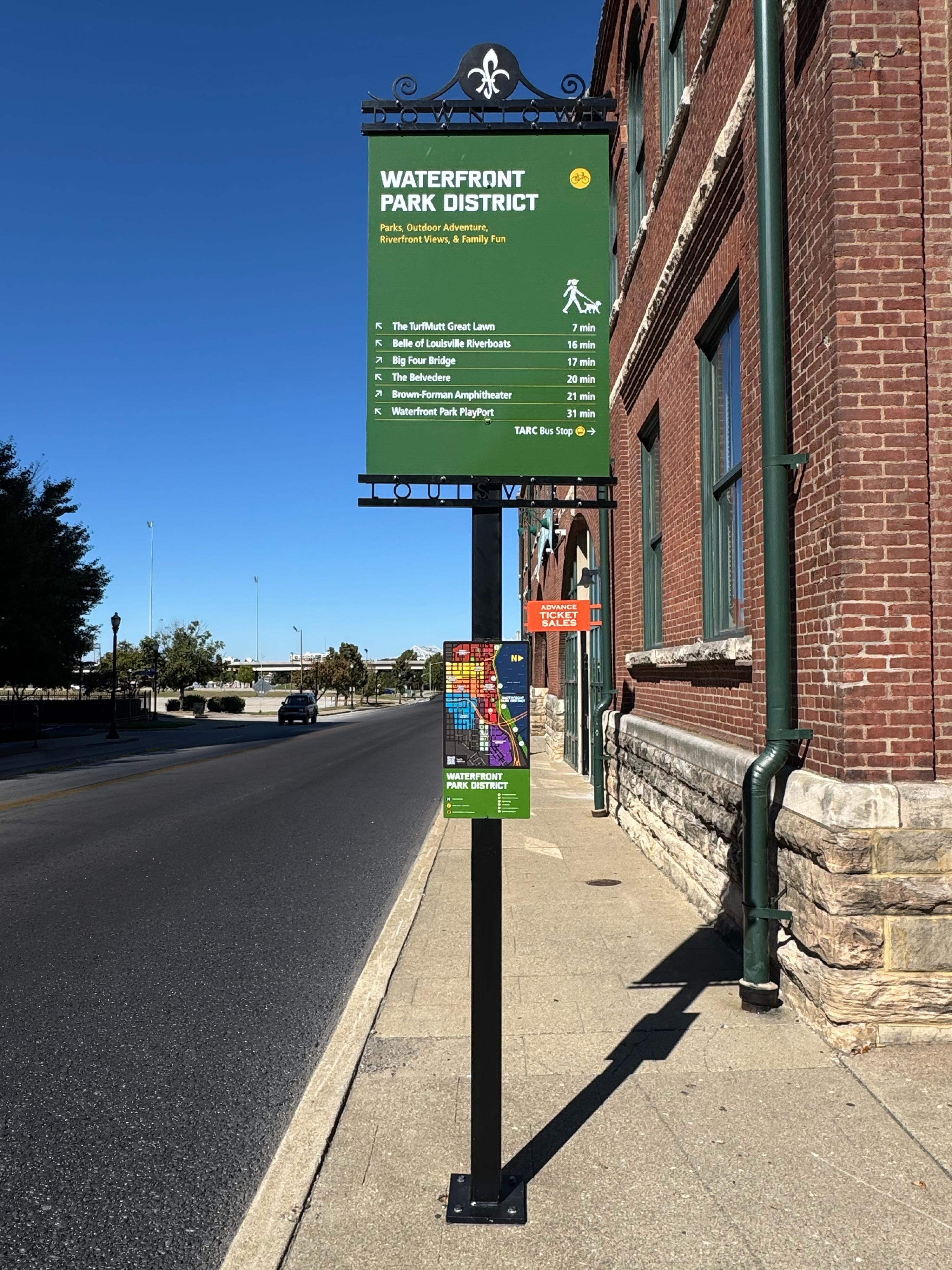
The attraction signs do the heavy lifting of telling people what’s nearby. The existing signs did this too, but stopped at a list of destinations. We saw an opportunity to give visitors more of the information they needed to actually make a decision.
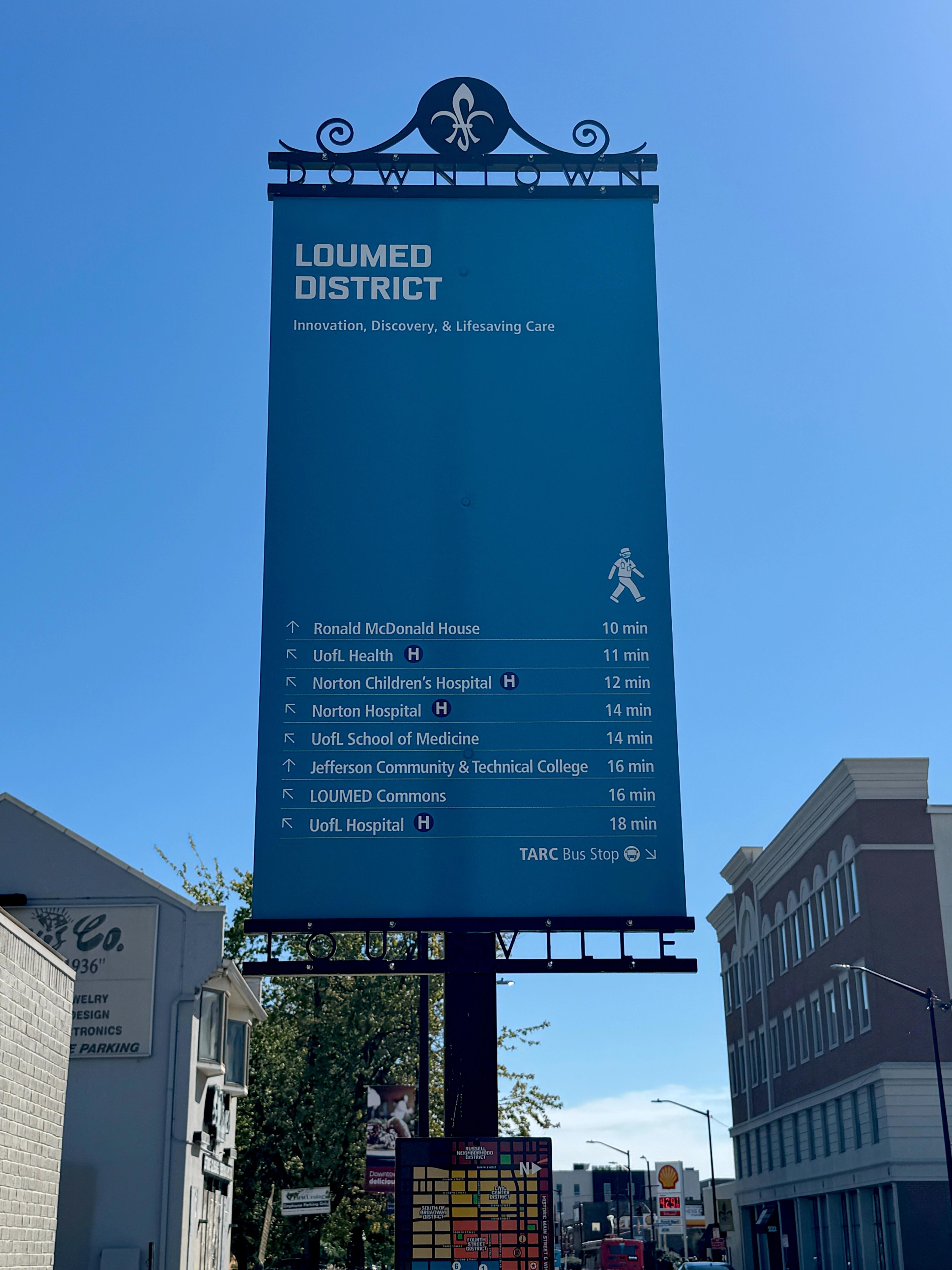
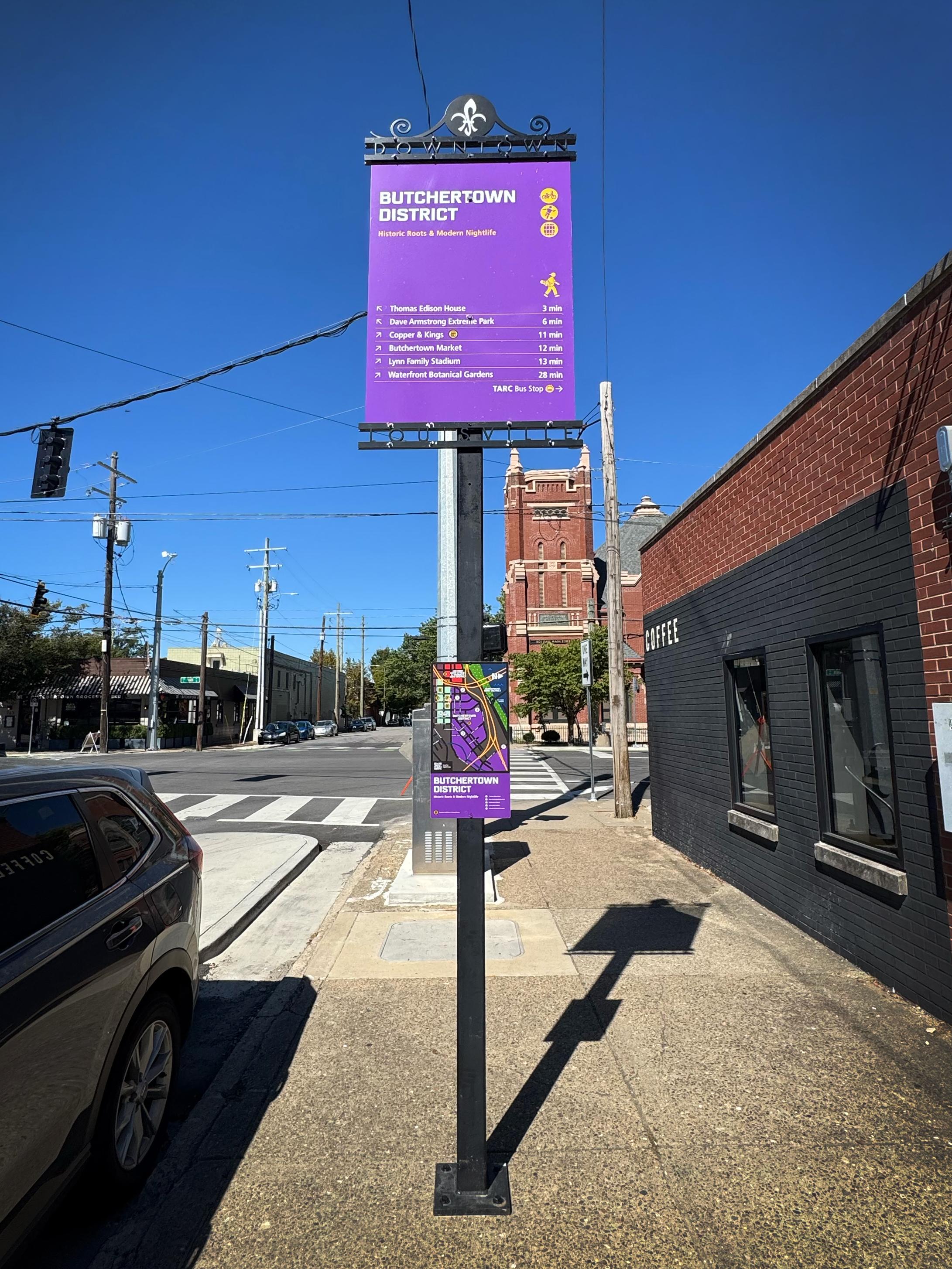
Each sign includes:
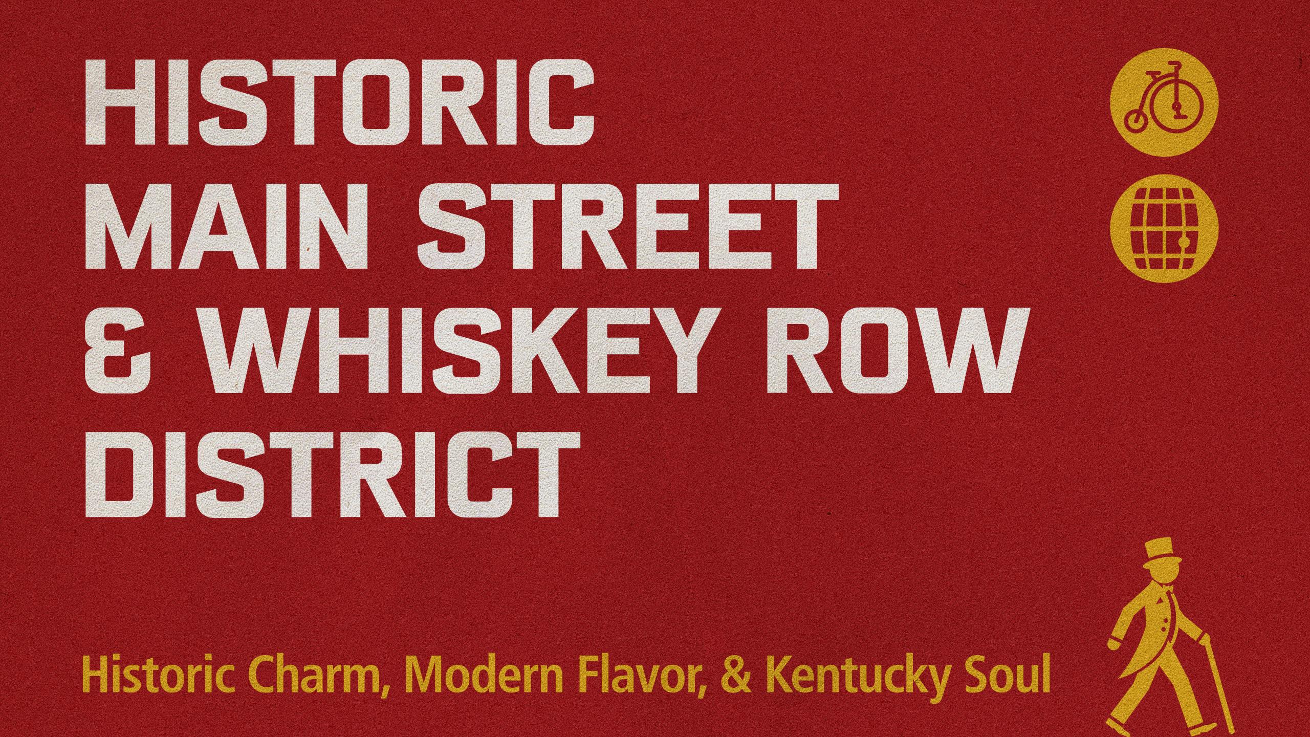
- District name to establish where you are
- A short, playful description to introduce the district
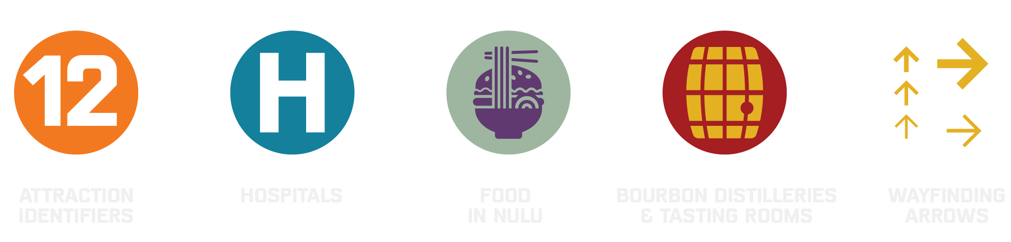
- Pedestrian and bicycle icons themed to the area
- Nearby attractions organized for quick scanning
- Directional arrows showing which way to go
- Walking times to make distance easier to understand
- Transit information pointing toward the nearest bus stop

A Little Personality Goes a Long Way
Louisville is a quirky city. And we’re proud of that. But wayfinding needs to be simple, intuitive, and easy to understand. In other words, not particularly quirky.


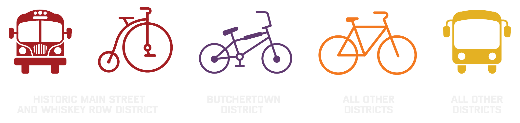
Icongraphy became our space to create a little delight and be a little quirky. In Historic Downtown, the traditional pedestrian icon becomes a dandy chap out for a walk, paired with a penny-farthing for cyclists. Butchertown gets a skateboarder and dirt bike. Fourth Street Live gets a musician. The Medical District gets a doctor. The Civic District gets a judge. NuLu gets a shopper. Each communicates quickly while giving visitors a little glimpse of the neighborhood’s personality.
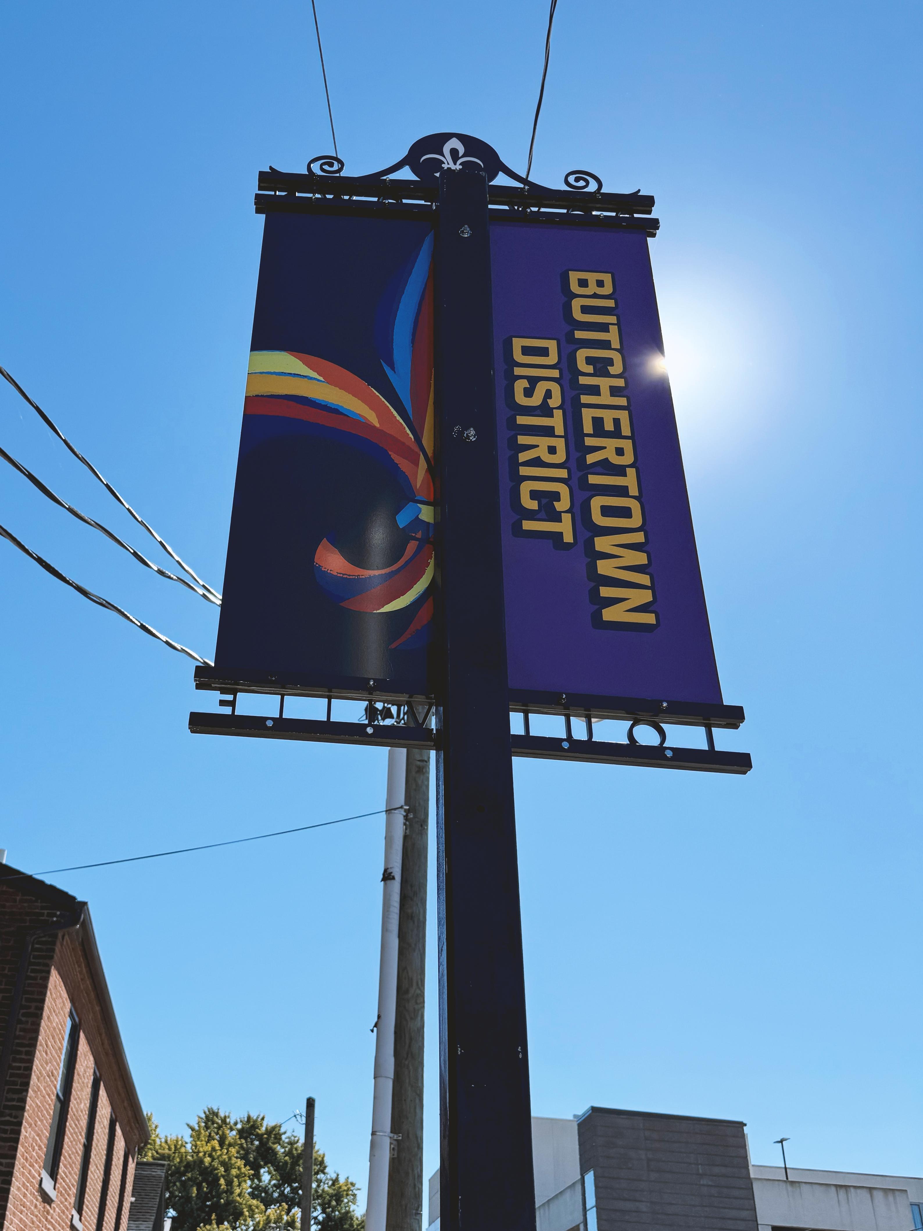
We took the same approach with color, assigning each district its own from the existing LDP palette. Beyond adding personality, color does some real wayfinding work and helps visitors quickly recognize where one district ends and another begins.
Every Good Journey Begins With a Map
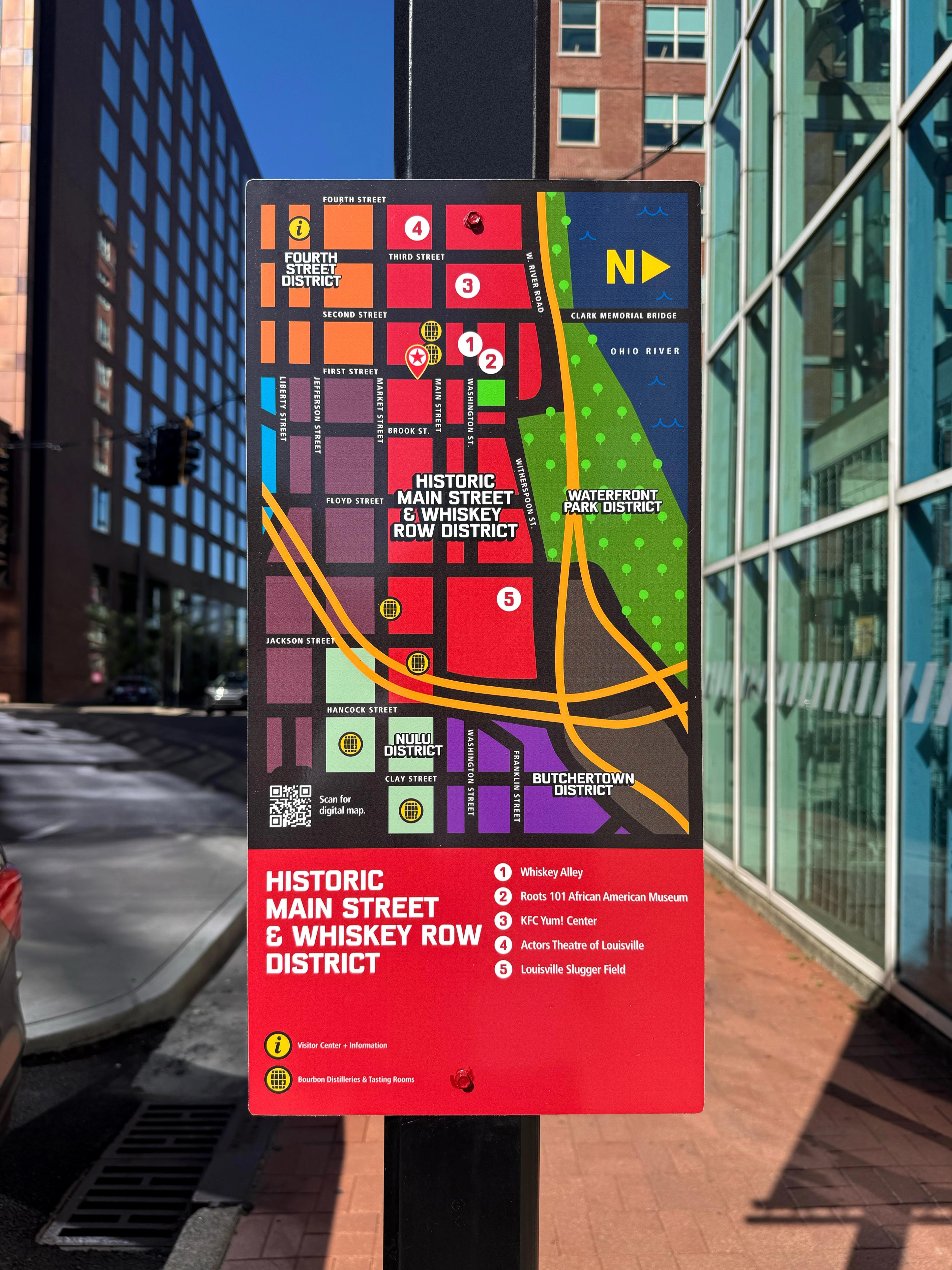
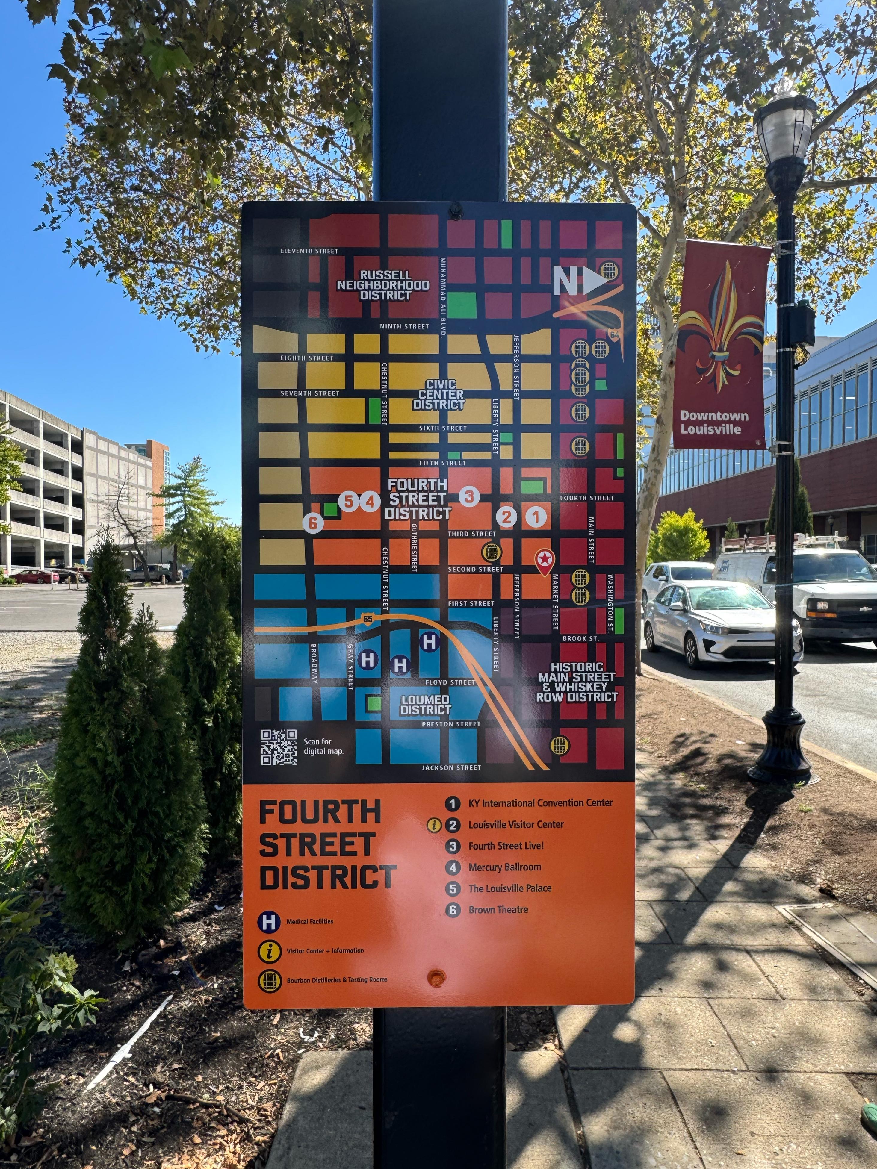
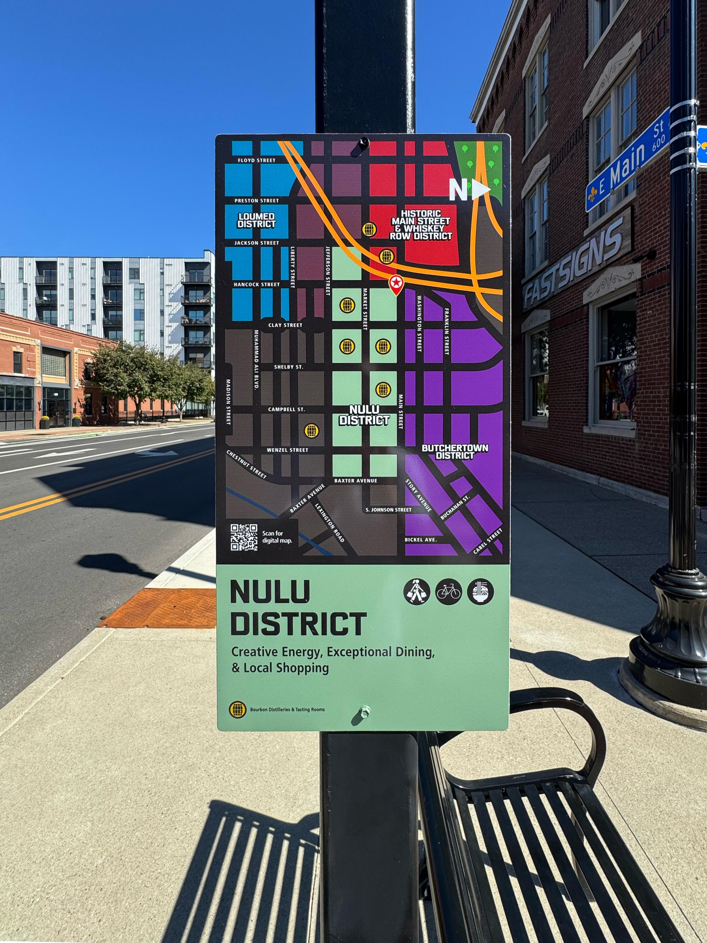
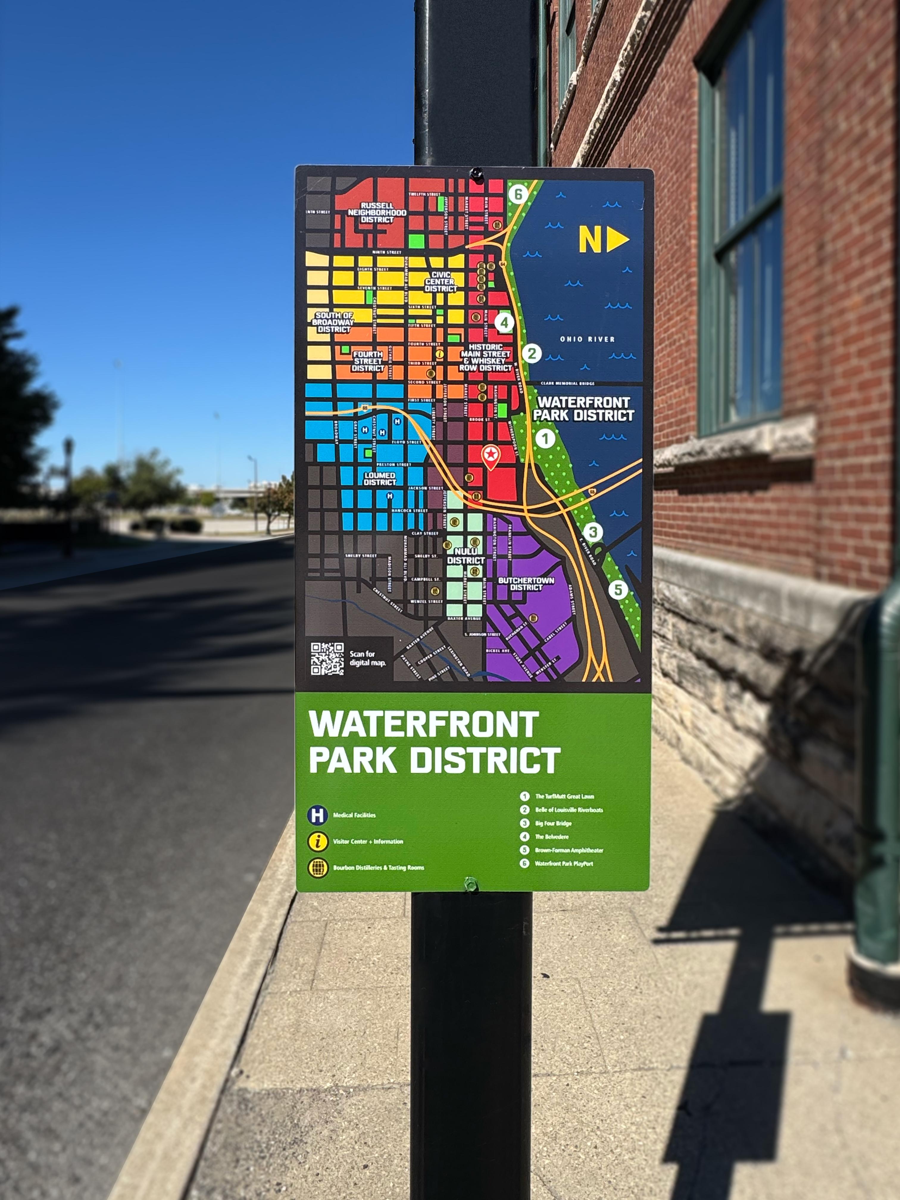
While the attraction signs answer “What’s nearby?”, the maps answer “Okay, but where is it?”
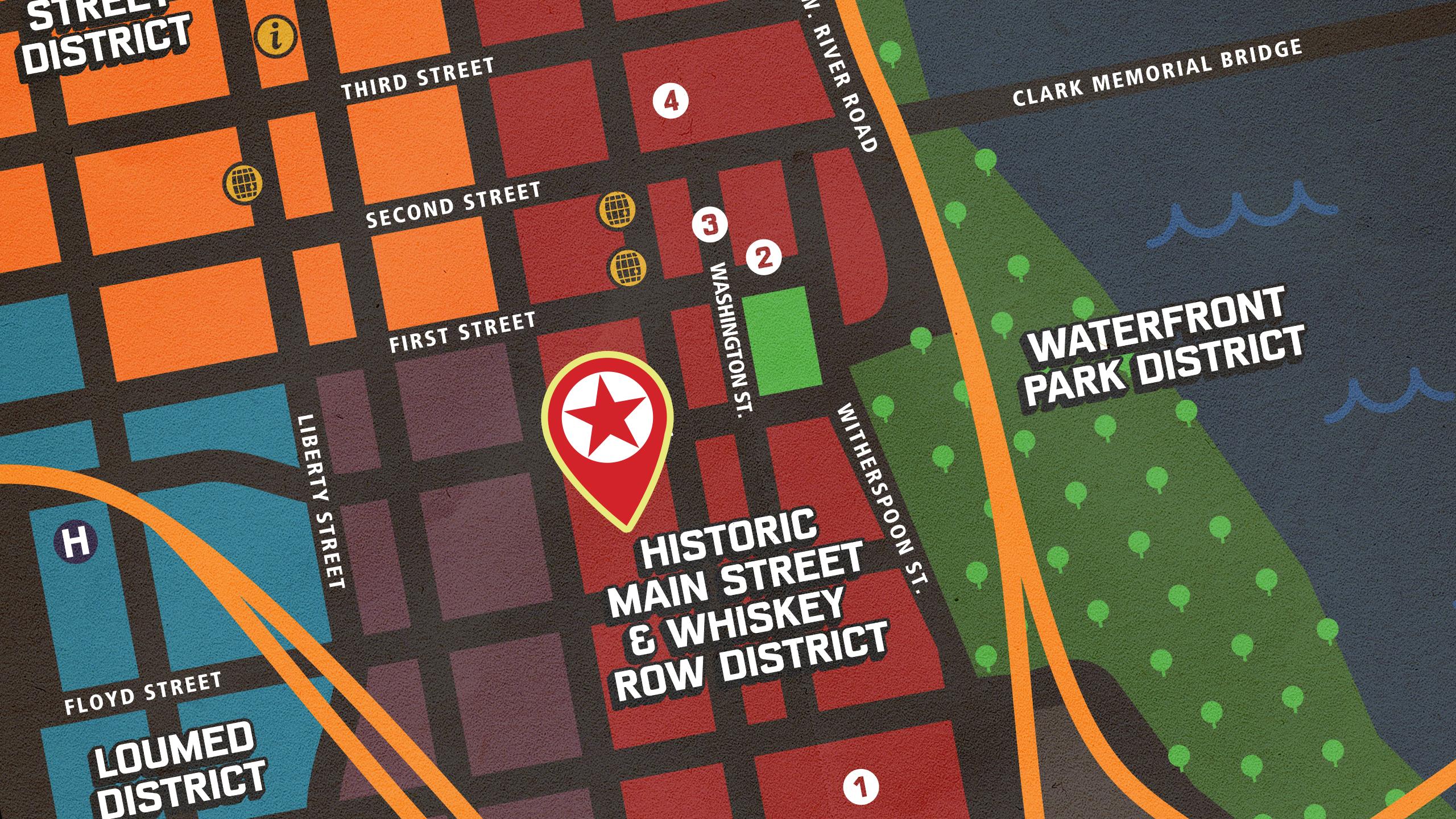
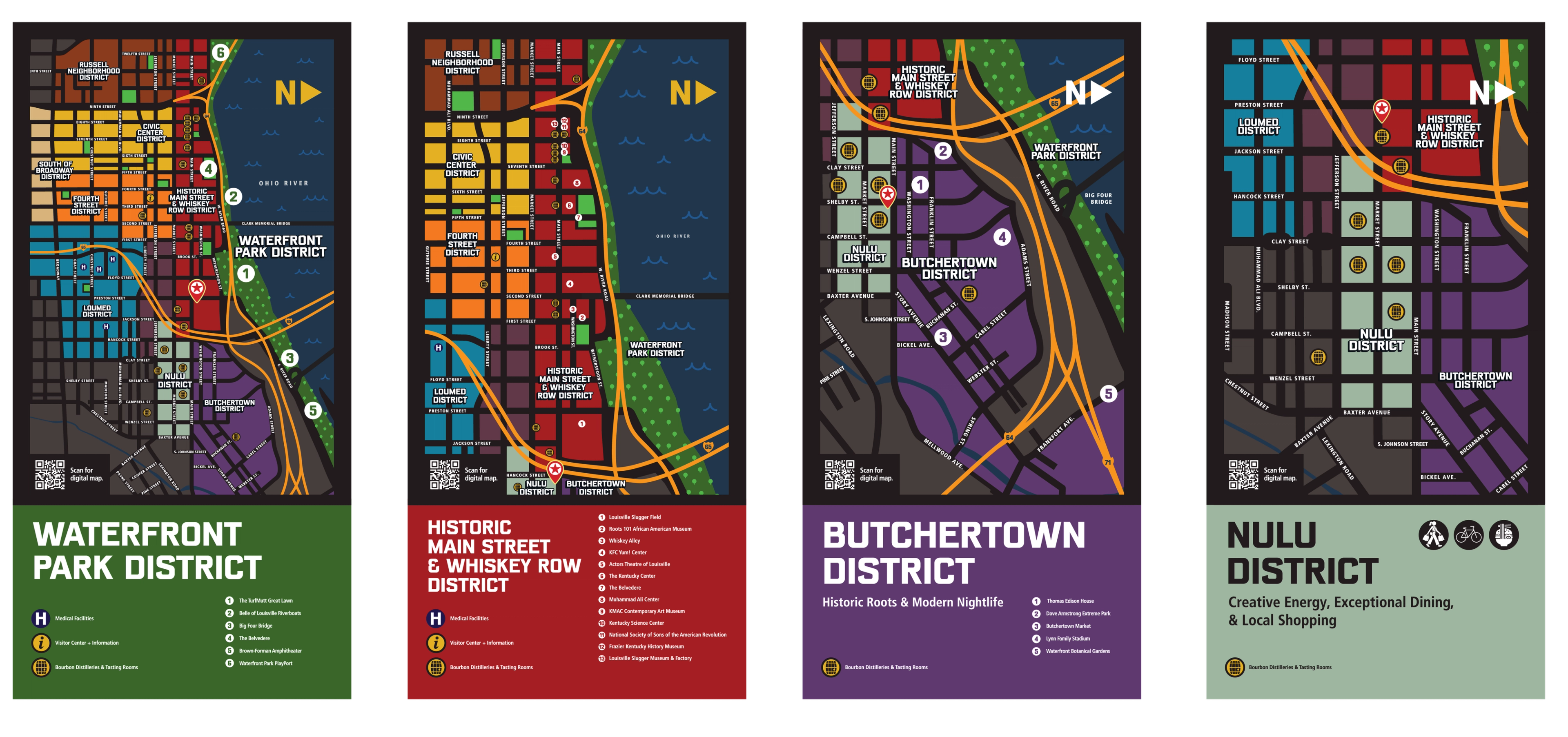
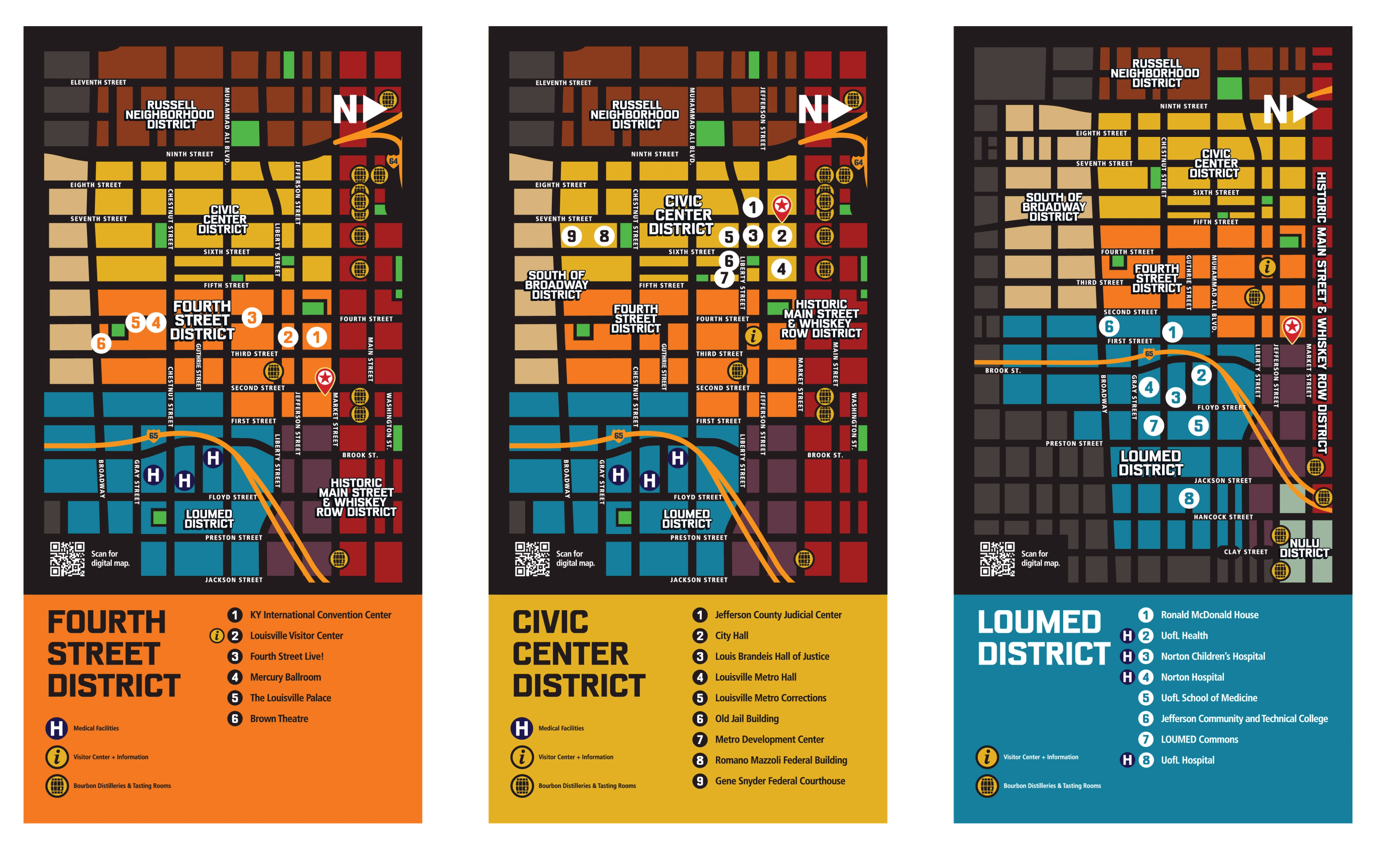
The maps show attractions in physical space, clearly mark You Are Here, and layer in other useful information like bourbon distilleries and tasting rooms, visitor centers, hospitals, street names, and other points of interest. District colors make all of that easier to understand at a glance, without studying the map like there’s going to be a quiz afterward.
Then there was the not-so-small problem of size. Downtown Louisville covers a lot of ground. Our maps did not.
Rather than squeeze the entire city onto every sign, we zoomed in. Each map gives more space and detail to the district where the visitor is standing, while surrounding districts provide just enough context to understand what’s next. As visitors move into another district, the next sign picks up the story.
It seems counterintuitive, but showing less city on each map ultimately made downtown easier to understand.
Finding the Way Forward
Good wayfinding doesn’t need to show you everything, but it should give you enough confidence to keep exploring.
Every decision — from Arrival Zones and walking times to district colors, custom icons, and tighter maps — started with what someone needs to know in that moment. The result is a system that makes downtown easier to understand without making Louisville feel any less like Louisville.
If you’re looking for a better way to make your signage, communications, or complex information easier to navigate, we’d love to help. Reach out and let’s find a clearer way forward.
Give us a shout
Via Studio took on a complex downtown wayfinding redesign and stayed flexible through every iteration. They found the right creative direction quickly, and the final signs are vibrant, cohesive with our existing citywide look, and easy to notice. We're sticklers for accuracy, and they delivered.
