 VIA Studio
Building the Brand Behind the Brands
For nearly 90 years, Heaven Hill Brands has grown from a small, family-owned distiller into one of the largest independent spirits companies in the world. Along the way, they've built an impressive portfolio of award-winning brands.
Now it was time to give the company behind them a story just as strong.
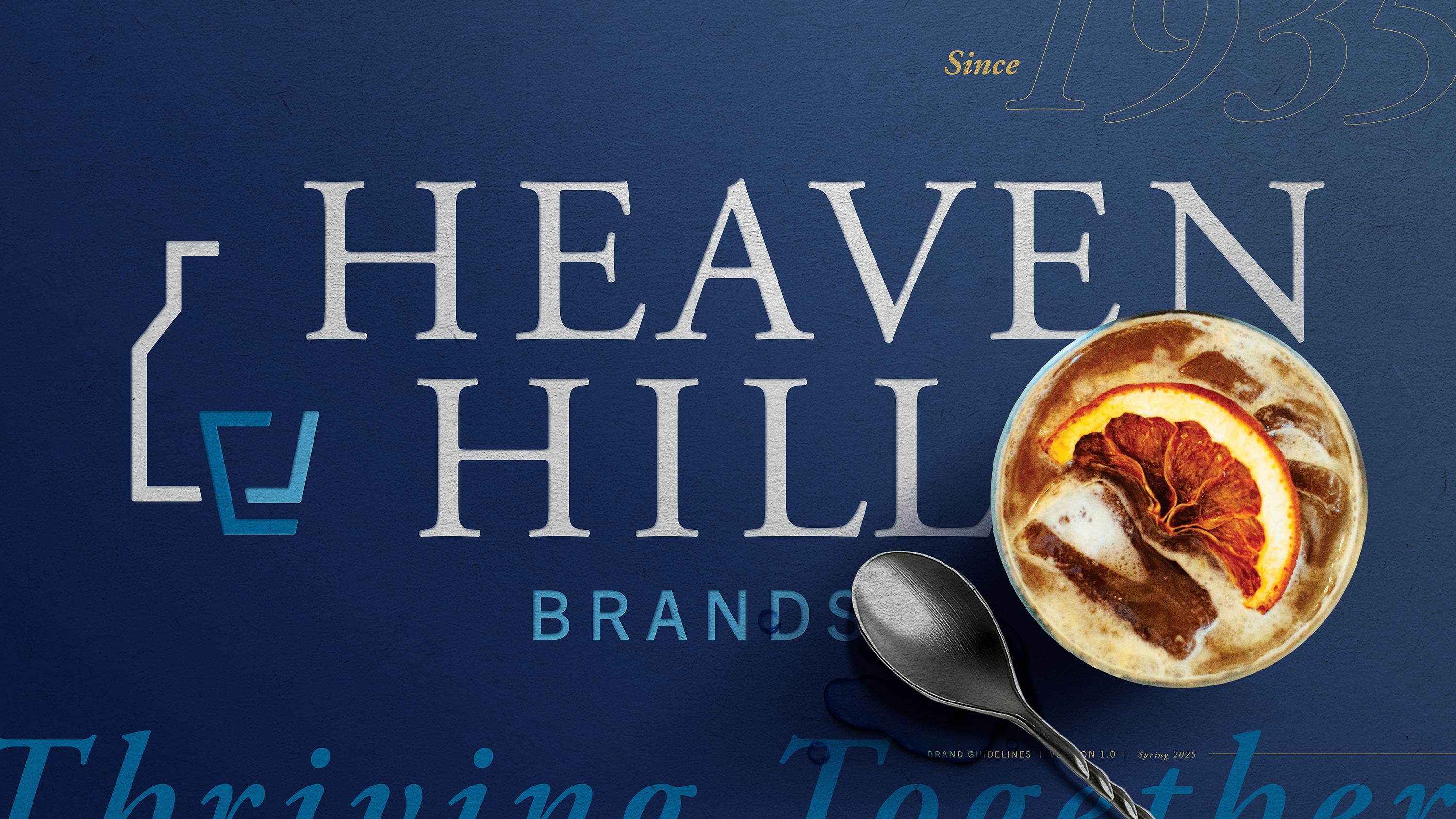
Heaven Hill's internal team had recently refreshed the corporate logo, but a logo alone doesn't make a brand. Beyond the mark, there was an opportunity to define how Heaven Hill looked, sounded, and showed up in the world.
The challenge wasn't creating another great brand. It was creating the brand behind the brands.
And that’s where we came in. Working with their internal team, we crafted a unified voice, visual language, and messaging system capable of supporting the company's next chapter of growth.

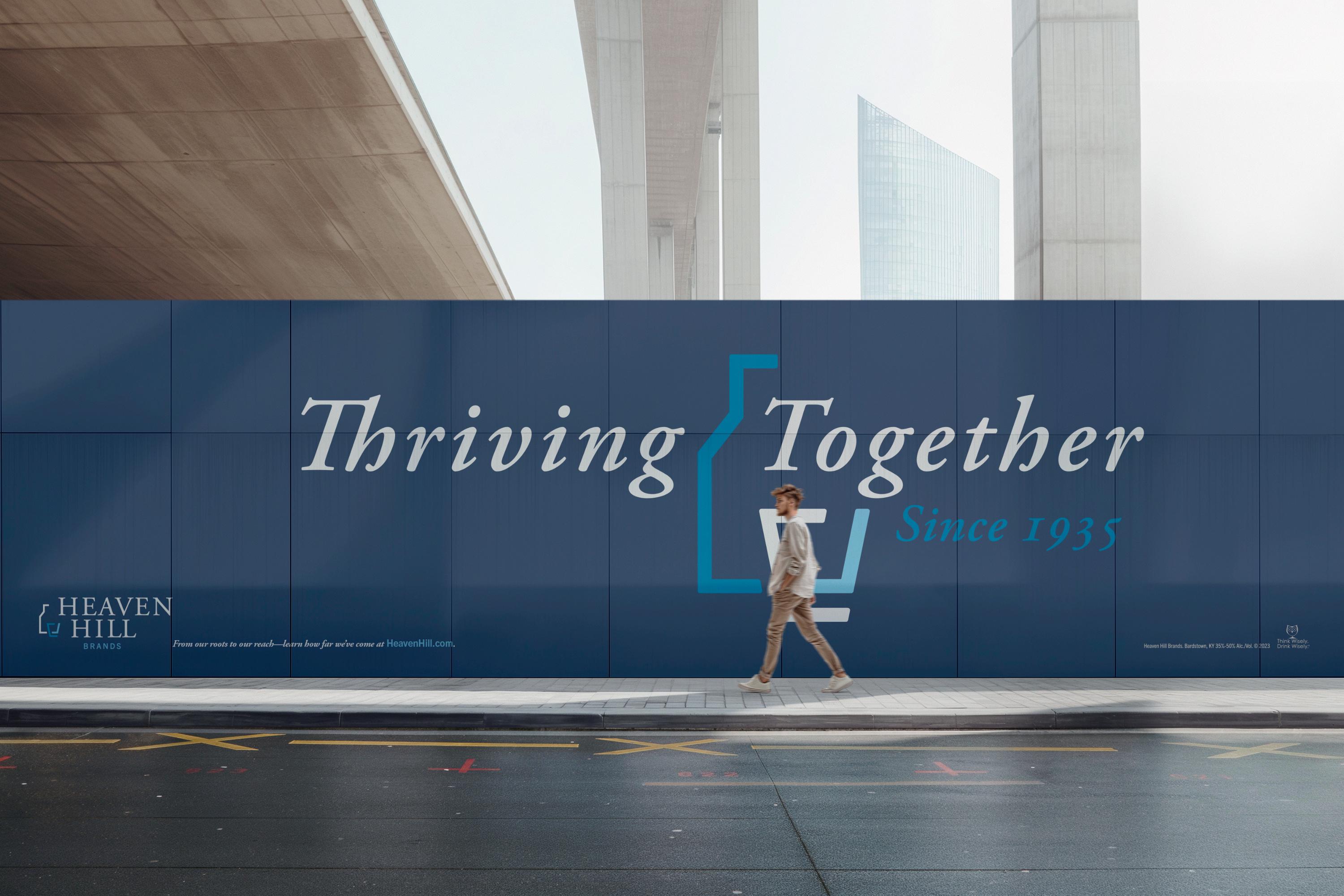
Thriving Together
Heaven Hill Brands sits in a unique position. It competes with global spirits giants while remaining family-owned and deeply rooted in the relationships that have defined the company since 1935.
When the team approached Tectonic, they had already identified a powerful organizing idea: Thriving Together. The phrase captured the culture, values, and spirit that had fueled Heaven Hill's success for generations.
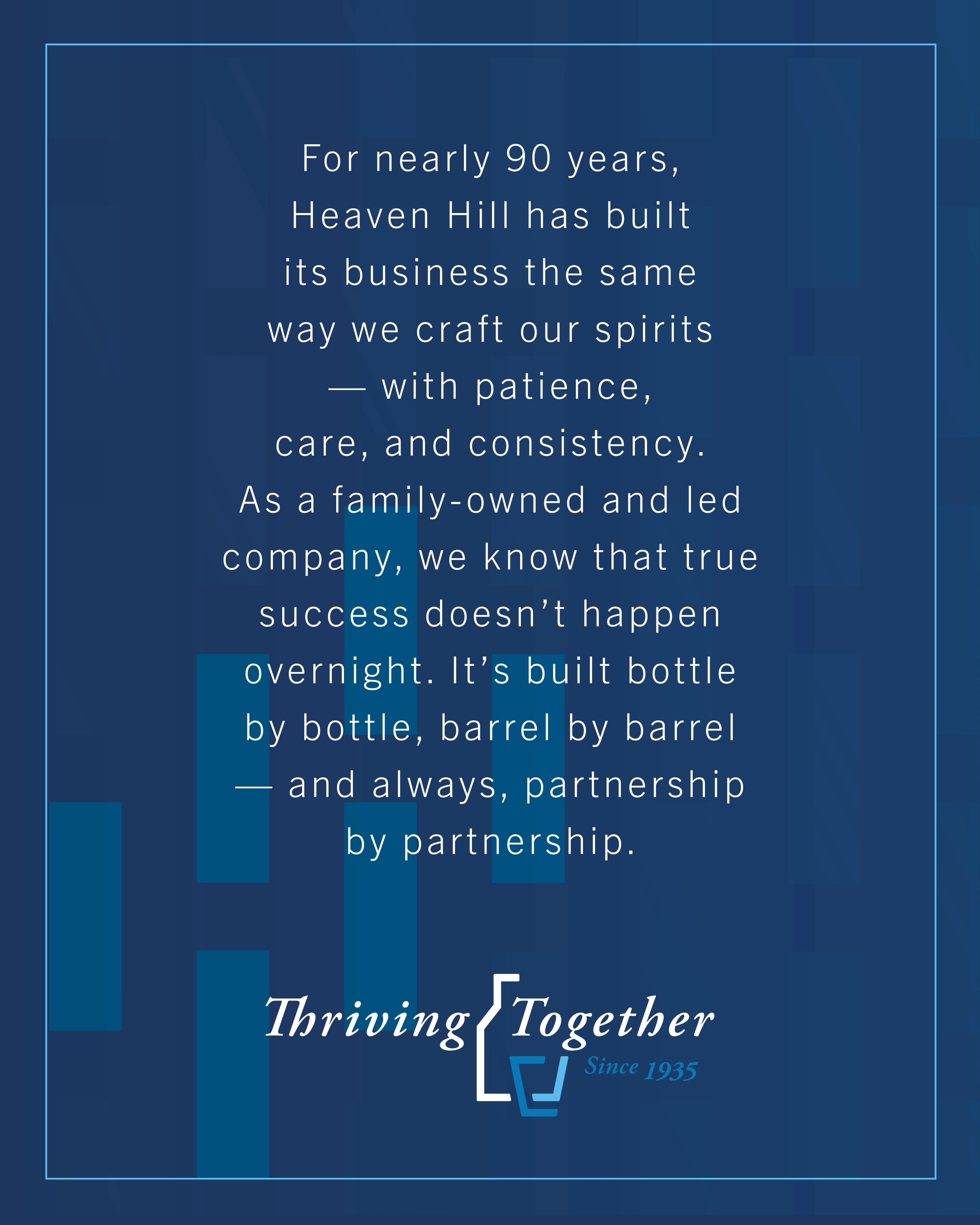
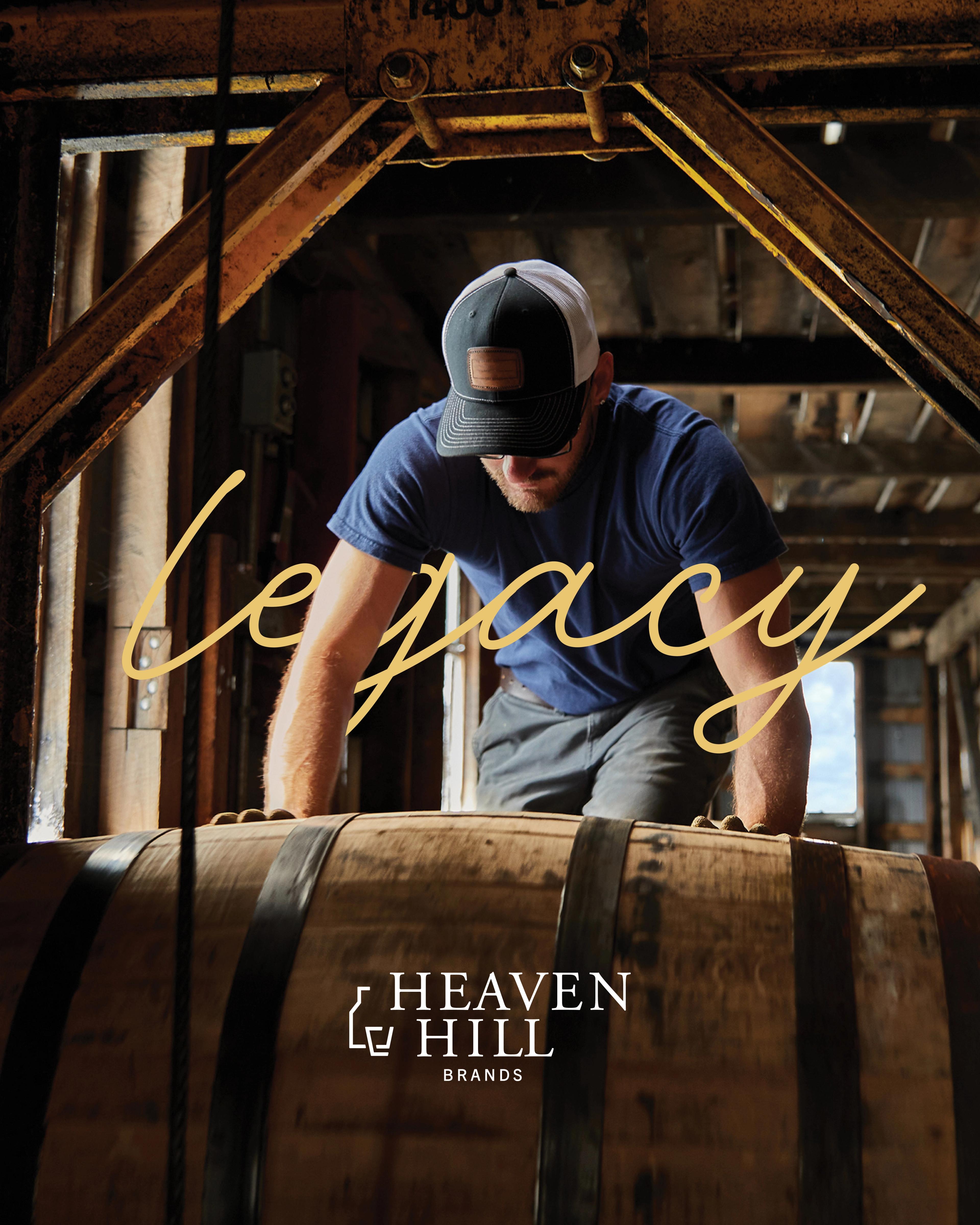
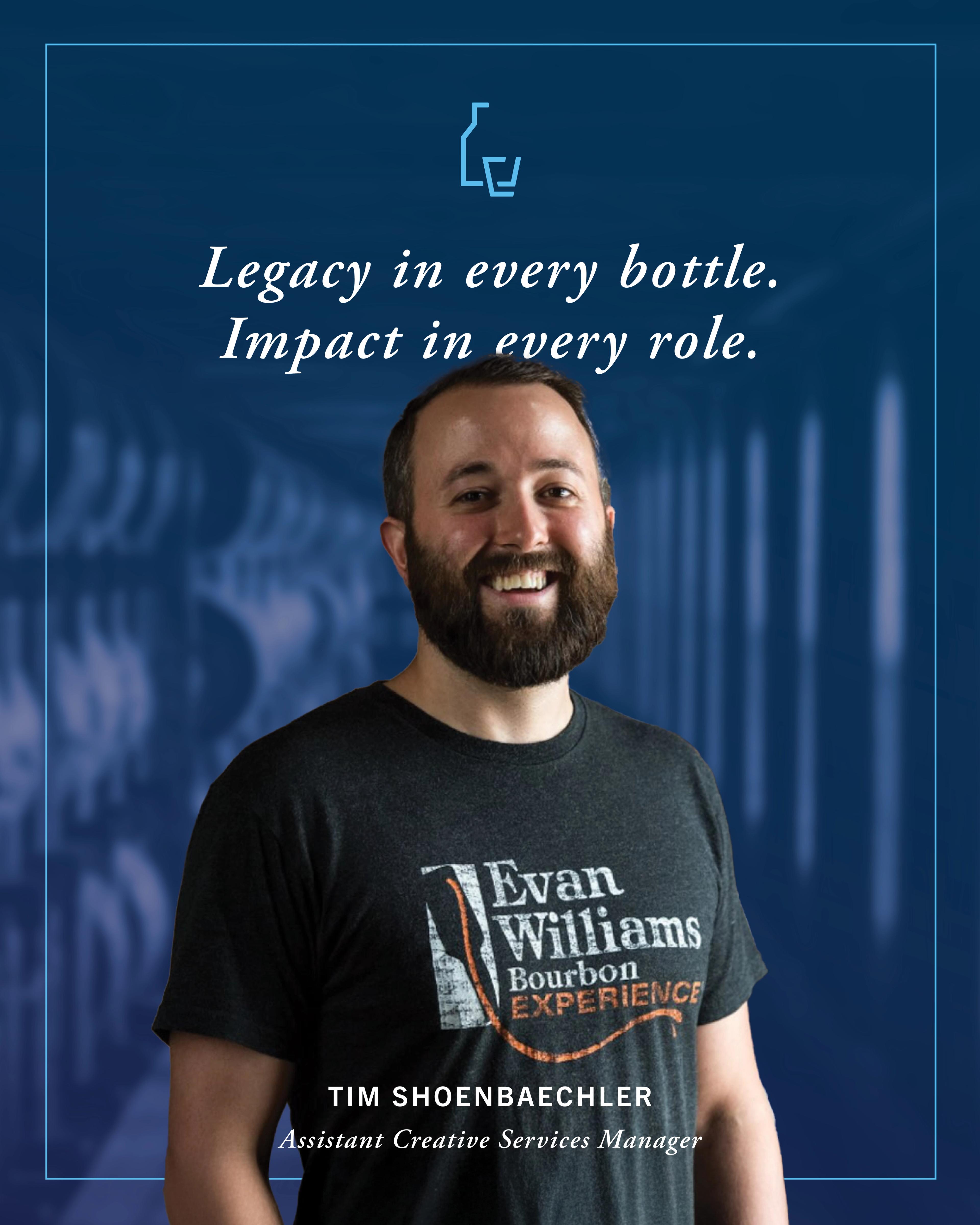
Rather than centering the corporate brand solely around products and performance, we focused on the people, partnerships, communities, and shared successes behind them. The goal was to transform Thriving Together from a tagline into a complete brand experience that could be expressed consistently through messaging, typography, photography, illustration, advertising, digital experiences, and beyond.
Crafting the Voice
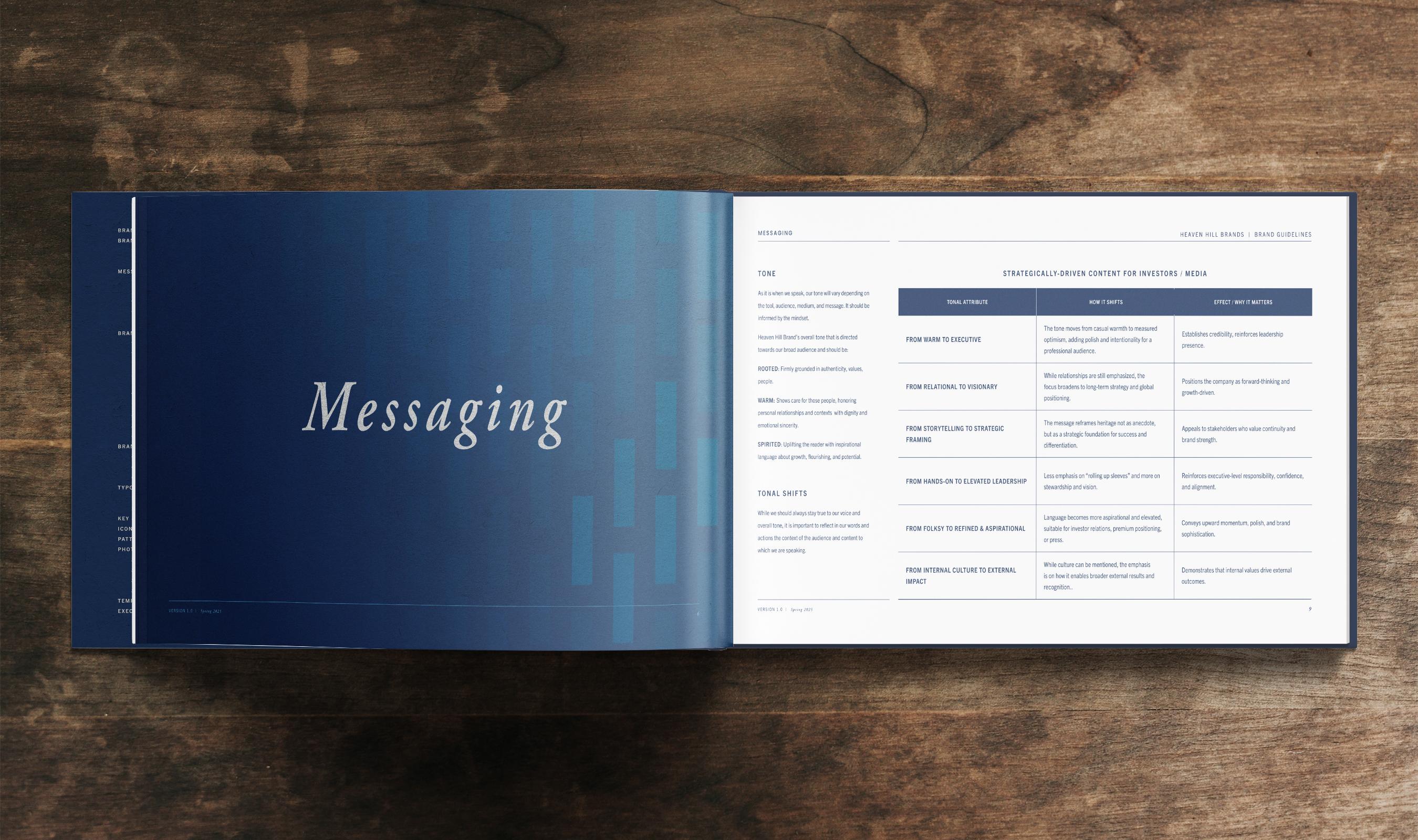
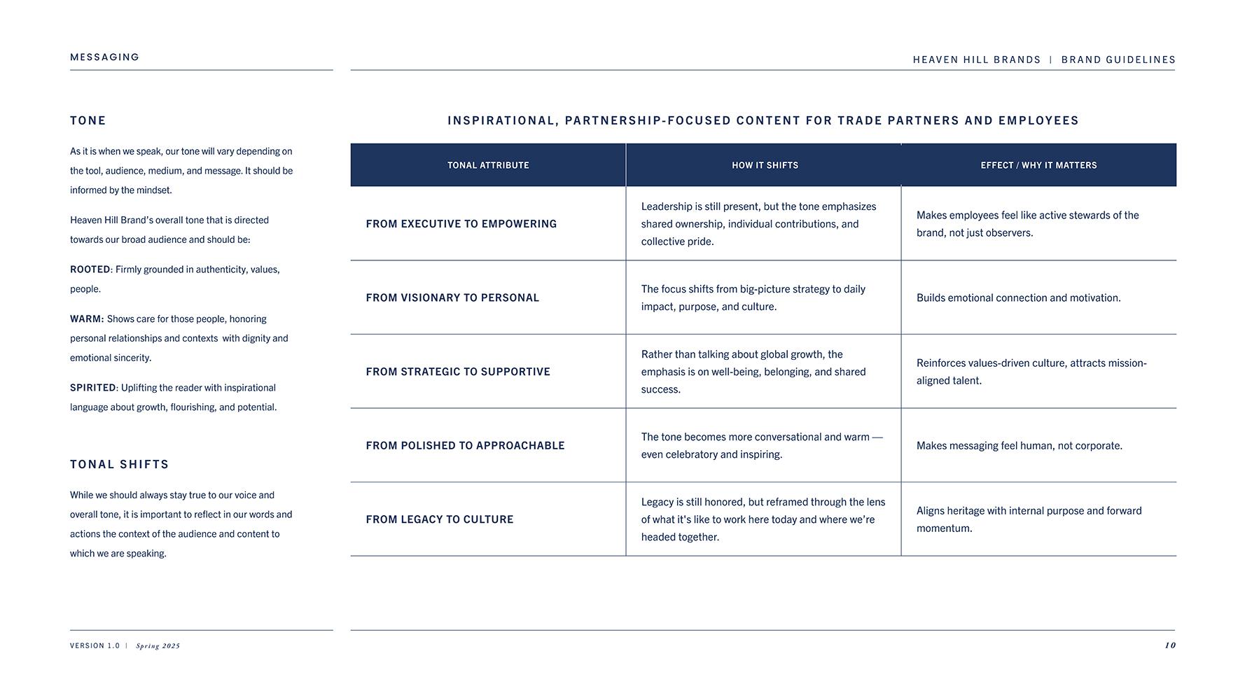
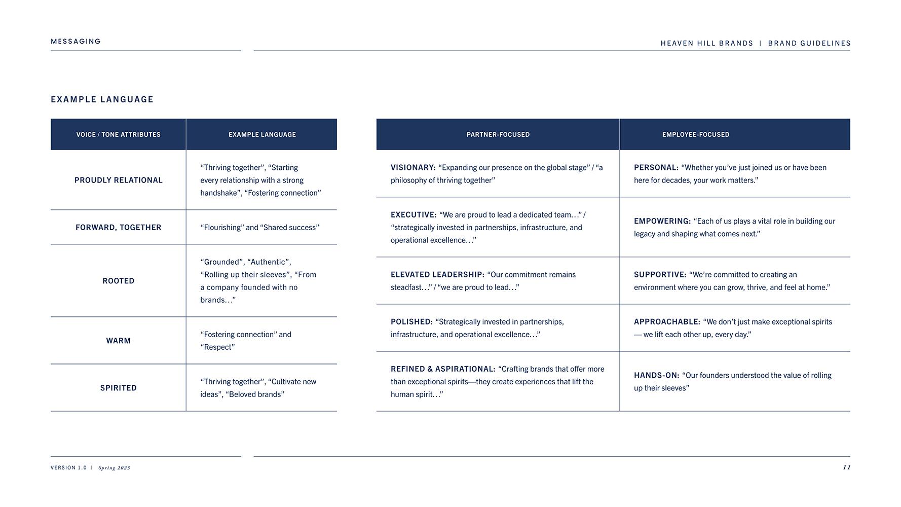
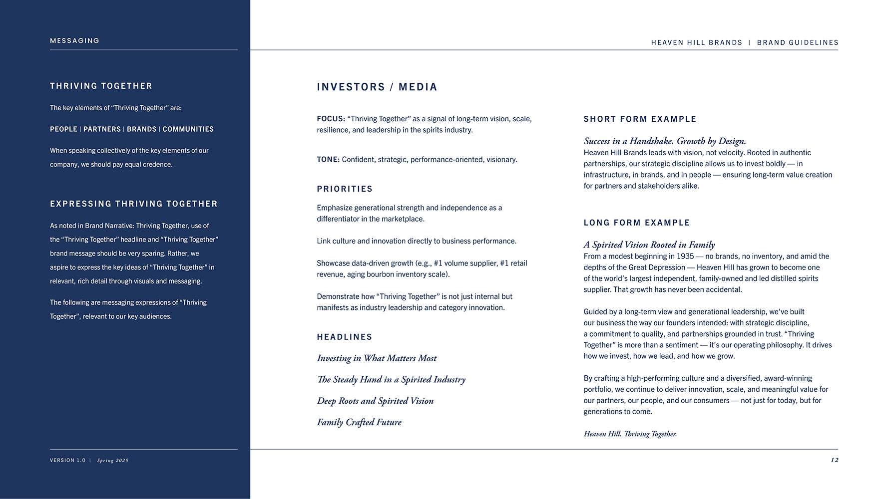
To help Heaven Hill communicate more consistently, we developed a voice and messaging framework rooted in the company's culture, values, and relationships. The goal wasn't to script every conversation. It was to create a shared understanding of how the brand should sound and show up across every touchpoint.
At the center of the system was a messaging matrix that defined how the brand's tone should shift depending on the audience. Investors needed a more strategic voice. Employees needed something more personal and empowering. Trade partners needed messaging built on trust and shared success. The framework provided clear guidance on how to adapt without ever losing the core of the brand.
Beyond the Logo
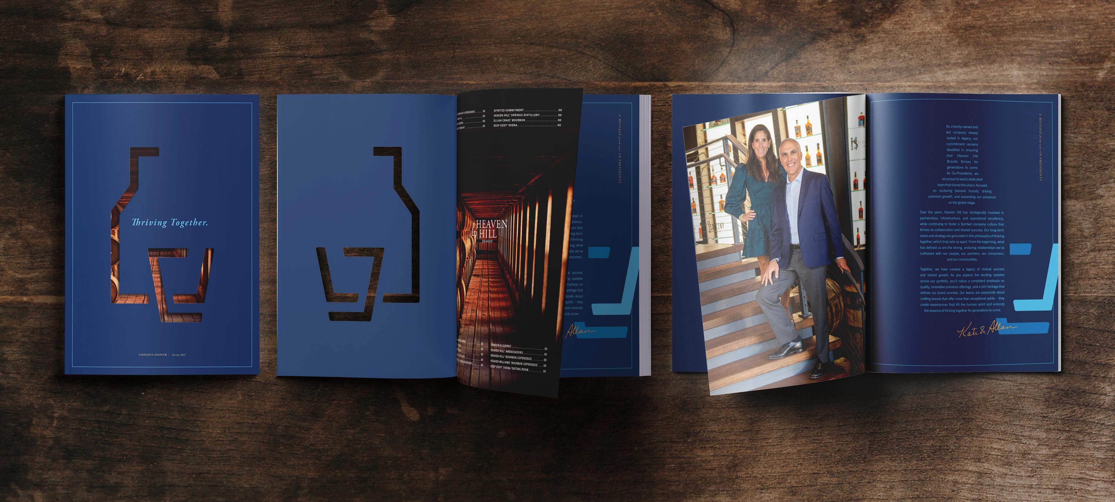
A great logo is only the beginning of a great visual identity. To help Heaven Hill create a more cohesive brand experience, we established clear guidelines for the primary logo, secondary logo, and brand mark, ensuring each could be used consistently across a wide range of applications. But we didn't stop there.





The geometry and visual language of the brand mark itself became the foundation for an entire family of supporting assets. Using the same forms, proportions, stroke weights and design principles, we developed a system for iconography, illustration, and a series of custom "Marks of Culture" that represent the behaviors and values at the heart of Heaven Hill's Spirited Commitment.

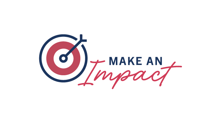

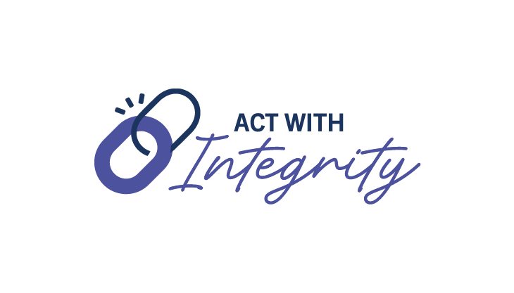

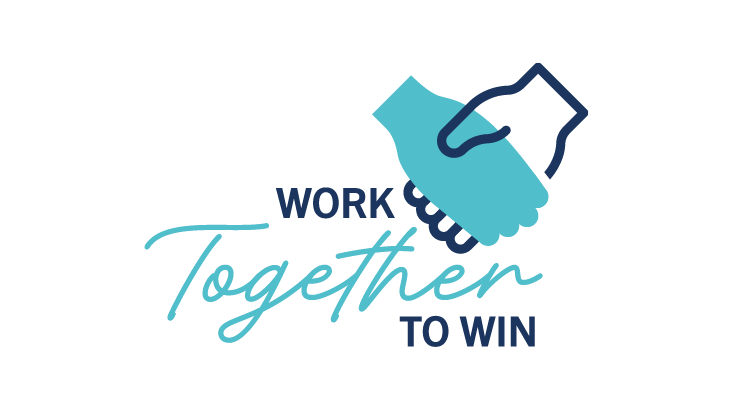
In the end, we had a visual system where every element feels connected. Whether you're looking at an icon, an illustration, a cultural initiative, or the logo itself, everything speaks the same language.
Three Blues and a Point of View
Building on the foundation established by the internal team, we developed a comprehensive color system that brought structure, flexibility, and meaning to the brand. At its center is a trio of signature blues that help Heaven Hill stand apart in a crowded category while reinforcing qualities like trust, craftsmanship, and authenticity.
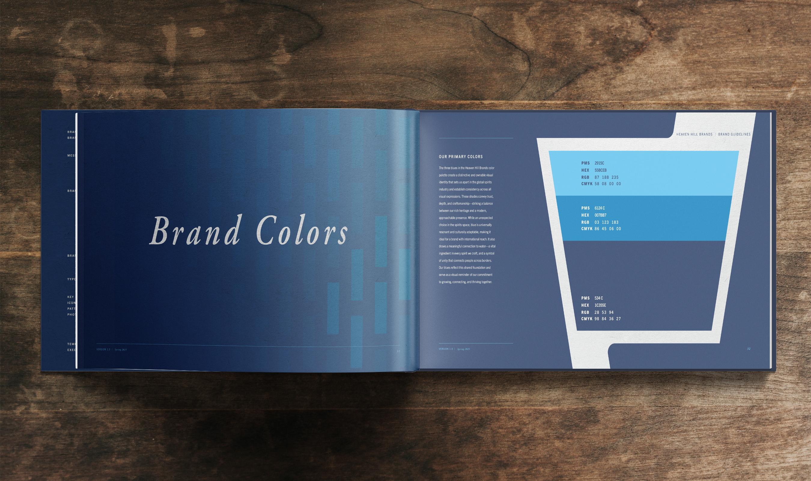
The choice is symbolic. Blue draws a connection to water, one of the most essential ingredients in every spirit Heaven Hill produces and a universal thread that connects people, places, and cultures around the world.
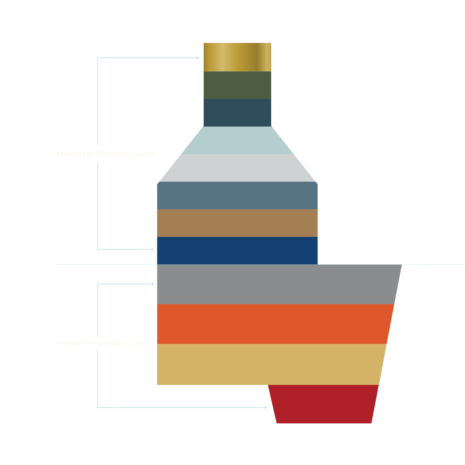
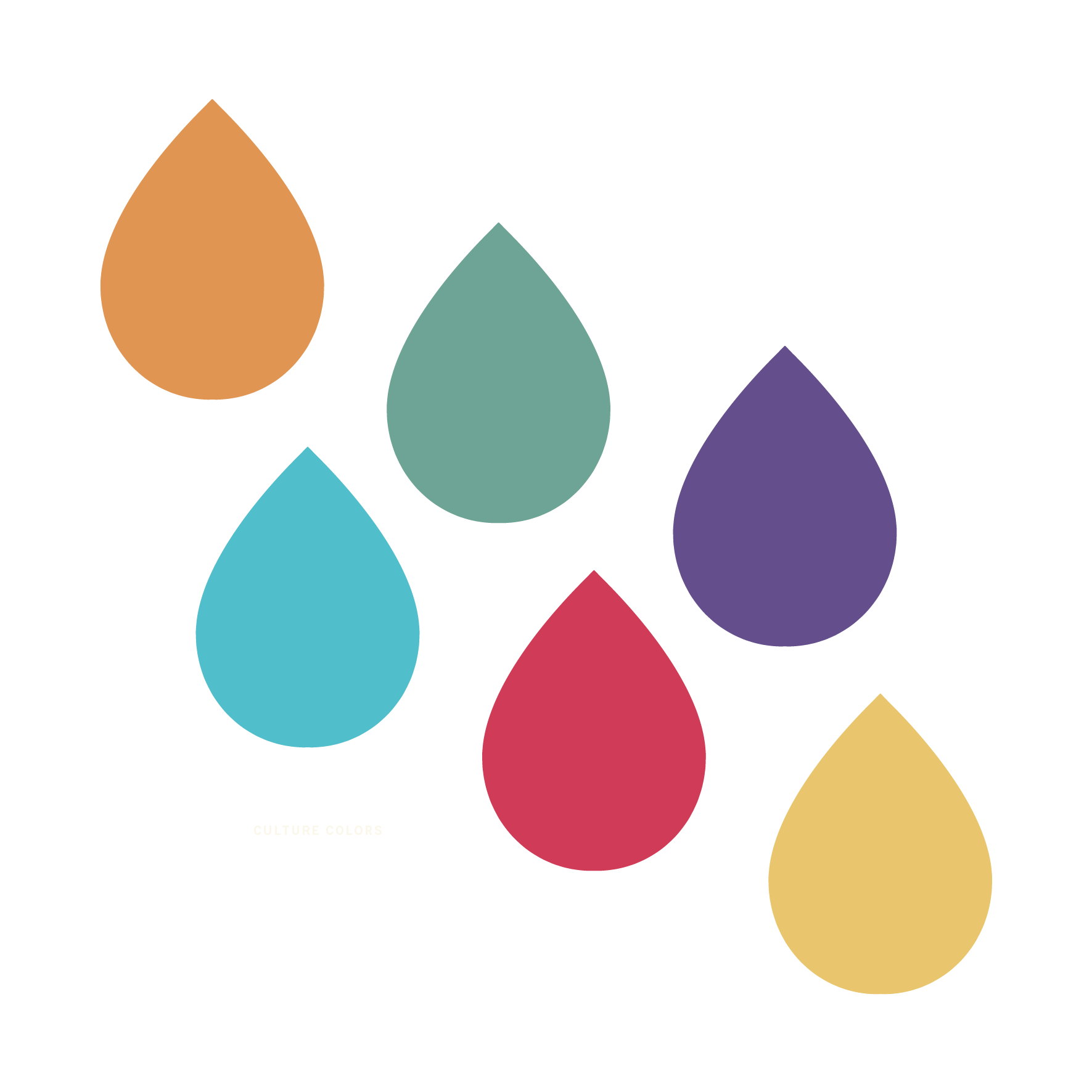
From there, we expanded the palette with a carefully balanced system of Extended Colors designed to add energy, contrast, and storytelling opportunities without competing with the core brand. We also introduced a dedicated set of Culture Colors reserved for employee initiatives, community programs, and sustainability efforts, giving those stories their own visual voice while preserving consistency across the broader brand.
Dynamic Type
Heaven Hill's typography system is a lot like the company itself: part family recipe, part forward thinking. A timeless serif delivers warmth and craftsmanship, while a modern sans serif keeps things clear, confident, and moving forward.
Our opportunity was to make it work harder.
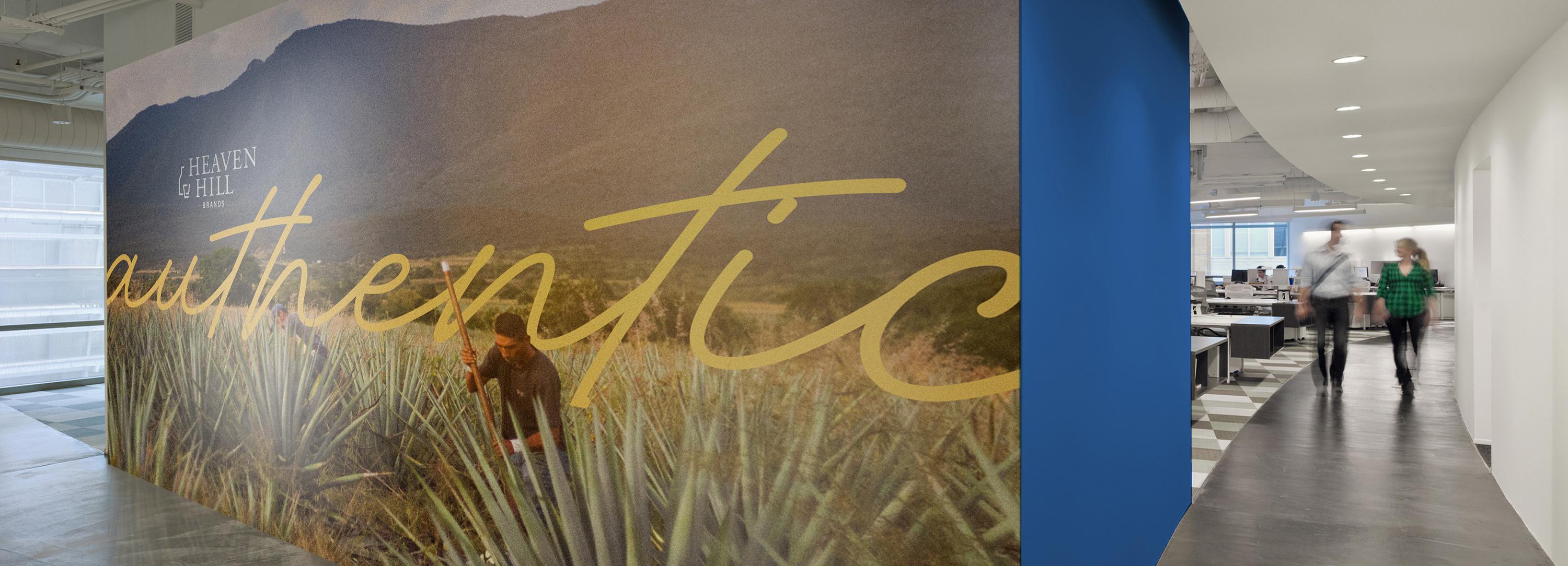
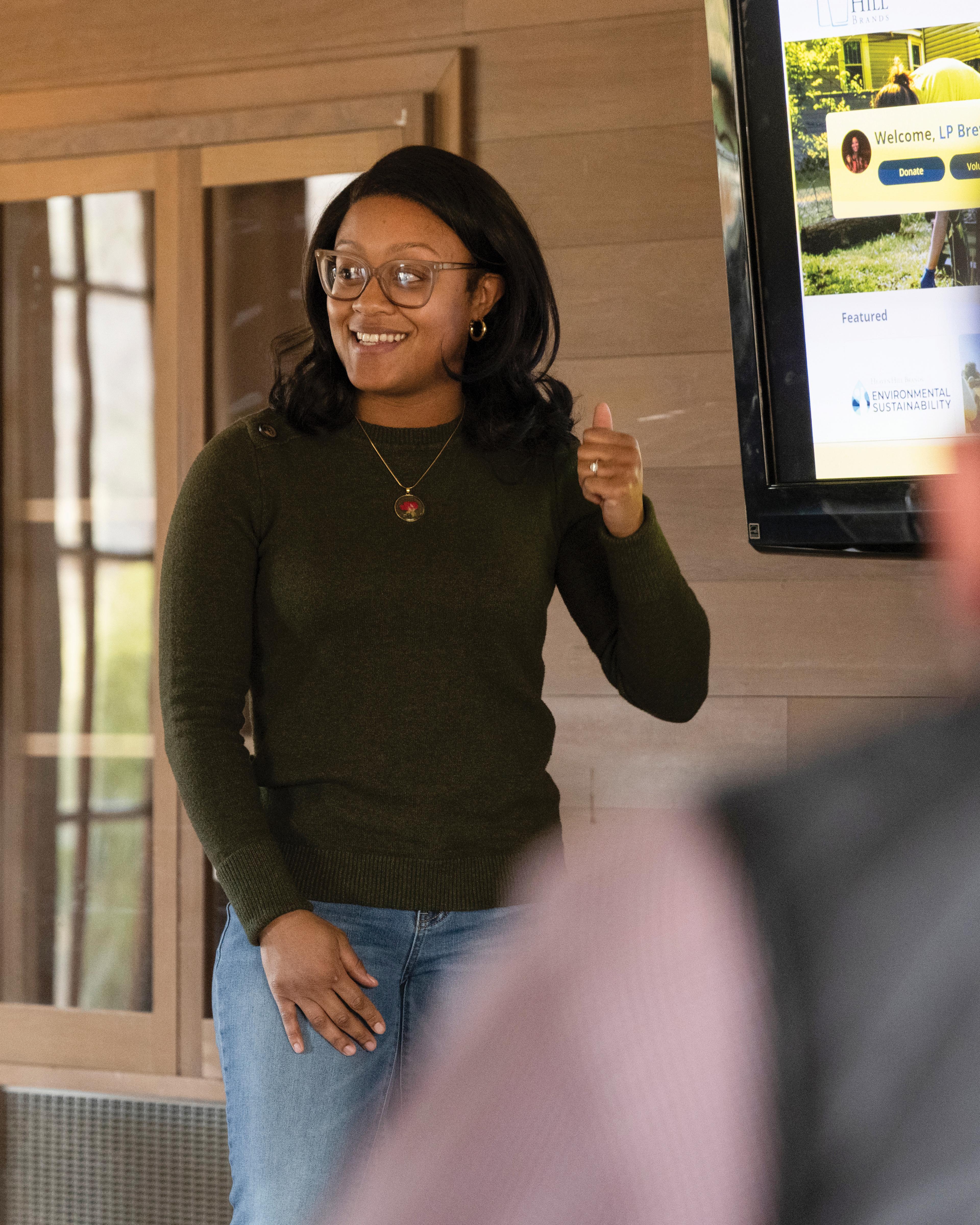
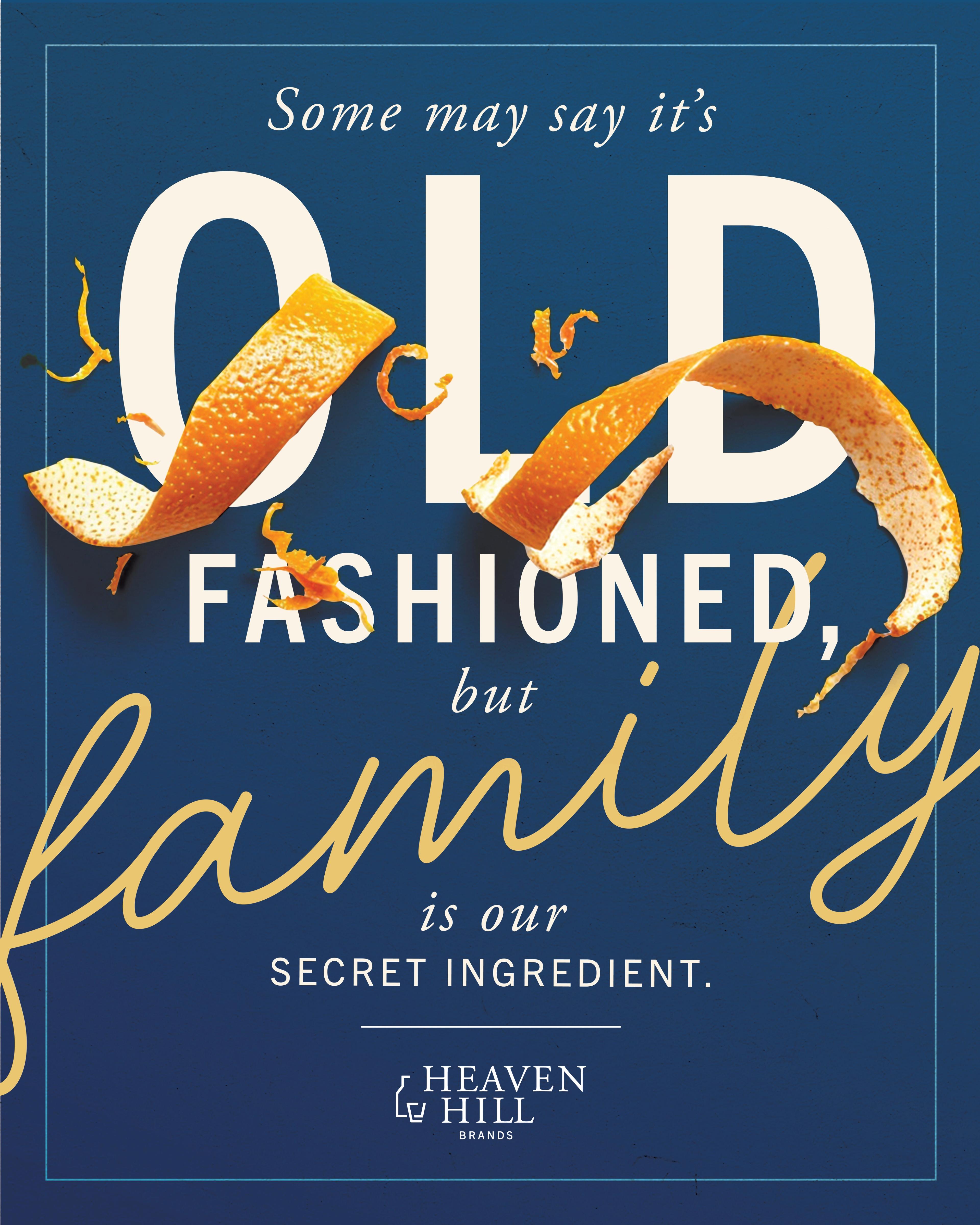
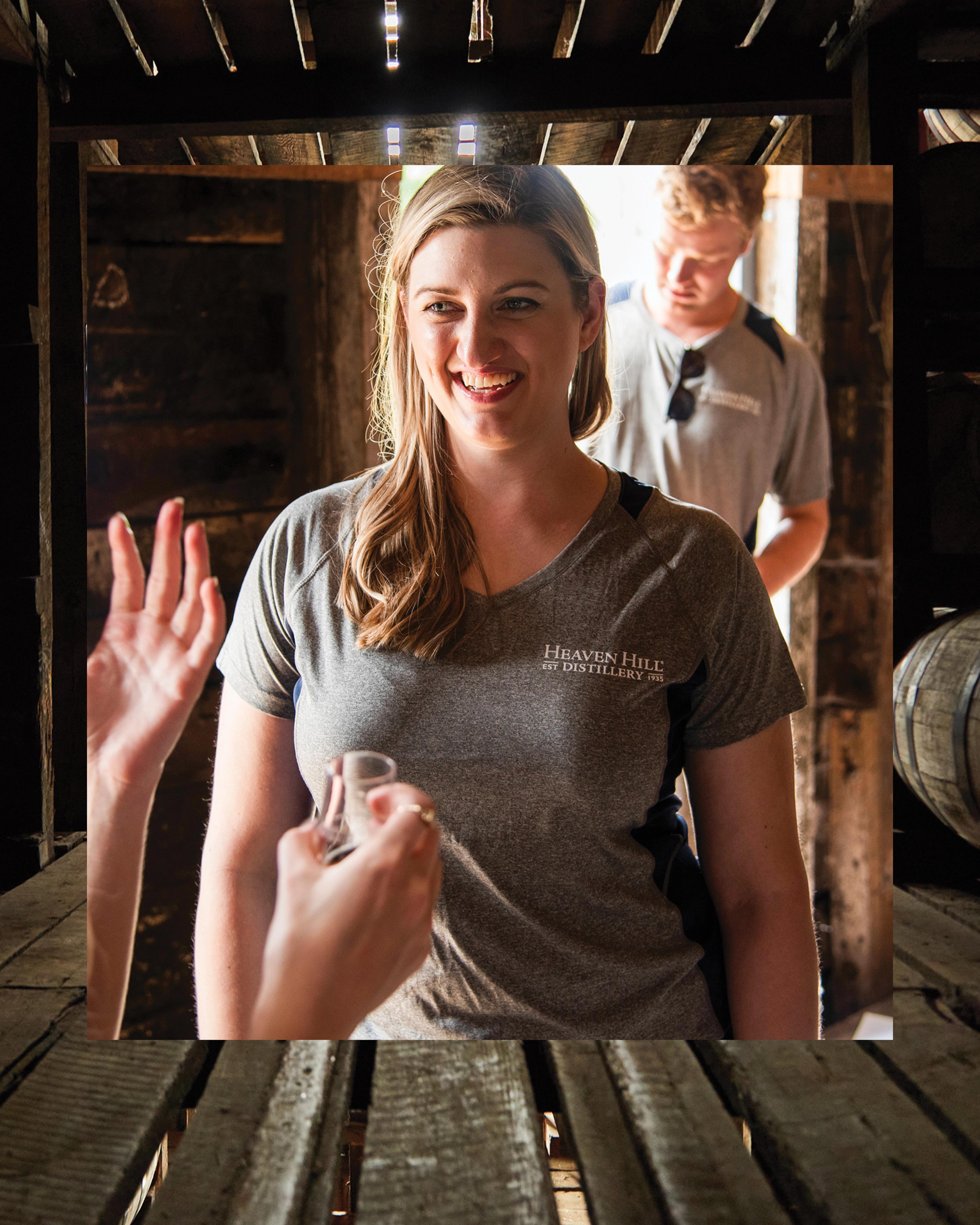
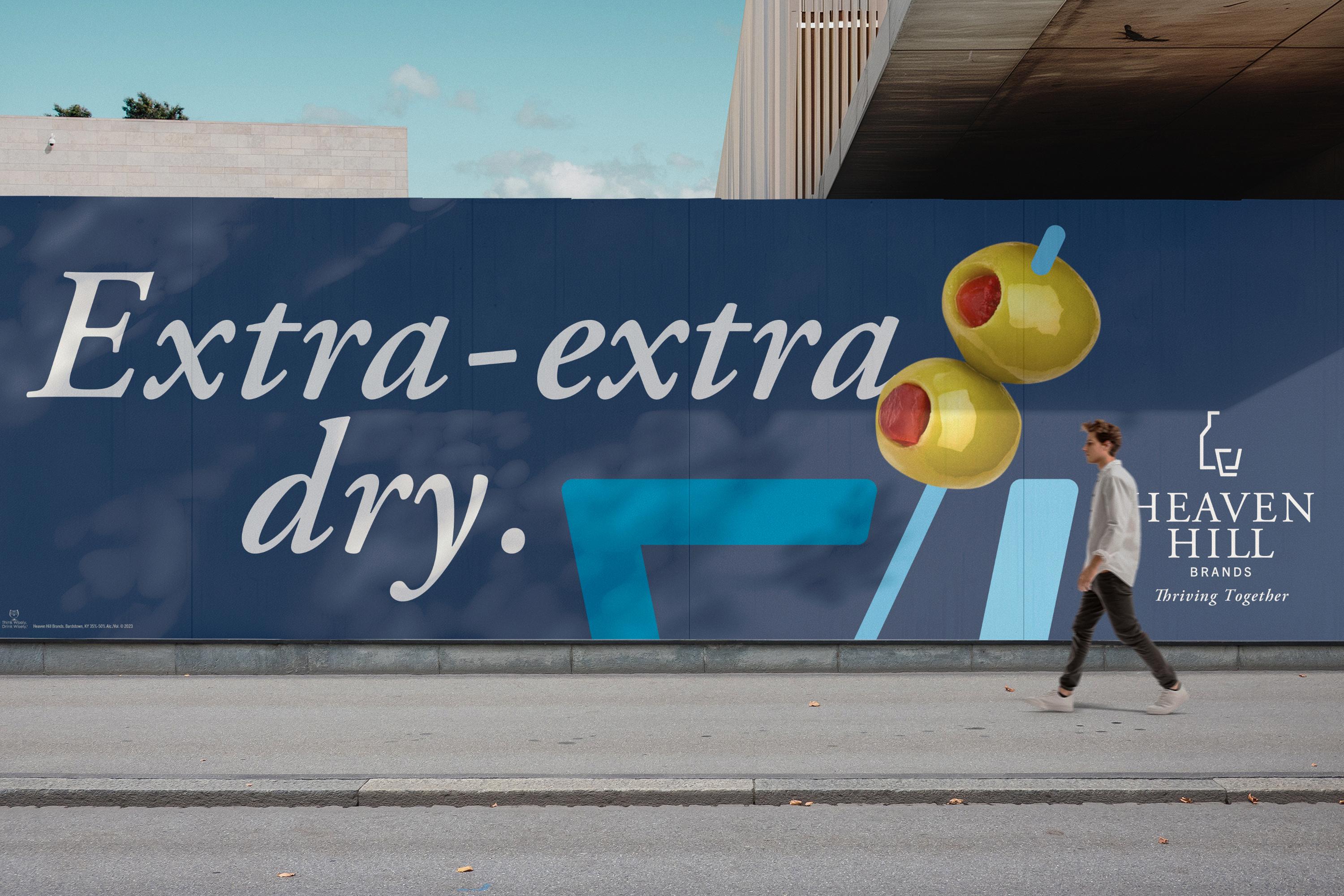
Heaven Hill Brands is corporate, but that doesn’t mean everything needs to sound like it came from a boardroom. Inspired by vintage posters, handcrafted signage, and expressive editorial design, we introduced a dynamic typography system that adds personality, warmth, and humanity that make corporate communications feel more like conversations.
A Shared Lens
For a company built on relationships, culture, and craftsmanship, photography needed to do more than look good. It needed to tell the right stories.
To bring focus and consistency to the brand, we organized Heaven Hill's photography into four distinct categories: Storytellers, Spirits, Stages, and Still Lifes.
Storytellers capture the people behind the brand. Spirits showcase the products in authentic moments of enjoyment. Stages highlight the places where the brand comes to life, from distilleries and tasting rooms to offices and events. Still Lifes celebrate the details, textures, and craftsmanship found in every bottle.
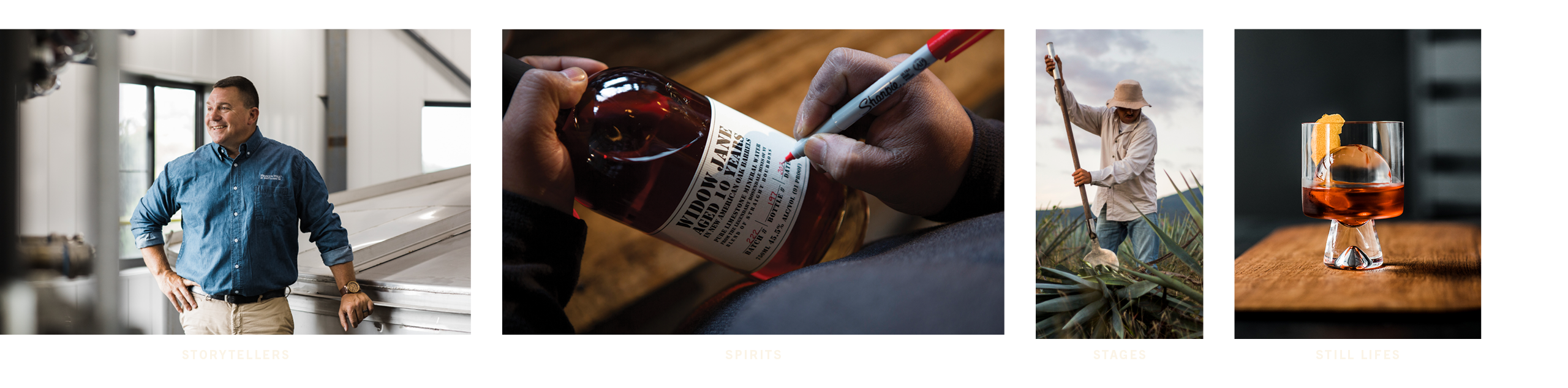
Together, the system creates a more intentional approach to photography that feels less staged, more human, and gives the Heaven Hill team a shared lens through which to tell the company's story moving forward.
Built for Real Life
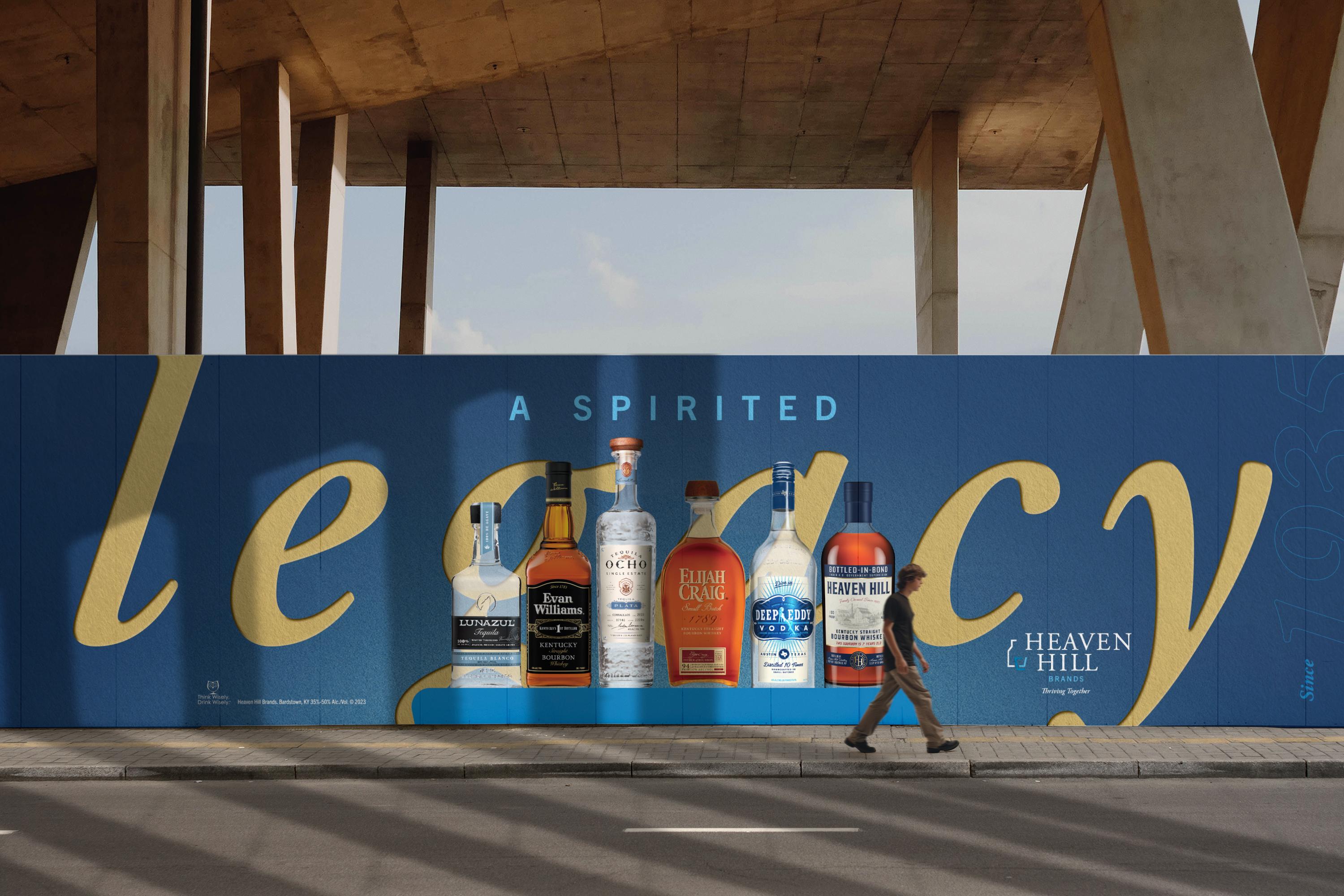
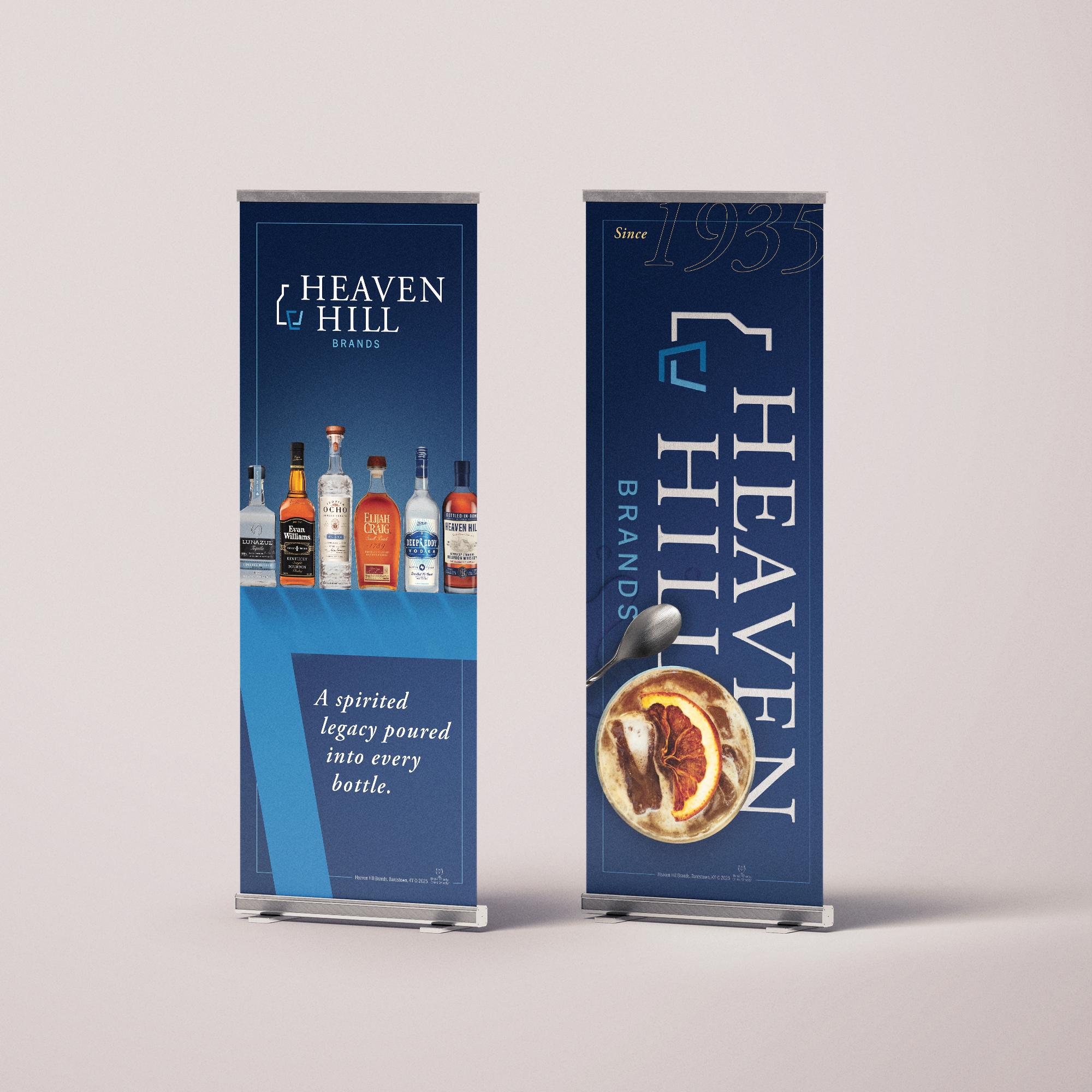
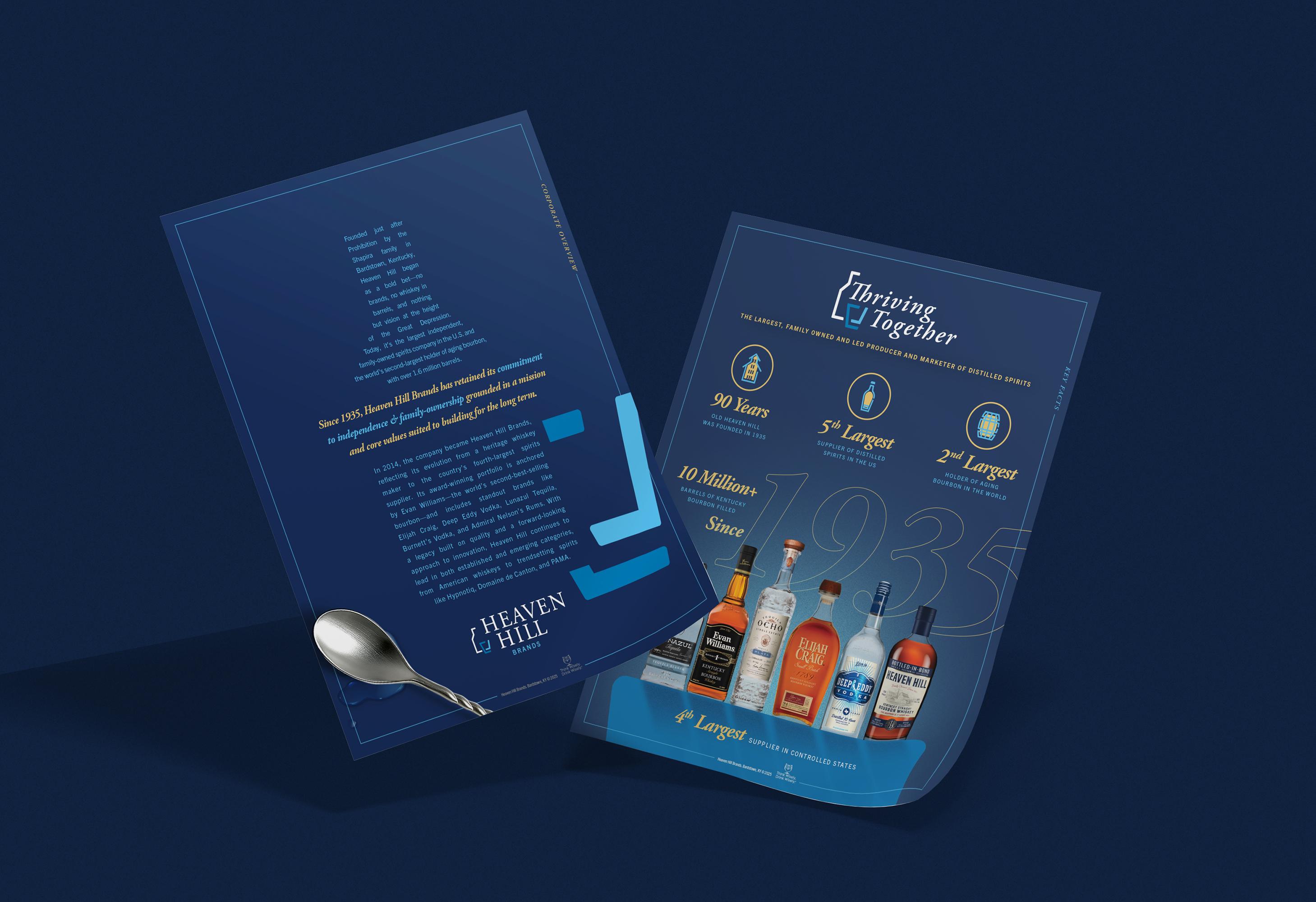
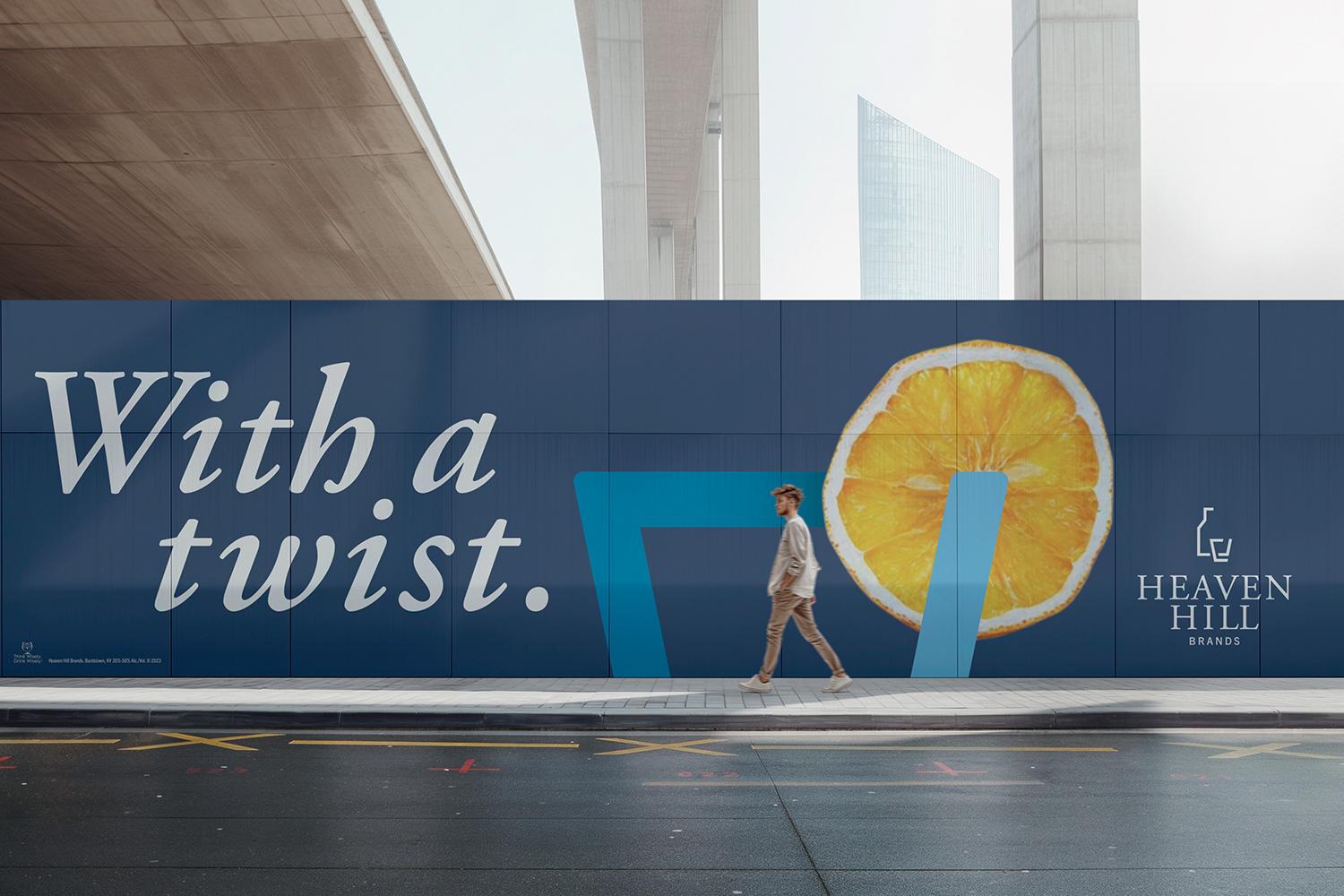
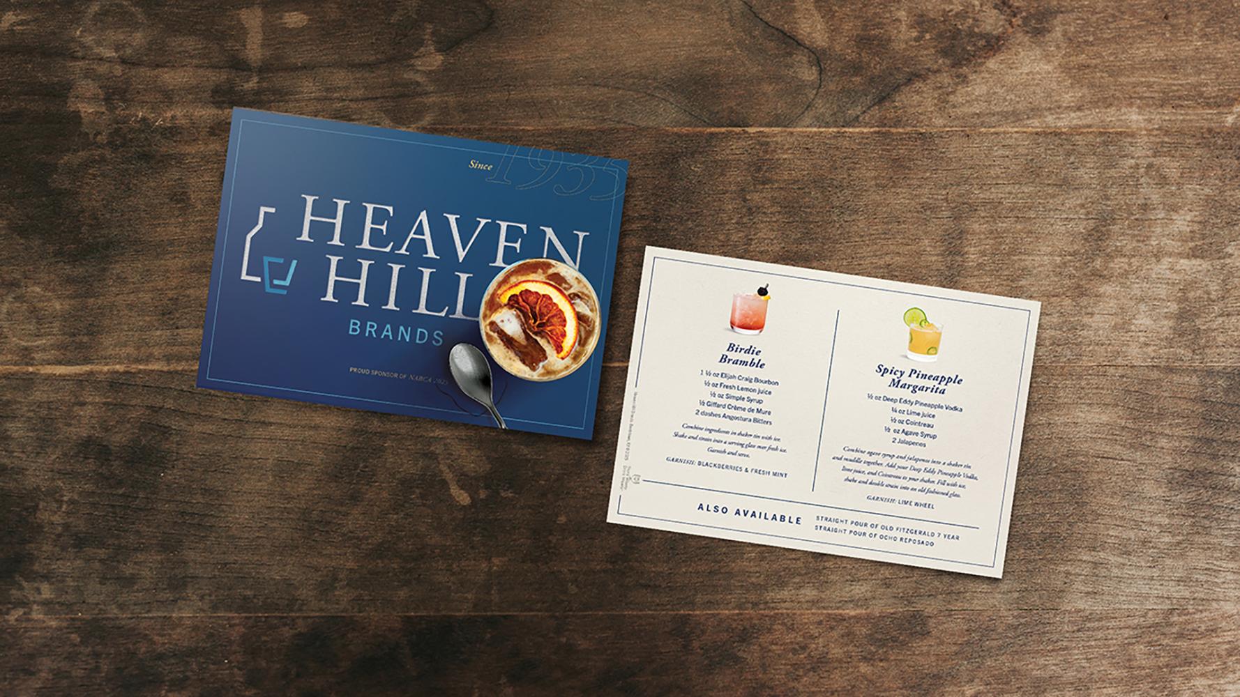
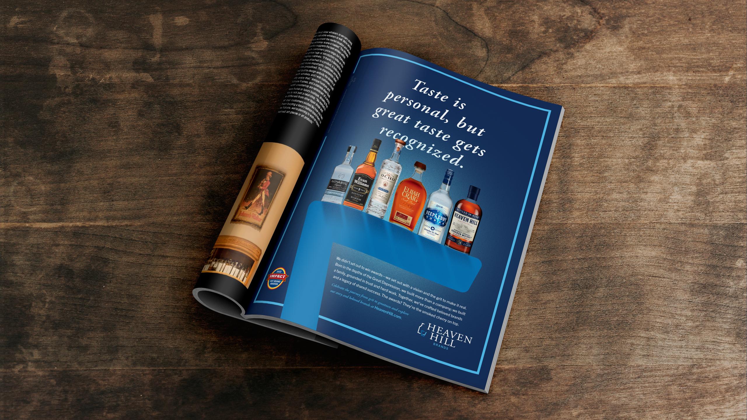
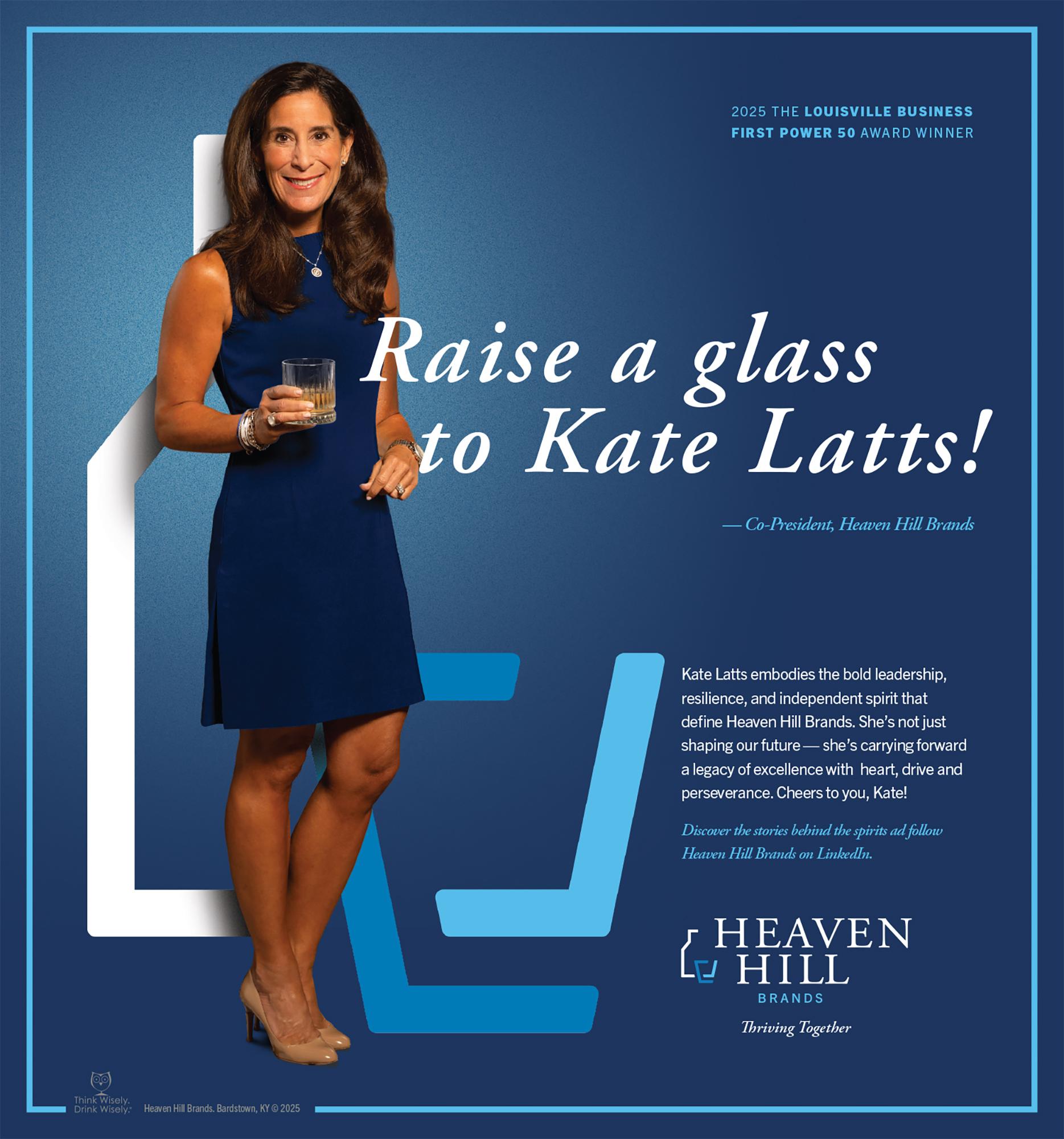
To help Heaven Hill Brands internal teams bring its new identity to life, we developed a flexible system of key visuals, complementary visuals, templates, grids, and social media tools that made creating on-brand communications easier and more intuitive.
Key Visuals became the heroes of the system: They’re bold, unmistakable expressions of the brand that combine photography, typography, color, and graphic elements into attention-grabbing campaign moments.
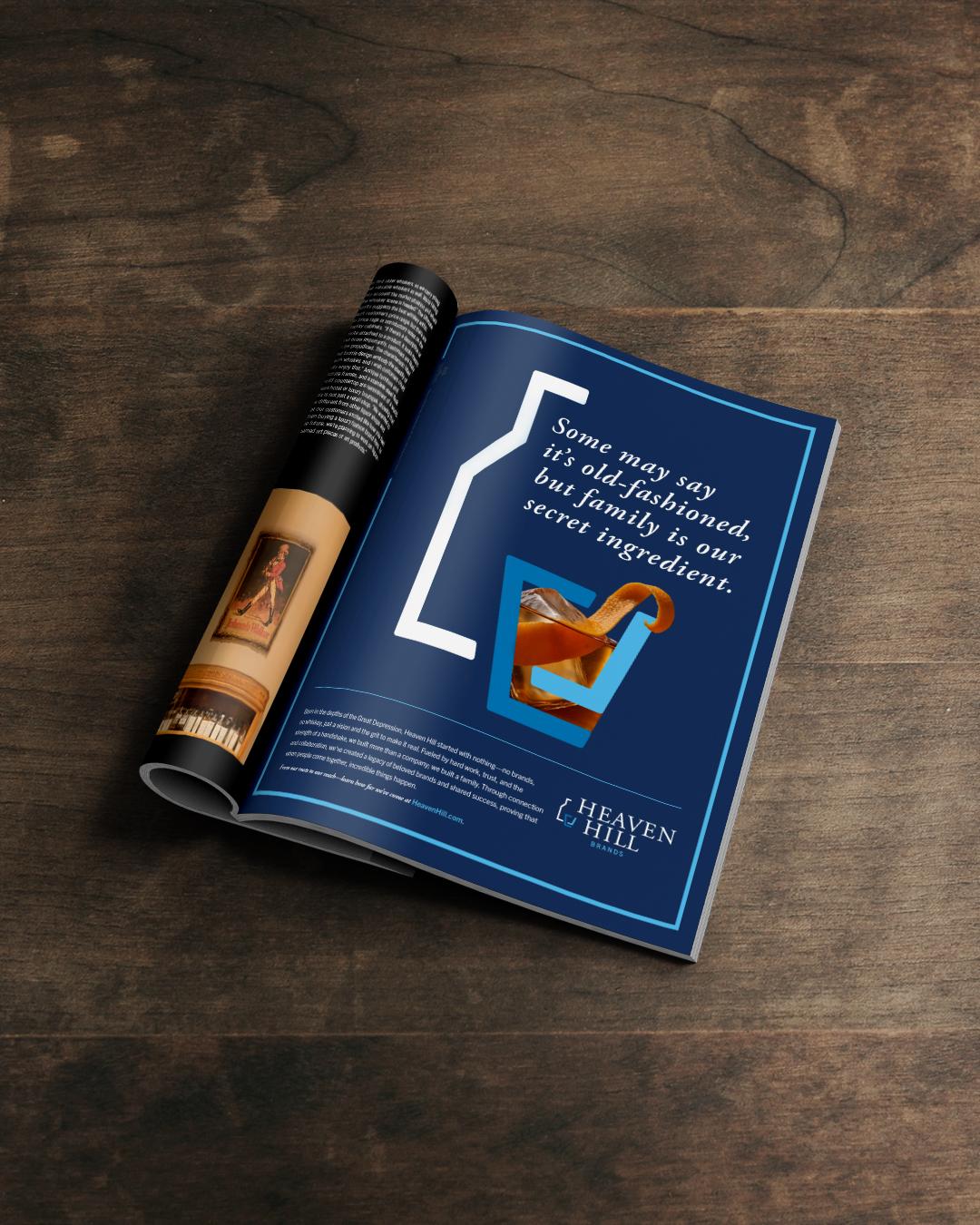
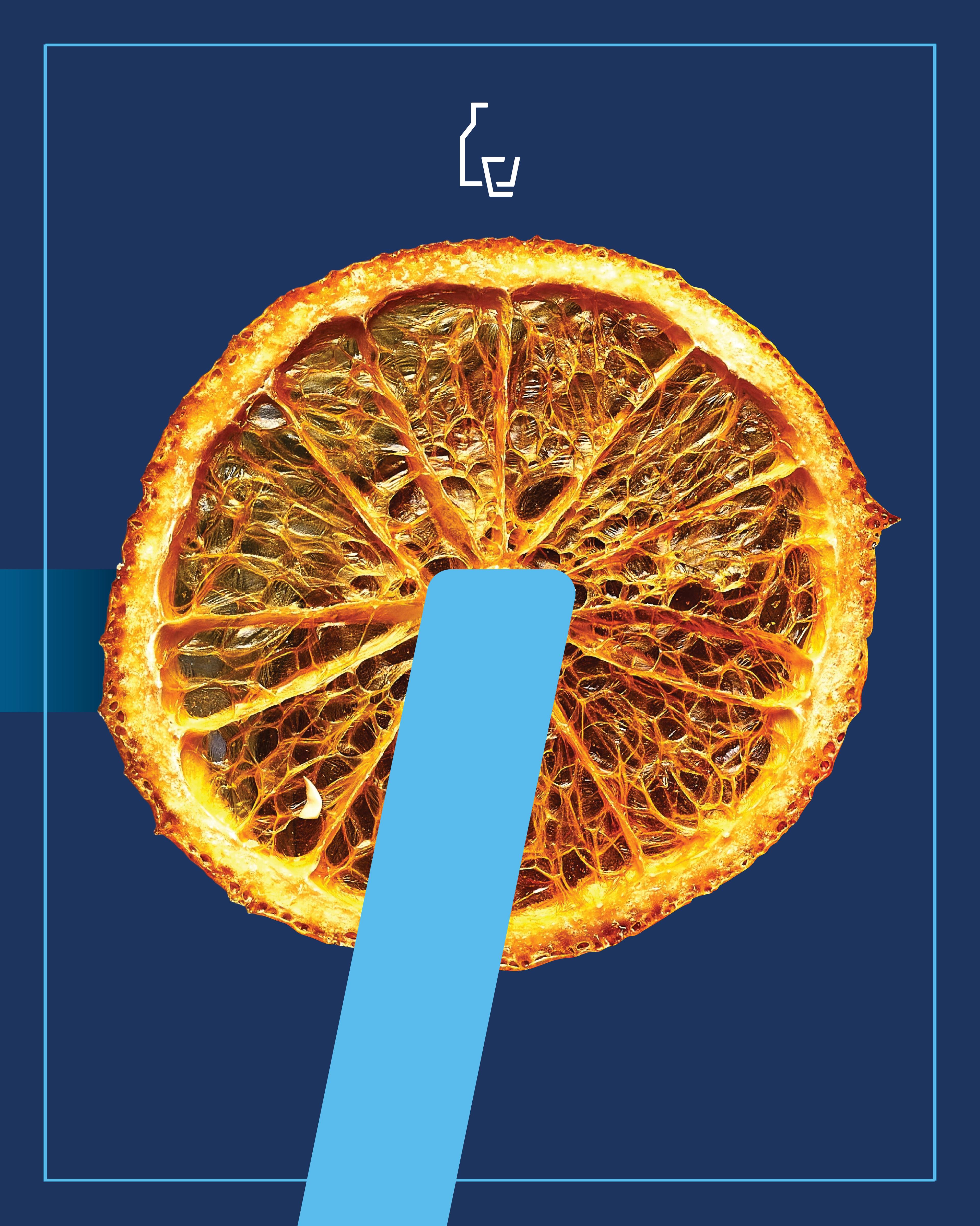
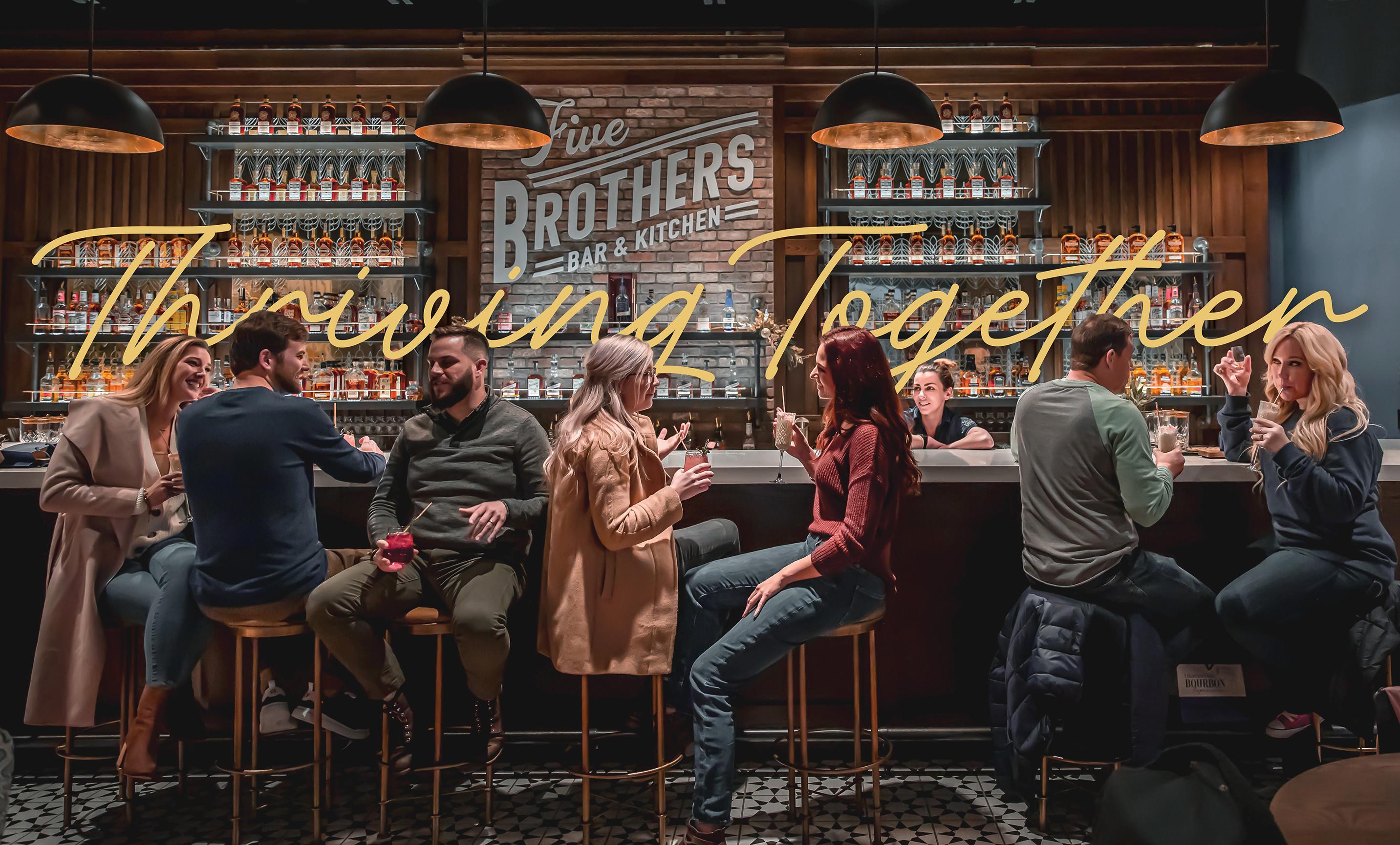
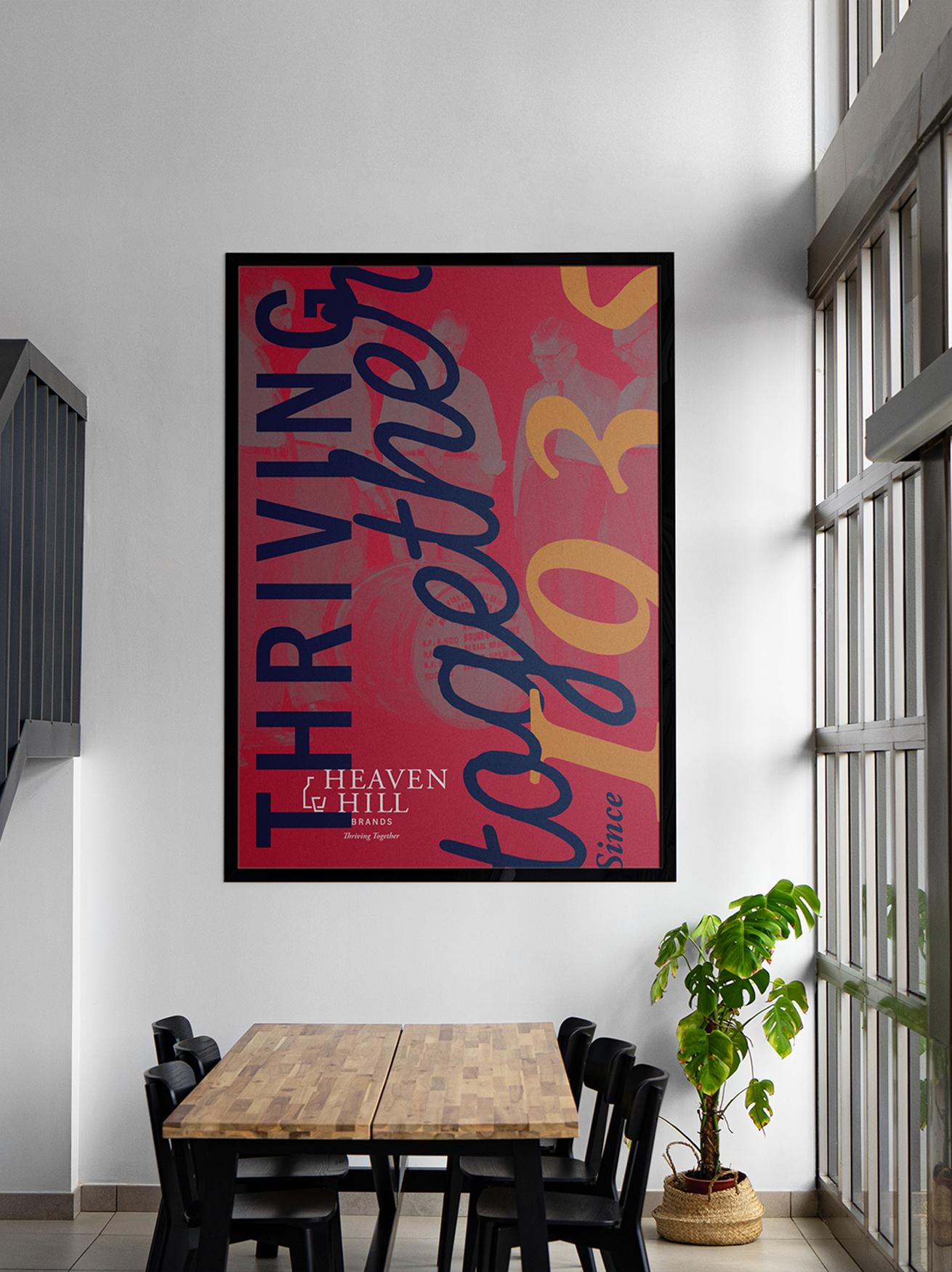
Complementary Visuals played a supporting role: They helped tell more personal stories about the people, places, and craftsmanship behind the brand.
Behind the scenes, we established grids, templates, and layout systems that gave teams a strong foundation without sacrificing creativity. From presentations and advertisements to social posts and internal communications, every tool was designed to create consistency while leaving room for great ideas.
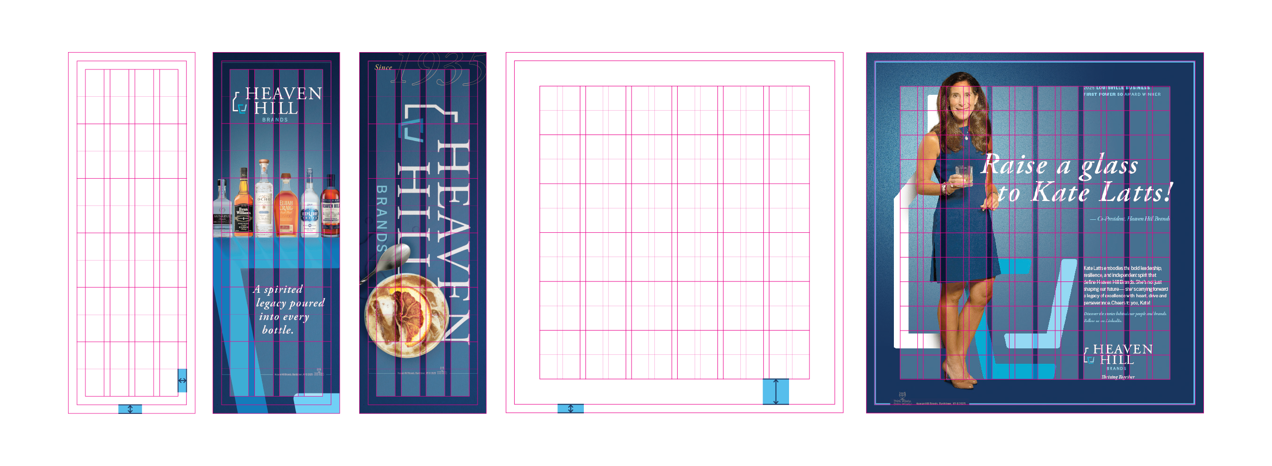
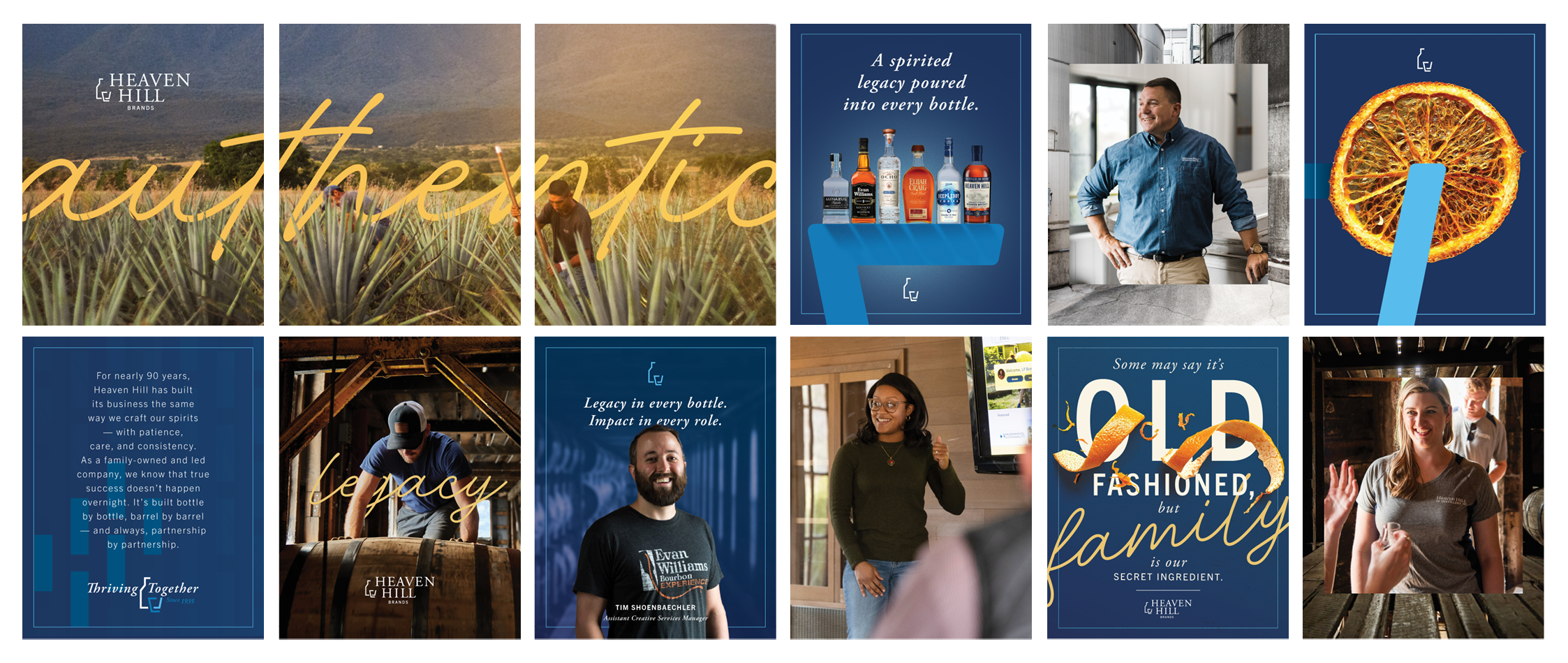
It was a lot, but we think the best brand systems build beautiful work AND make it easier to create beautiful work again and again.
All in, we developed:
- Voice and tone frameworks
- Messaging architecture
- Typography systems
- Illustration and iconography styles
- Photography direction
- Advertising frameworks
- Social media templates
- Presentation tools
- Brand guidelines
- A component-based website design system
Every element was designed to reinforce a consistent story while remaining flexible enough to serve investors, distributors, employees, partners, media, and consumers alike.
Results
At the end of the day, this project wasn't about logos, color palettes, or typography. It was about helping Heaven Hill tell its story with greater clarity, consistency, and confidence. If your brand is ready to do the same, we'd love to talk.
Give us a shout