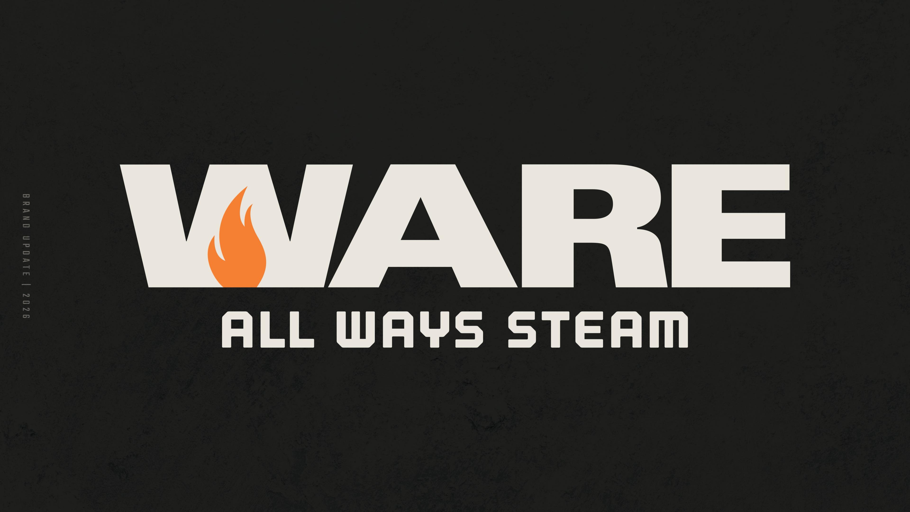
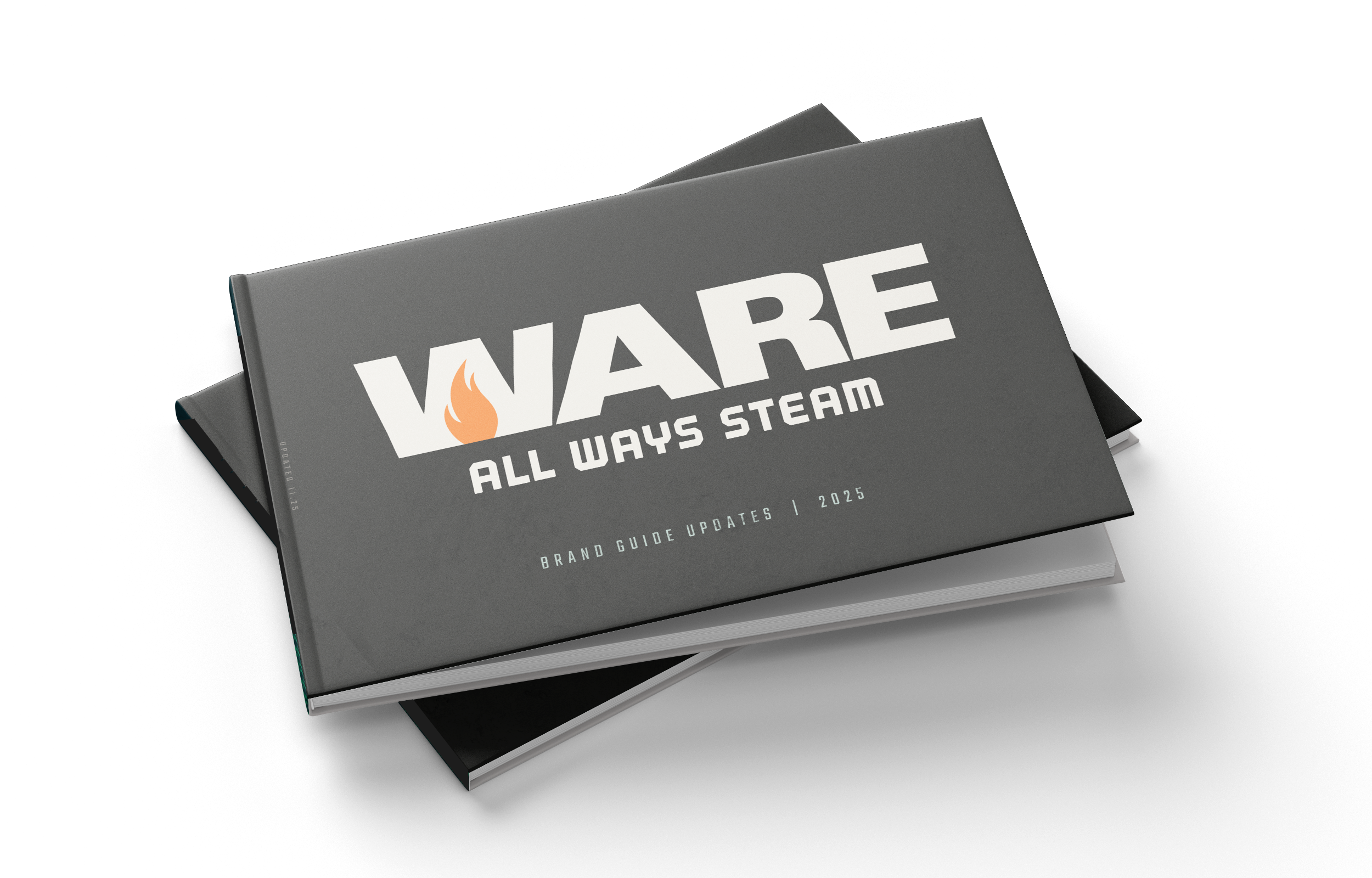
WARE Rebrand
Growing from One Offering to an Entire Ecosystem.
For nearly 75 years, WARE has been the company people call when they need the steam to get things done. What started as equipment has grown into a full ecosystem of rentals, service, parts, and training, all built to support boilers at any scale. From stepping in during hurricane response efforts in New York to powering mission-critical operations at U.S. Air Force bases, WARE has earned a reputation for showing up when the pressure is on.
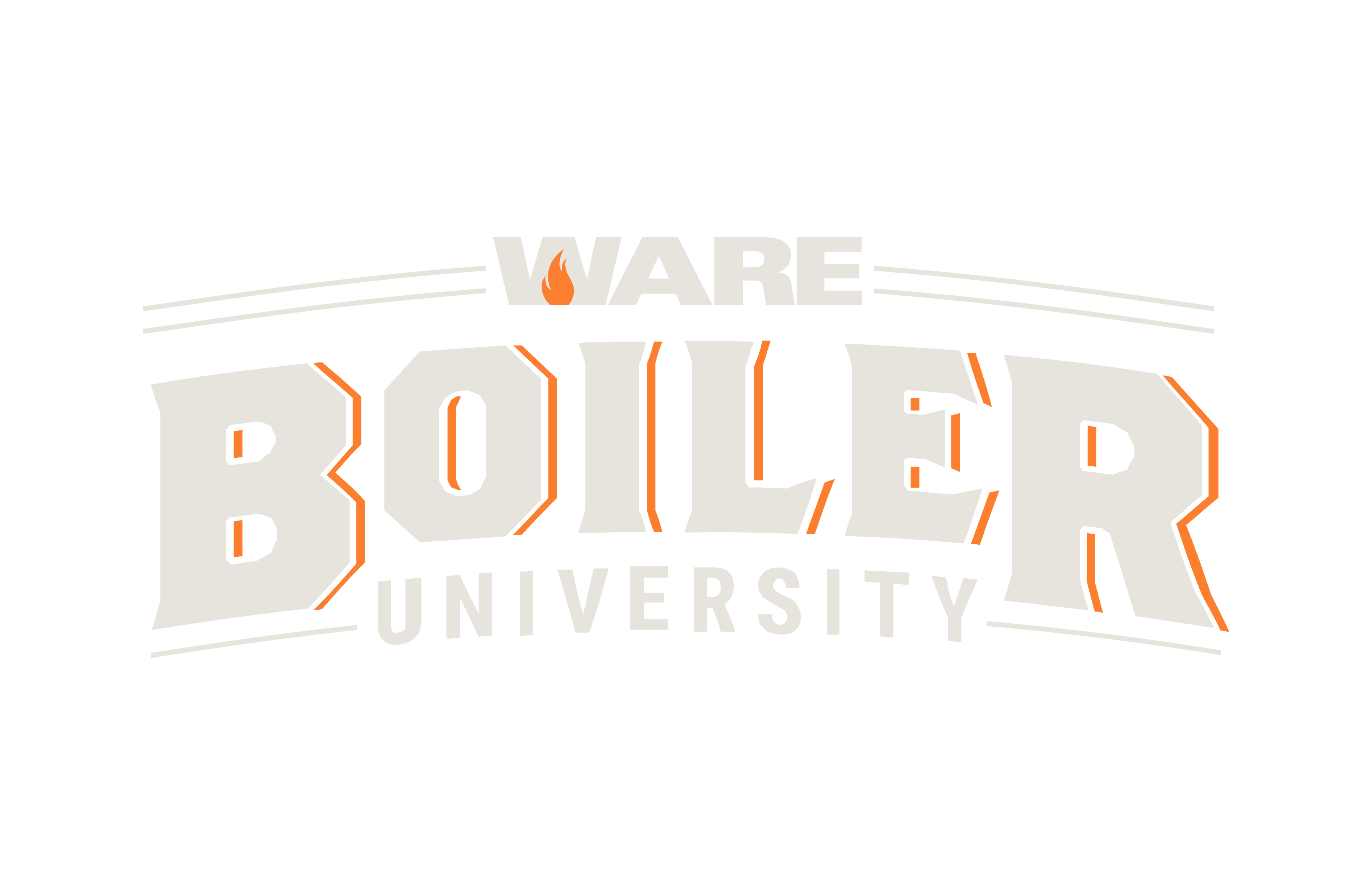
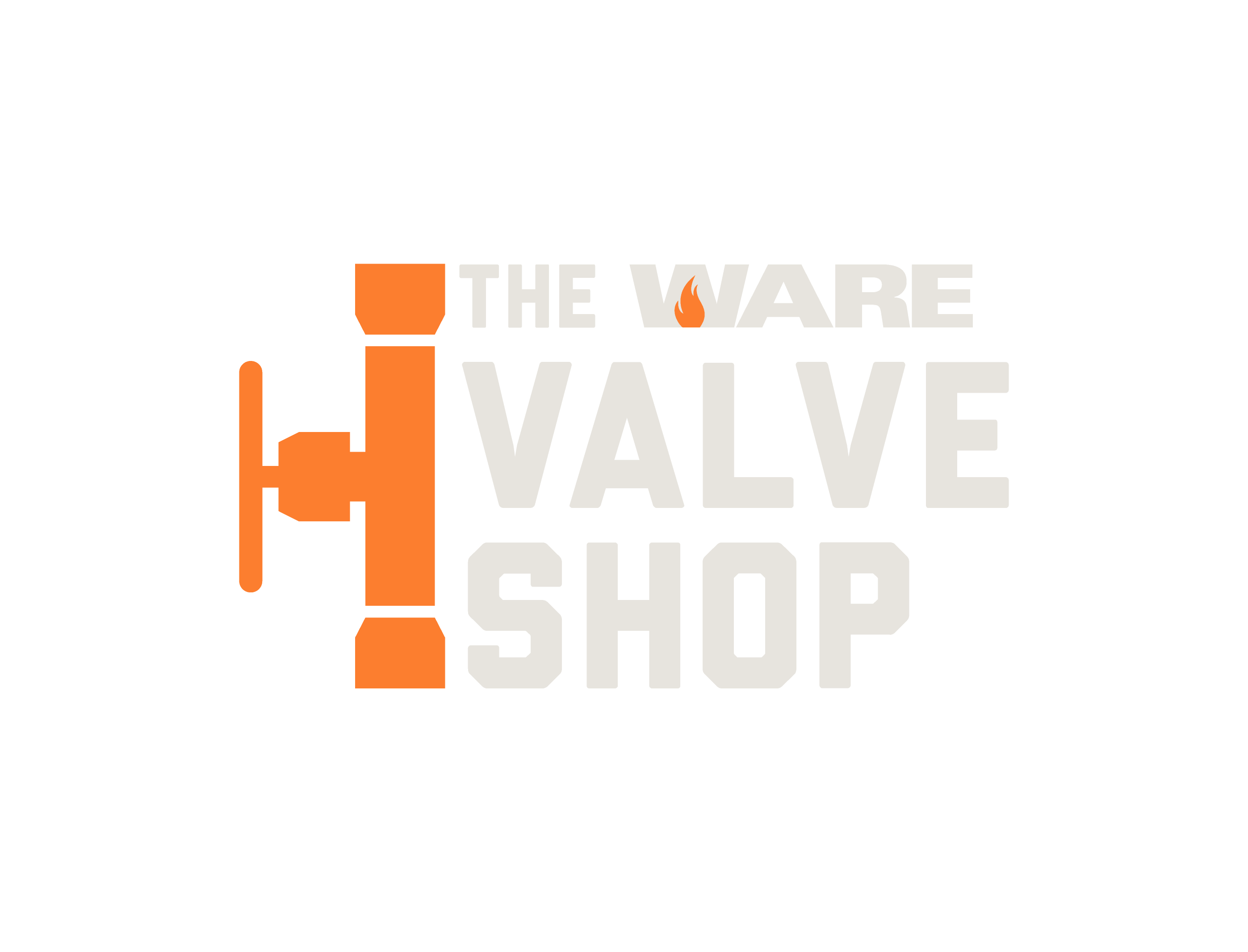
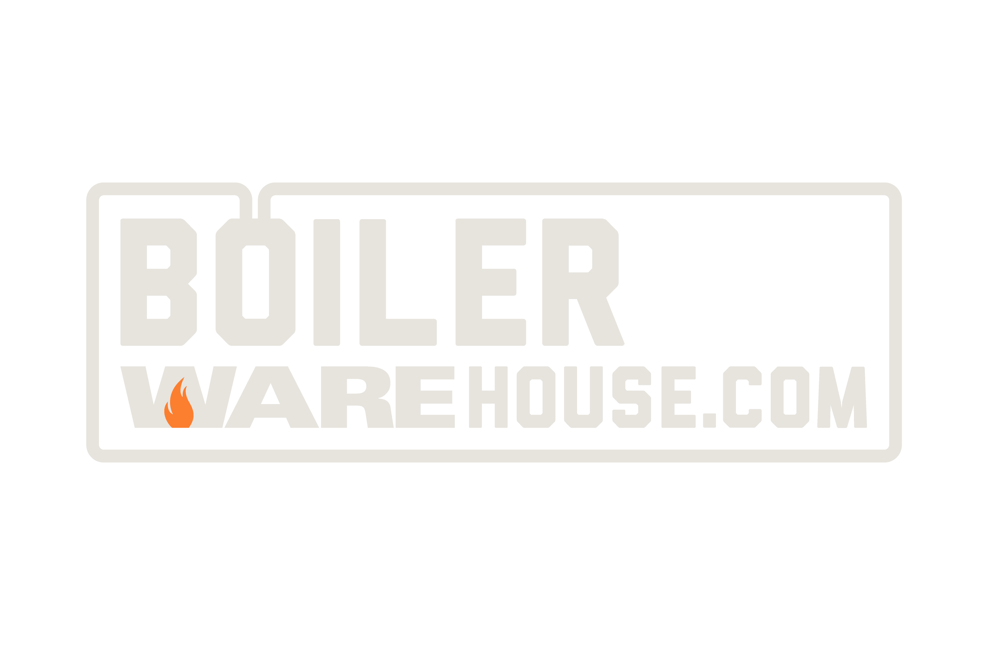
Along the way, that hands-on expertise expanded into a strong family of brands, including WARE Boiler University, BoilerWAREhouse, The WARE Valve Shop, and a growing network of media and podcasts reaching thousands of people every month.
When it comes to steam, WARE doesn’t blow smoke.
WARE Do We Go from Here?
The existing WARE brand had been around for a while, and it was starting to show. It was built to be big and bold, and it worked great when you had the side of an eighteen-wheeler to play with. But as WARE’s world expanded into modern spaces like the website, social media, and digital platforms, the system started to feel the strain.
The brand wasn’t built to live small. And in places where clarity, flexibility, and speed matter most, it struggled.
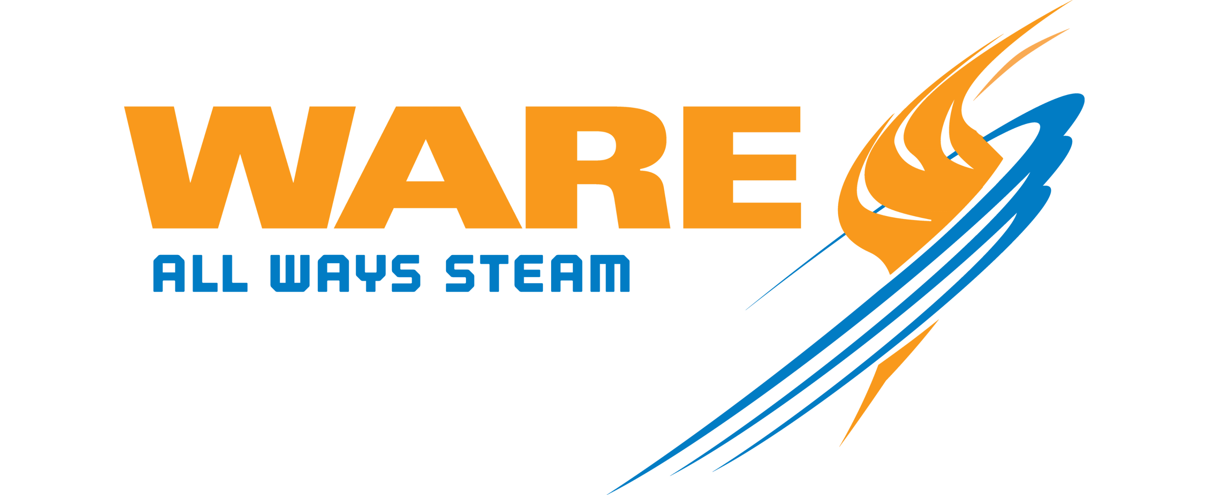
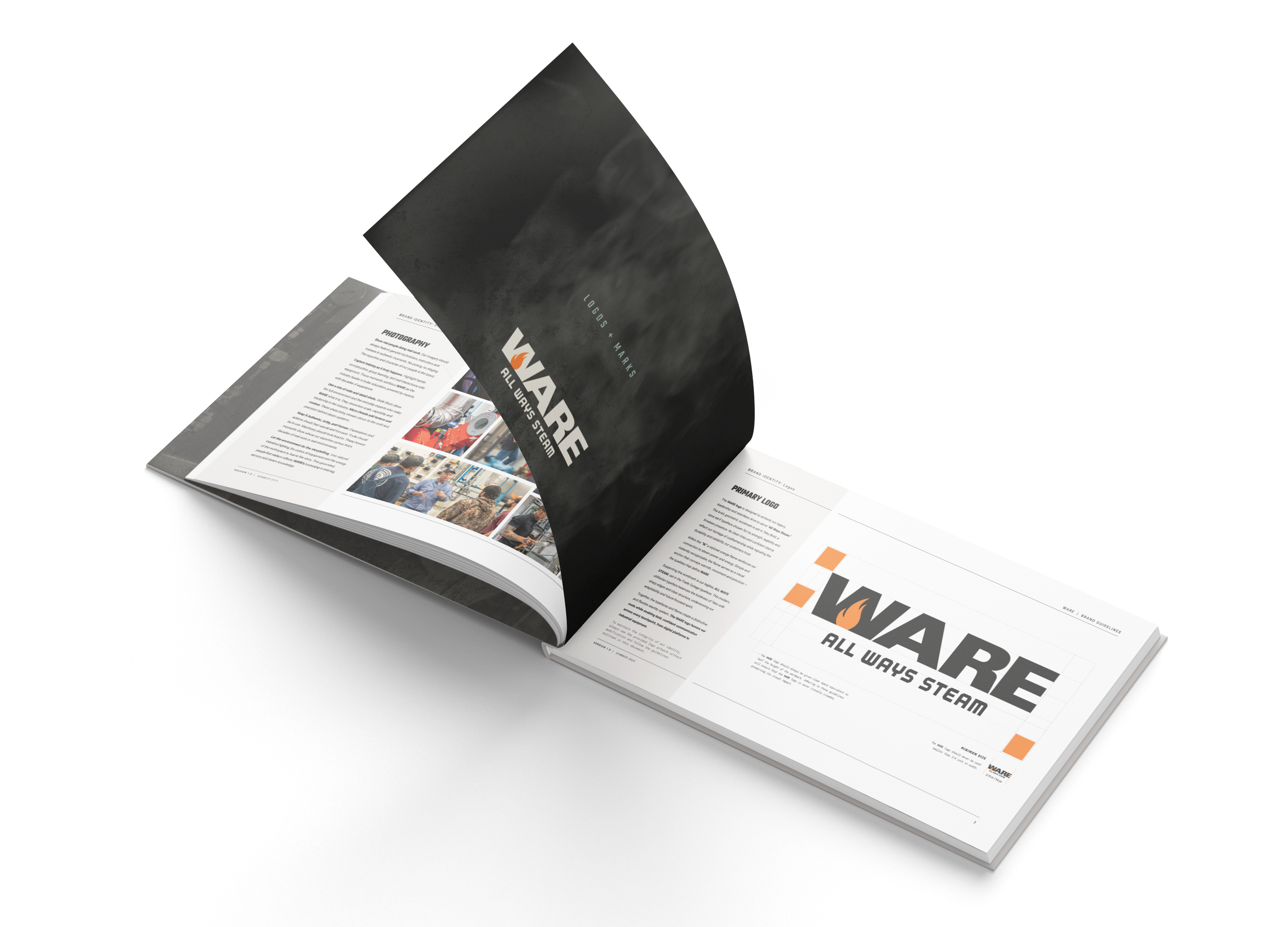
The wordmark itself was solid. Strong. A great foundation. But the brandmark around it was doing a little too much. It felt unbalanced, cumbersome, and honestly pretty tough to use, especially in tight spaces where today’s brands need to perform.
So the initial question was simple: could we tweak it? Could we create a smarter, small-space version that actually worked where WARE needed to show up now?
WARE it Counts
Like most strong leaders, the team at WARE immediately saw the bigger opportunity. With WARE’s recent acquisition by Armstrong International — a global force in power and energy — it became clear this wasn’t just about fixing a logo. This was a chance to evolve the brand to reflect what WARE had become over the last 75 years: more confident, more capable, and firmly positioned as an industry authority on steam.
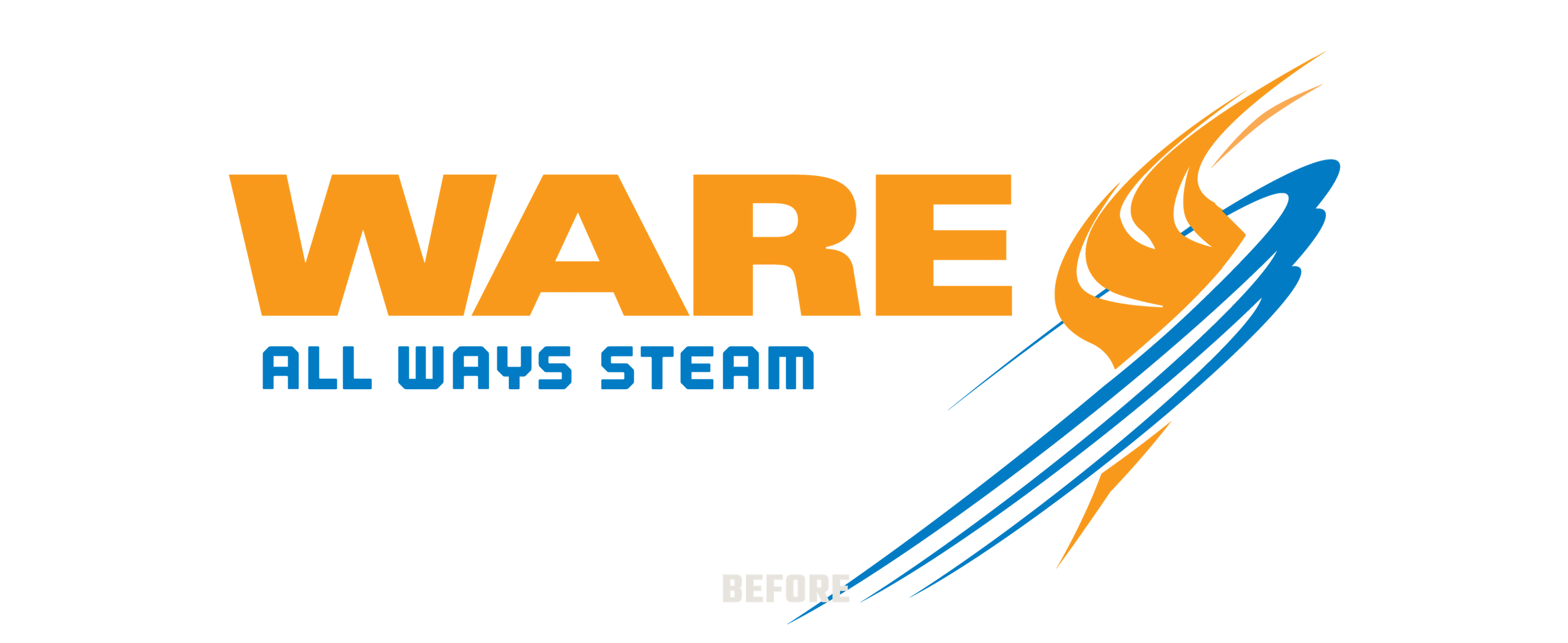
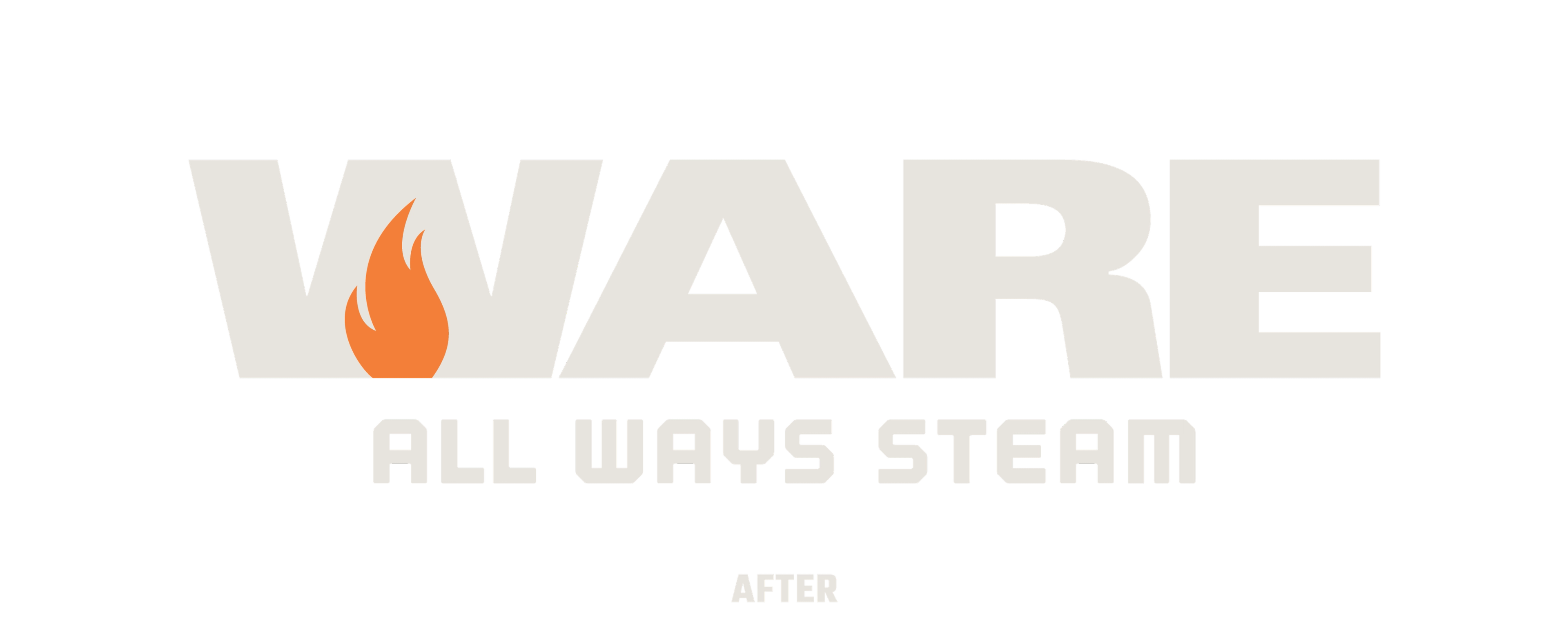
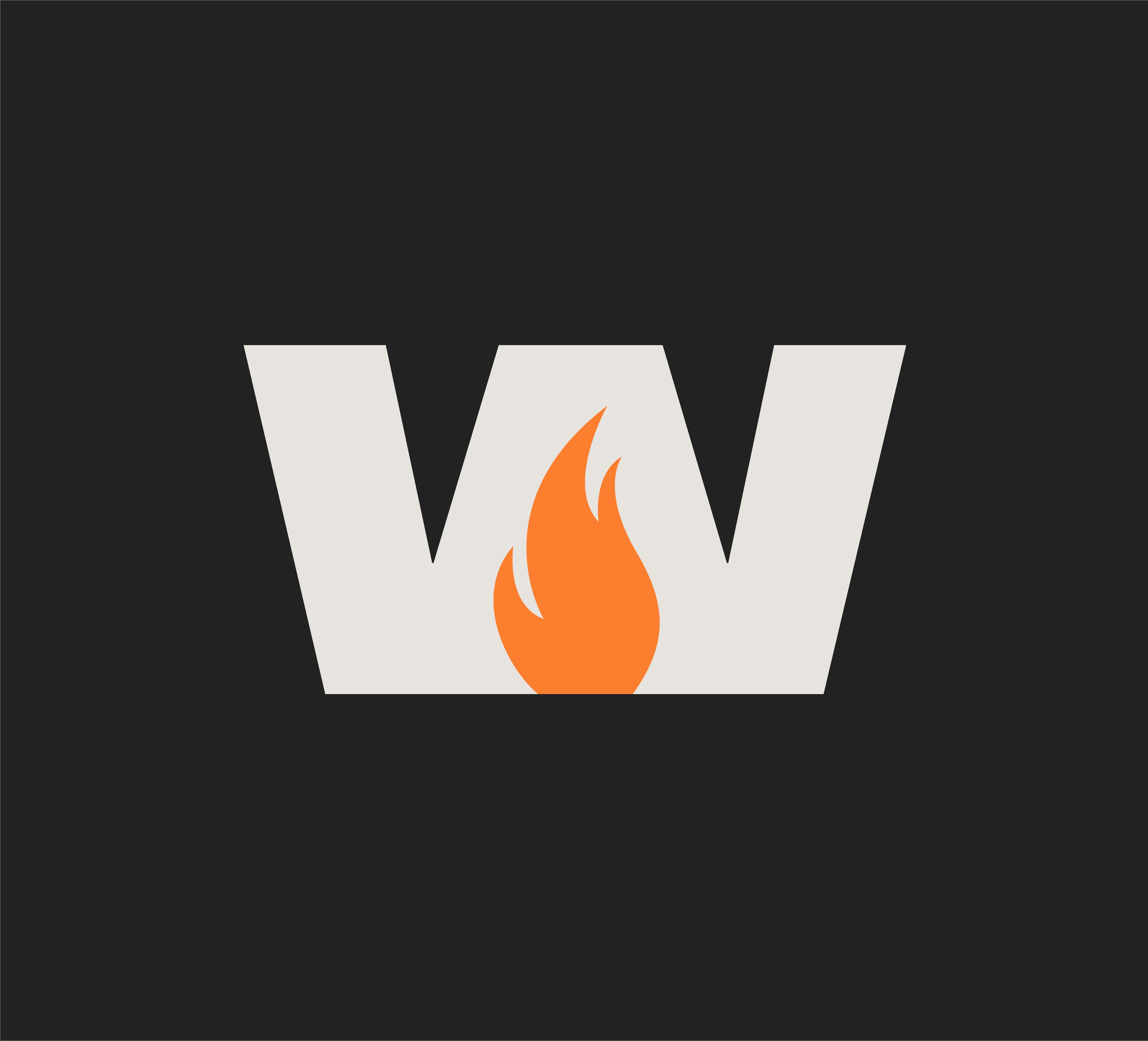
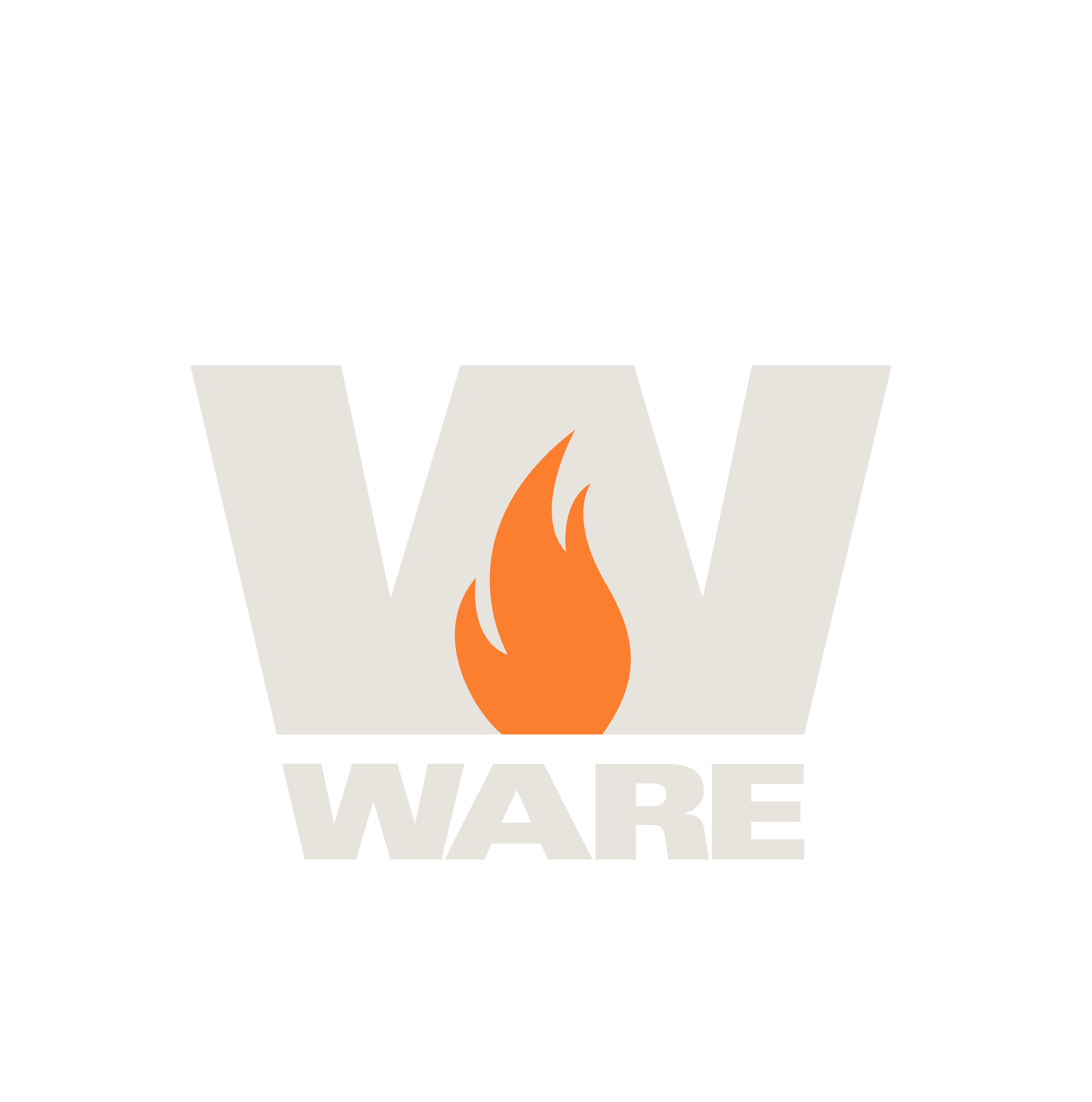
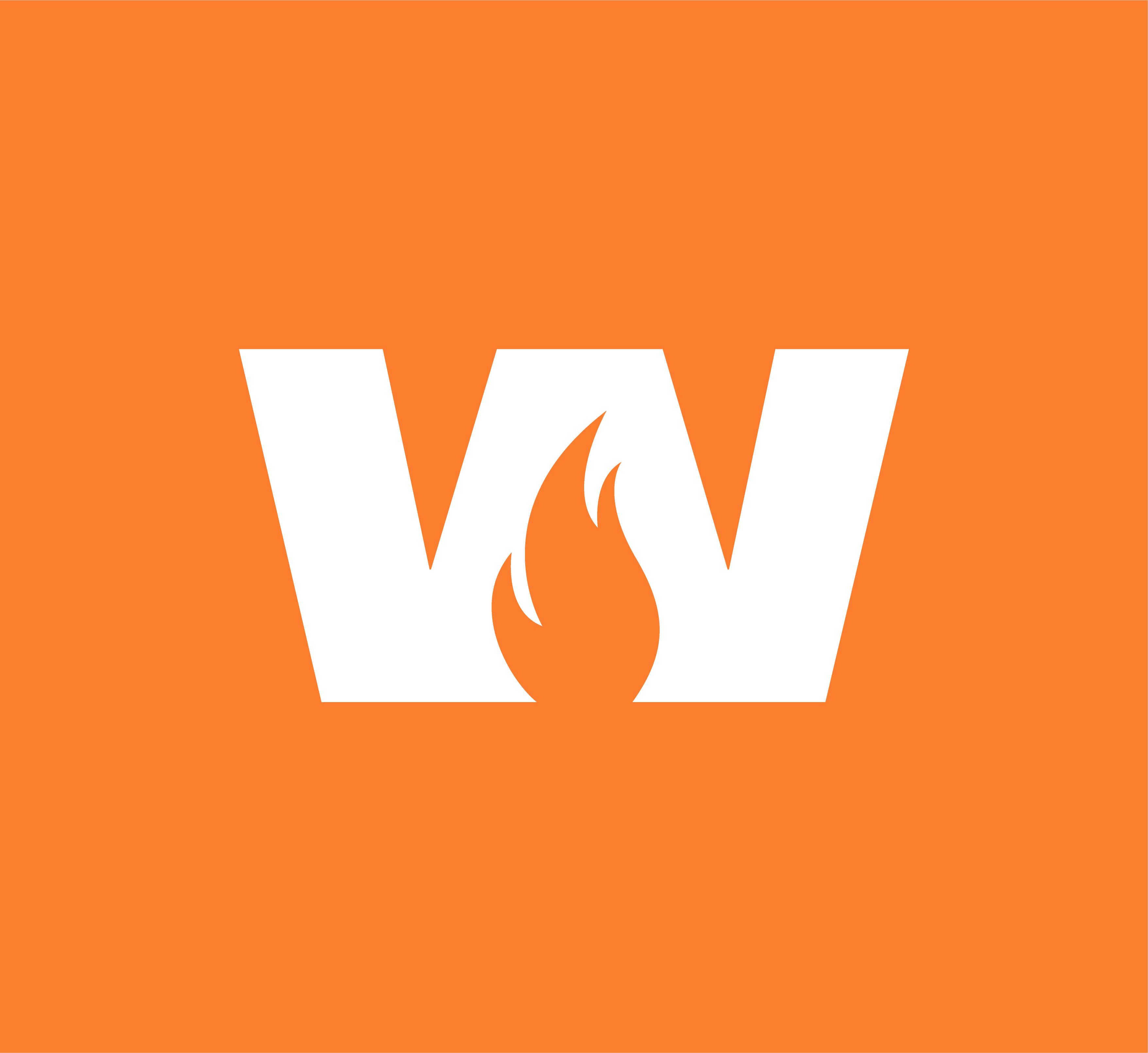
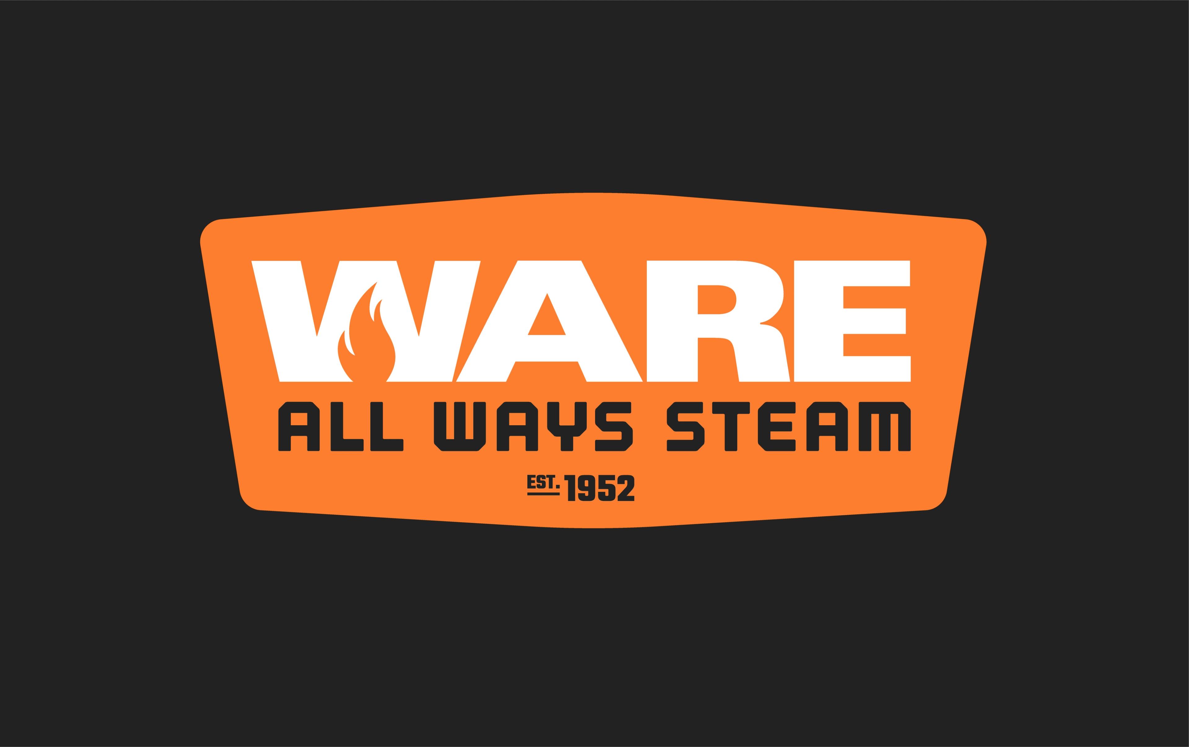
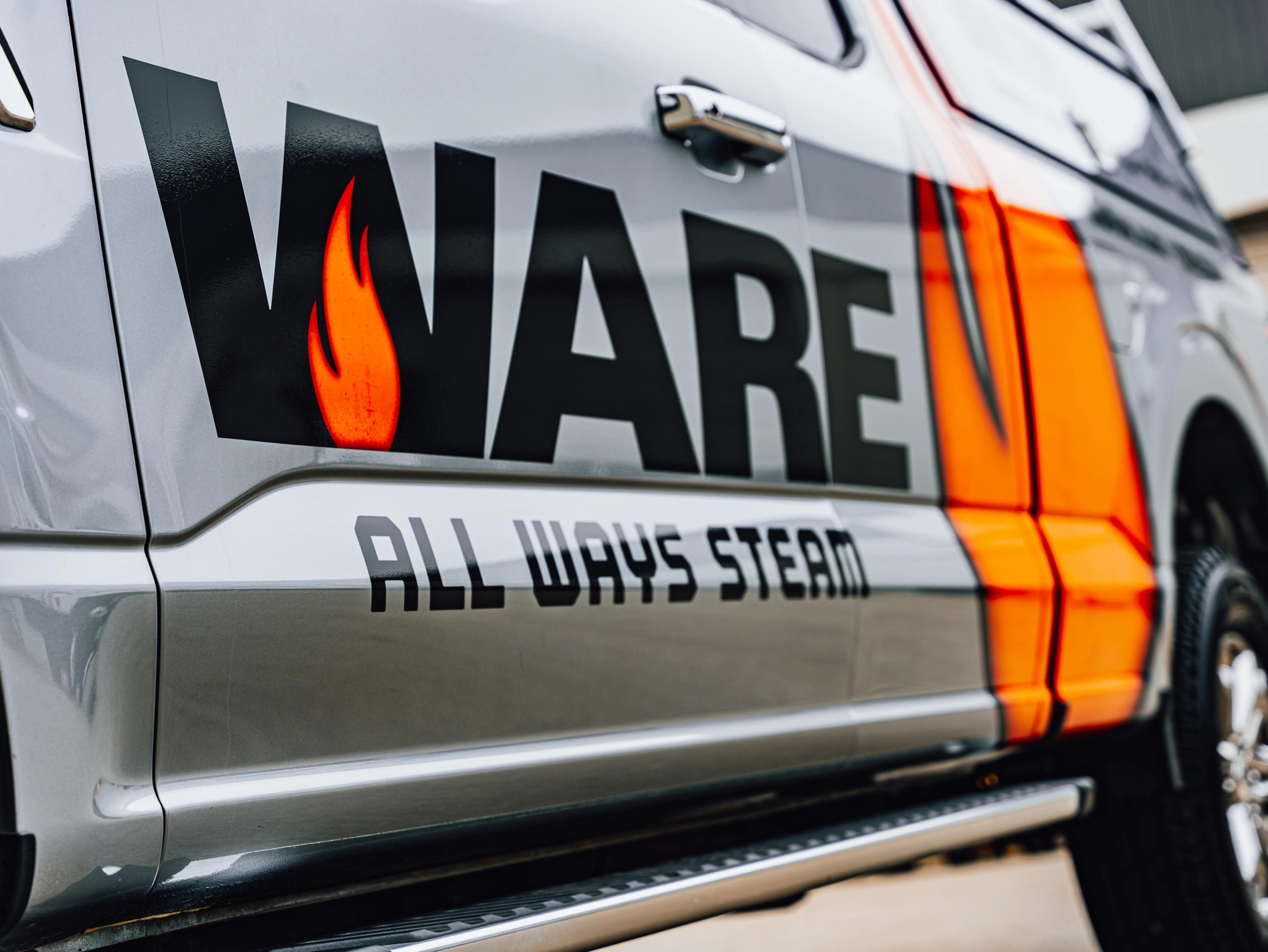
That’s when we made the call to simplify and sharpen. We dropped the oversized flame mark and built it directly into the wordmark itself. This put the focus exactly where it belongs, on the WARE name, turning it into the visual driver and reputation leader it already is in the industry.
Tucked into the negative space at the base of the W, the flame becomes the source of heat that makes steam possible and keeps industries moving.
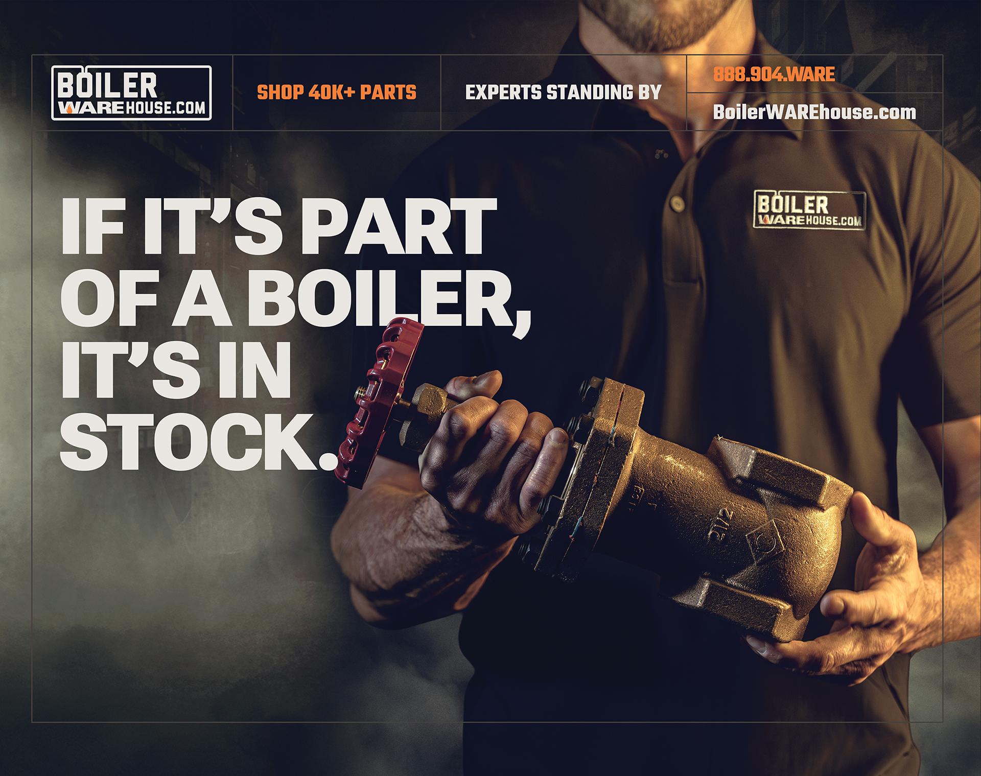
A WAREhouse of Brands
Once the core WARE logo family was locked in, we shifted focus to the brands that make WARE more than just another player in the space. This wasn’t about starting over, it was about bringing alignment to a growing House of Brands that already carried real equity.
Boiler University, BoilerWAREhouse, and The WARE Valve Shop all had strong foundations. Our job was to weave the new WARE identity into each one to create consistency without stripping away what made them recognizable or effective.
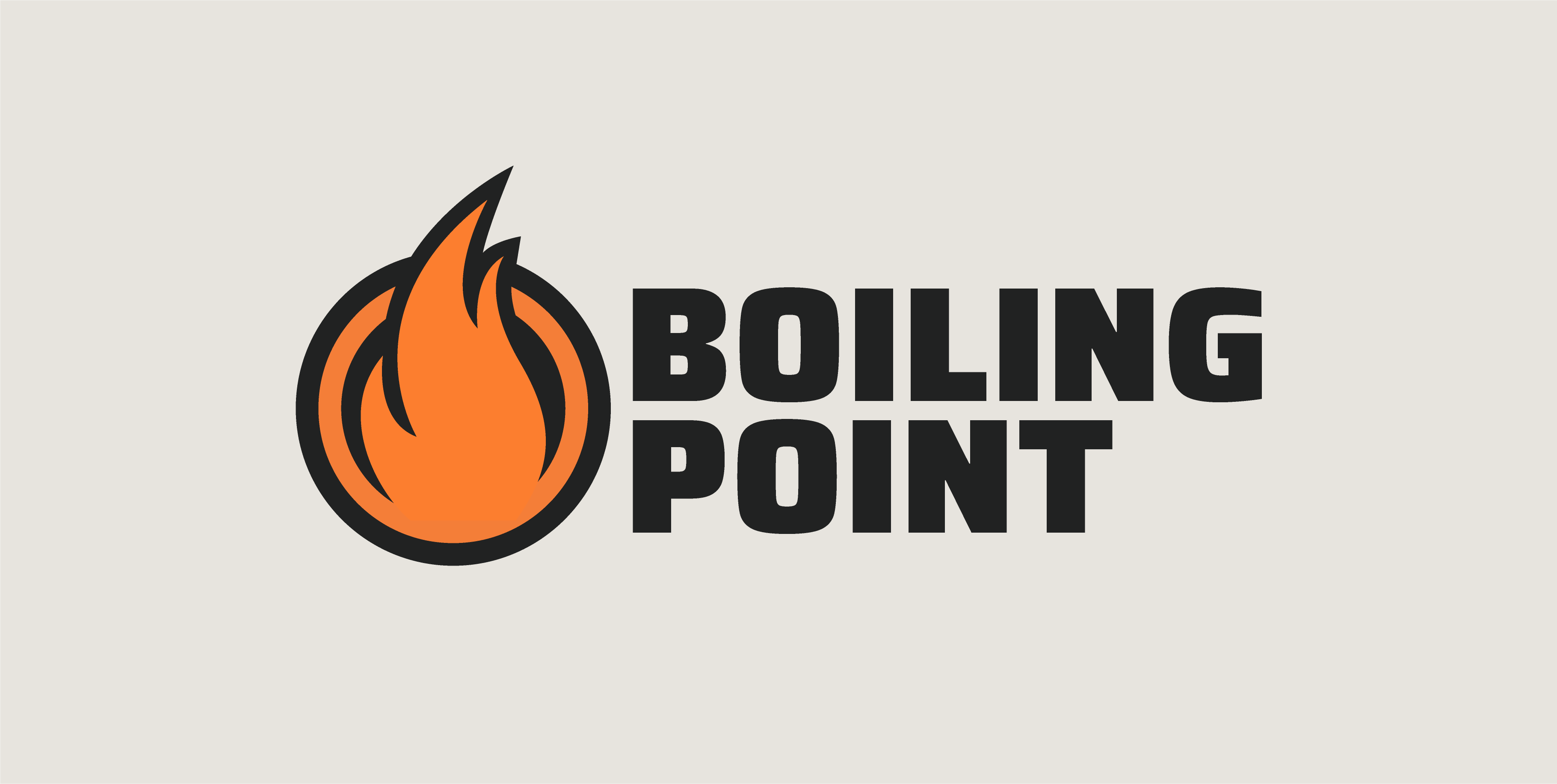
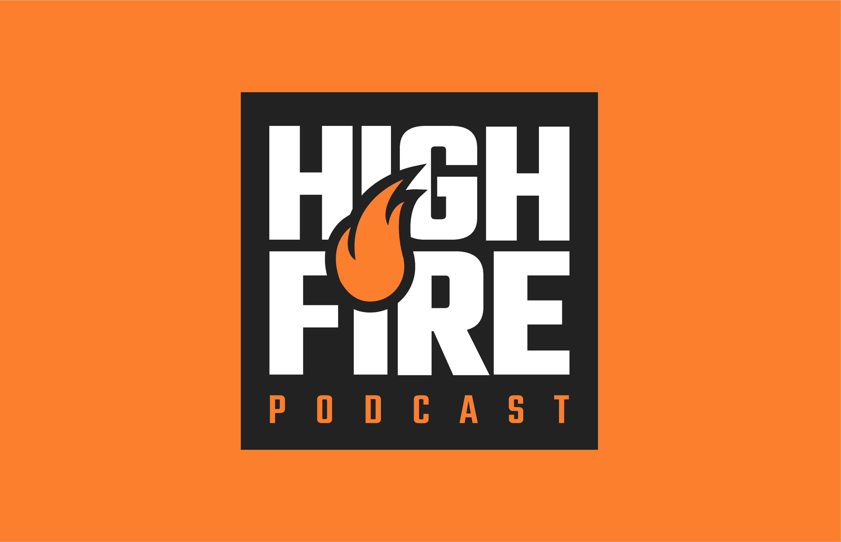
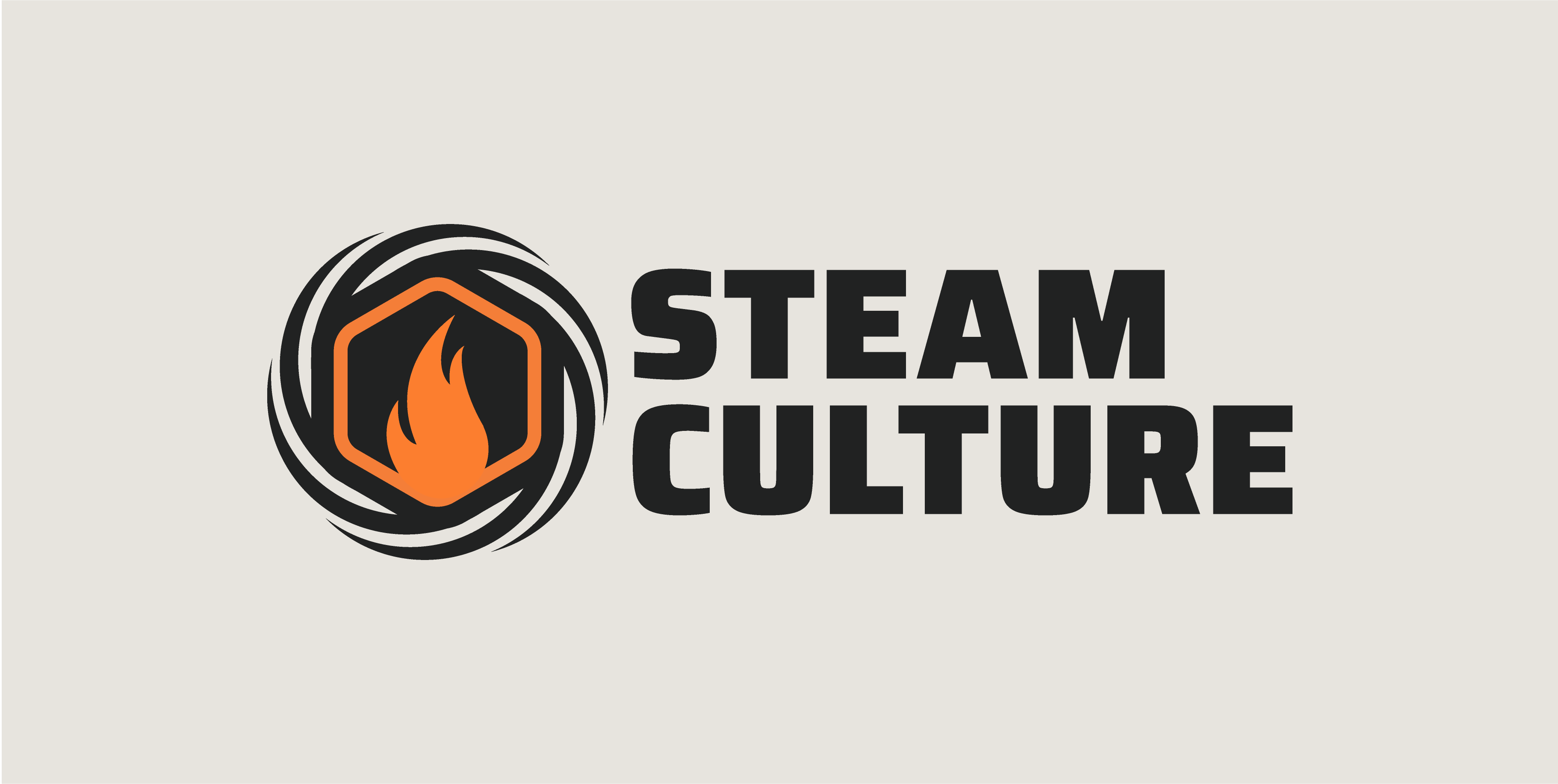
The same thinking applied to WARE’s media brands. As mentioned earlier, WARE is full steam ahead in the podcast world, with shows like High Fire, Boiling Point, and Steam Culture reaching audiences across the industry. These brands needed to feel distinct, but unmistakably connected to WARE. Each was refined to align with the new corporate identity so no matter where the content lives, it’s obvious who’s behind it.
From Static to Steam-Powered
With the WARE brand officially on the move, it felt right to actually put it in motion. If you’re going to lead in the boiler media space you can’t have marks that just sit there looking pretty. They’ve got to breathe. Move. Maybe throw a little heat.
So we built motion into the system. The animations are quick, purposeful, and built on clear patterns so they feel consistent, but each brings its own personality to the job. They’re designed to work with the content, not overpower it, while still carrying the energy and grit that define WARE.


WARE It All Comes Together
A rebrand isn’t really a rebrand unless everything around it gets pressure tested too. We went back to the color palette and tuned it for strength, making sure Flame Orange and Slag Black showed up bold, confident, and unmistakable.
The secondary colors got the same treatment. We trimmed the excess, tested the system, and kept only the colors that earned their place and supported the brand story.
Typography was no exception. Every typeface was put through its paces: tested on fleet graphics, digital screens, and real-world applications. Only the fonts with enough grit to hold up at scale, and enough clarity to work in tight spaces, made the cut. The result is a system that reads clean, hits hard, and works where it needs to.
WARE on Display
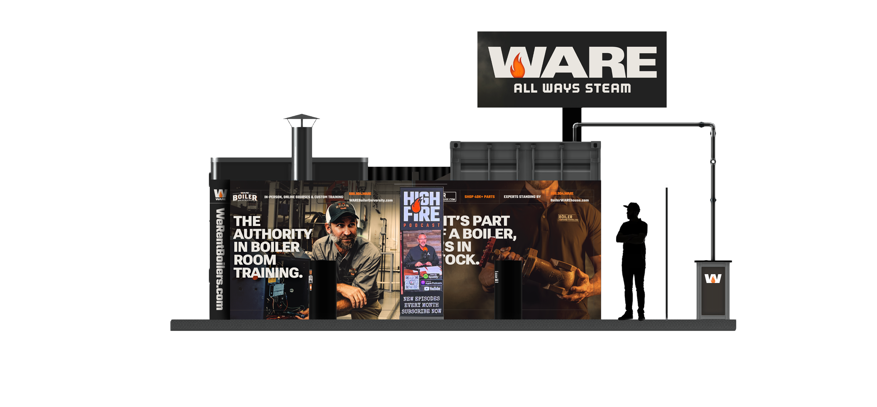
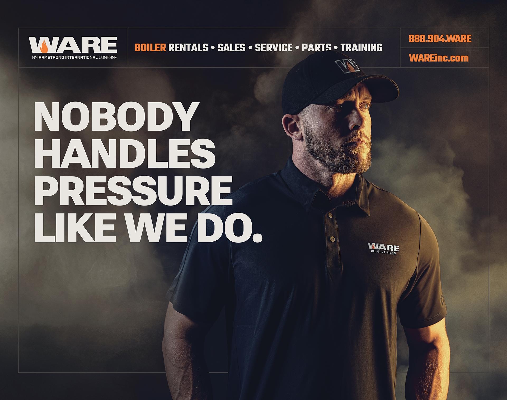
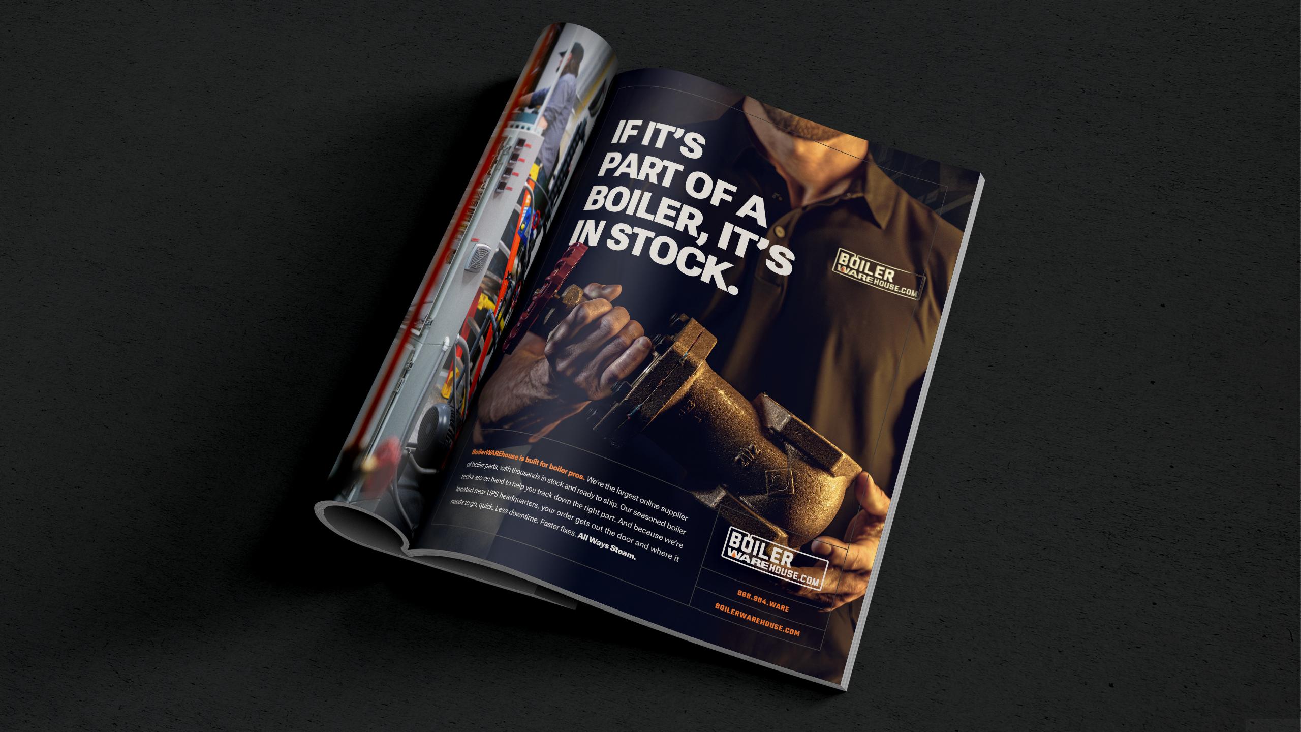
Tradeshows matter at WARE. It’s where deals get signed, eyeballs get captured, and where thier next great hire often walks into the booth. As soon as the new brand was finalized, the team put it to work in the field.
We worked side by side with the WARE marketing & creative team to sharpen the messaging and make sure the visuals actually looked like WARE: real employees, real steam, real grit. No stock-photo boiler rooms. Just the people who do the work every day. It’s another place where the brand proves it’s not just empty words. It’s how WARE shows up.
Simplified. Systemized. Supercharged.
The WARE website was up next. We didn’t start with colors or buttons. We started with strategy. Content first. We restructured the content hierarchy so when someone lands on the site, they immediately see what matters without having to dig three clicks deep to find it.
Rentals. Parts. Training. Service. Clear. Up front. No guessing.
From there, we turned up the visibility on search (because if you’re selling thousands of boiler parts, that search bar better work like a champ), tightened up user segmentation, and reworked the homepage and navigation so the whole thing felt intuitive instead of overwhelming.
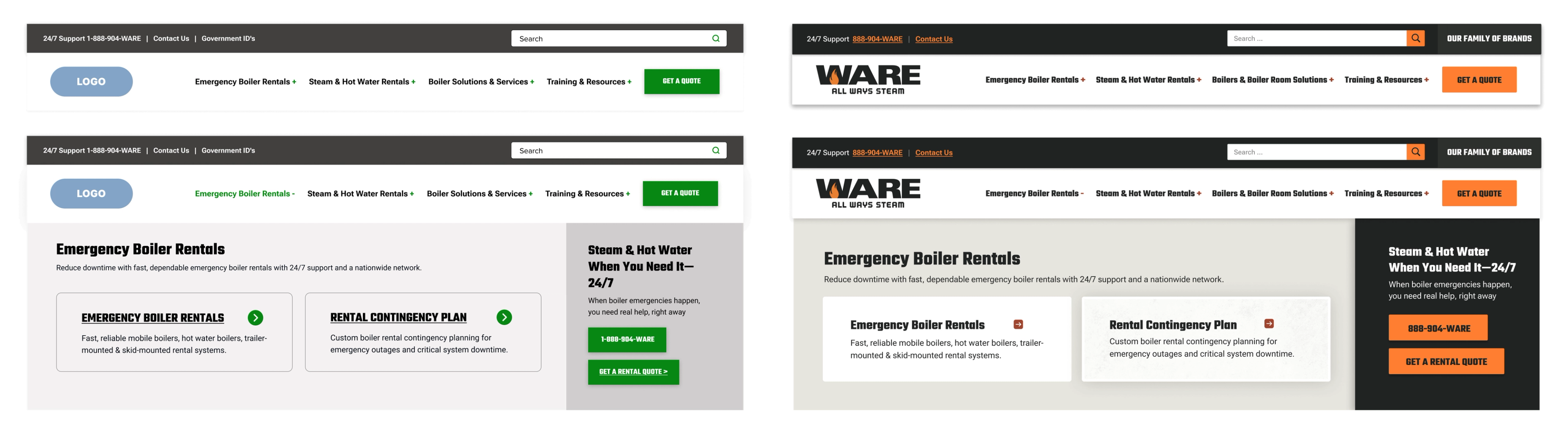
With a stronger foundation in place, we turned our attention to design consistency and system-building. The previous site had become a culmination of years of layered content and evolving styles. Blue links, orange links, arrows, rounded corners, harsh shadows, gritty overlays. The UI lacked cohesion, typography didn’t follow a clear hierarchy, and much of the site fell short of accessibility standards.
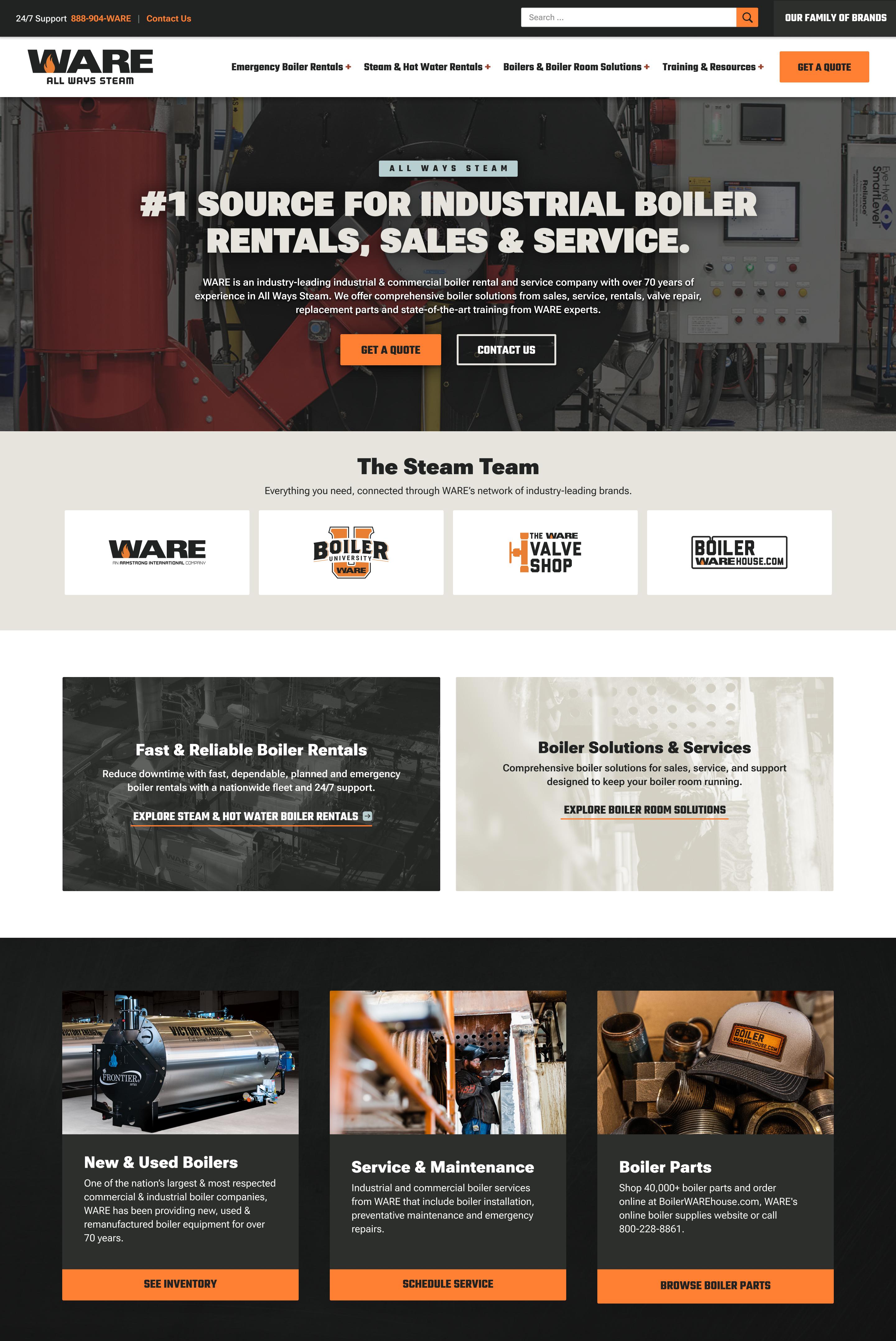

The new identity work gave us a strong foundation to build on. The redesign leaned on the strengths of the brands simplicity and confidence. The result is a clean, refined user experience that not only reflects the new brand but positions WARE for where they’re headed. Modern, trustworthy, polished and still undeniably bold.
Check Out the New Website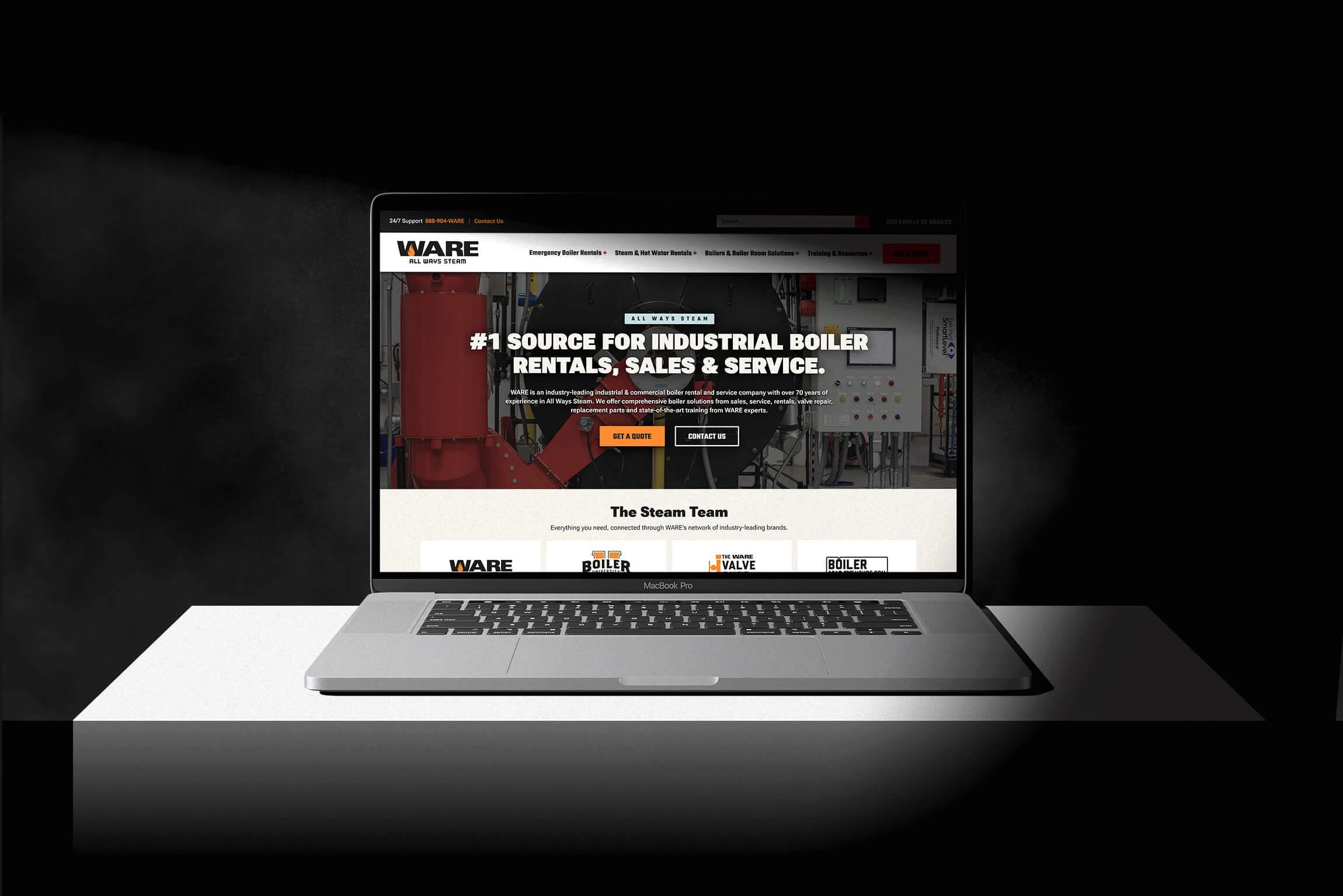
WARE at Work
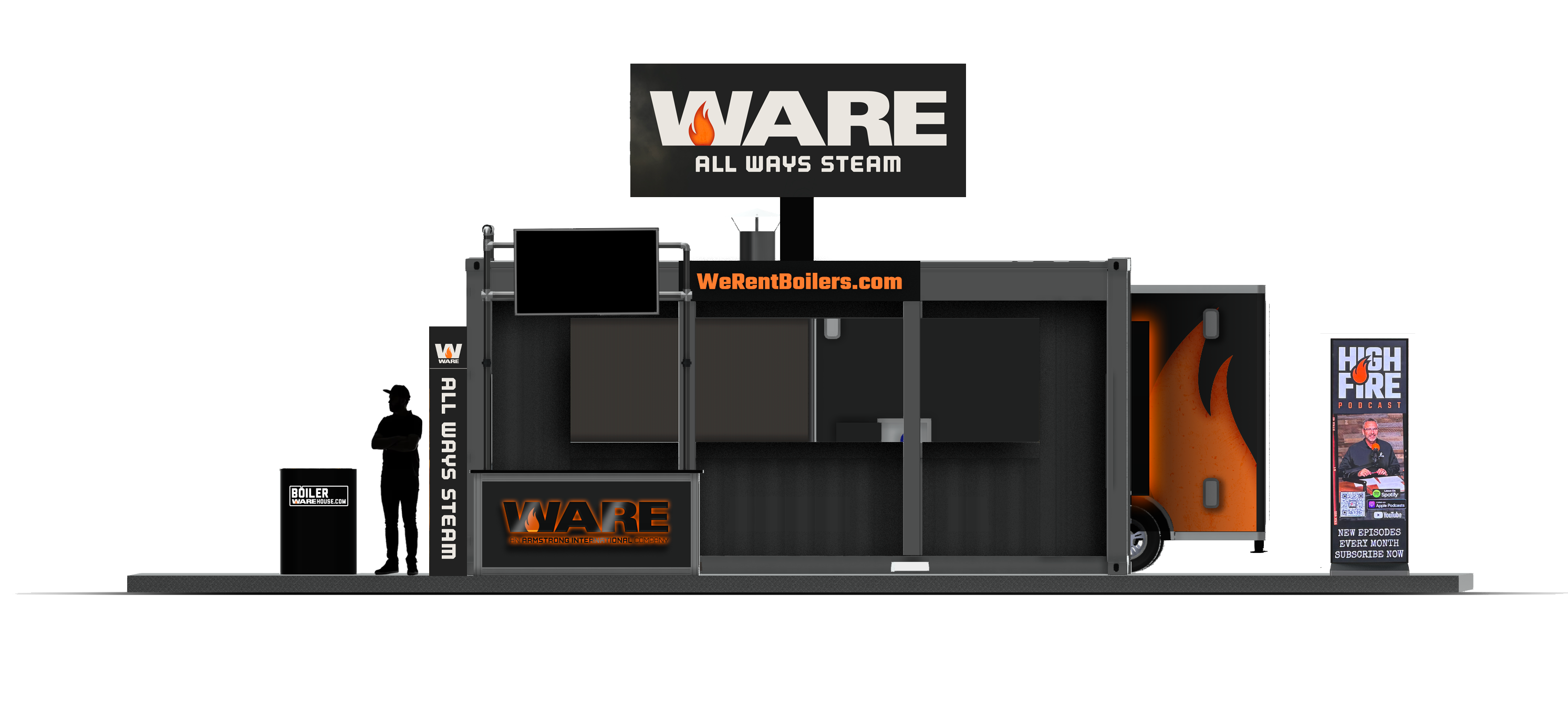
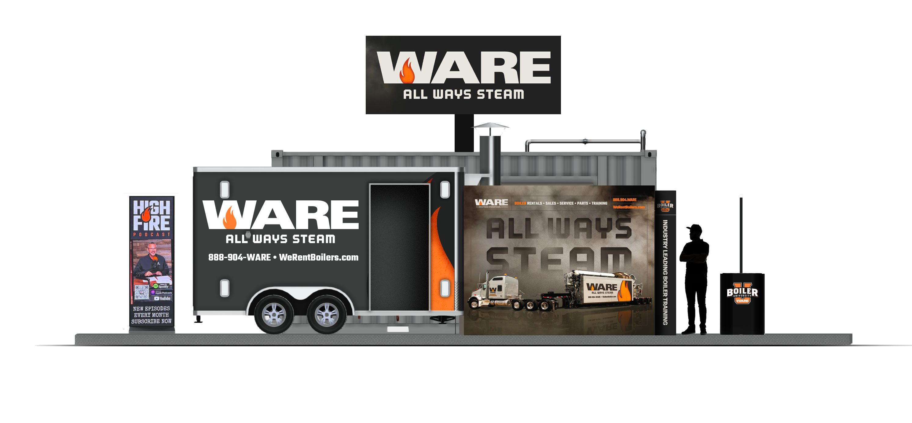
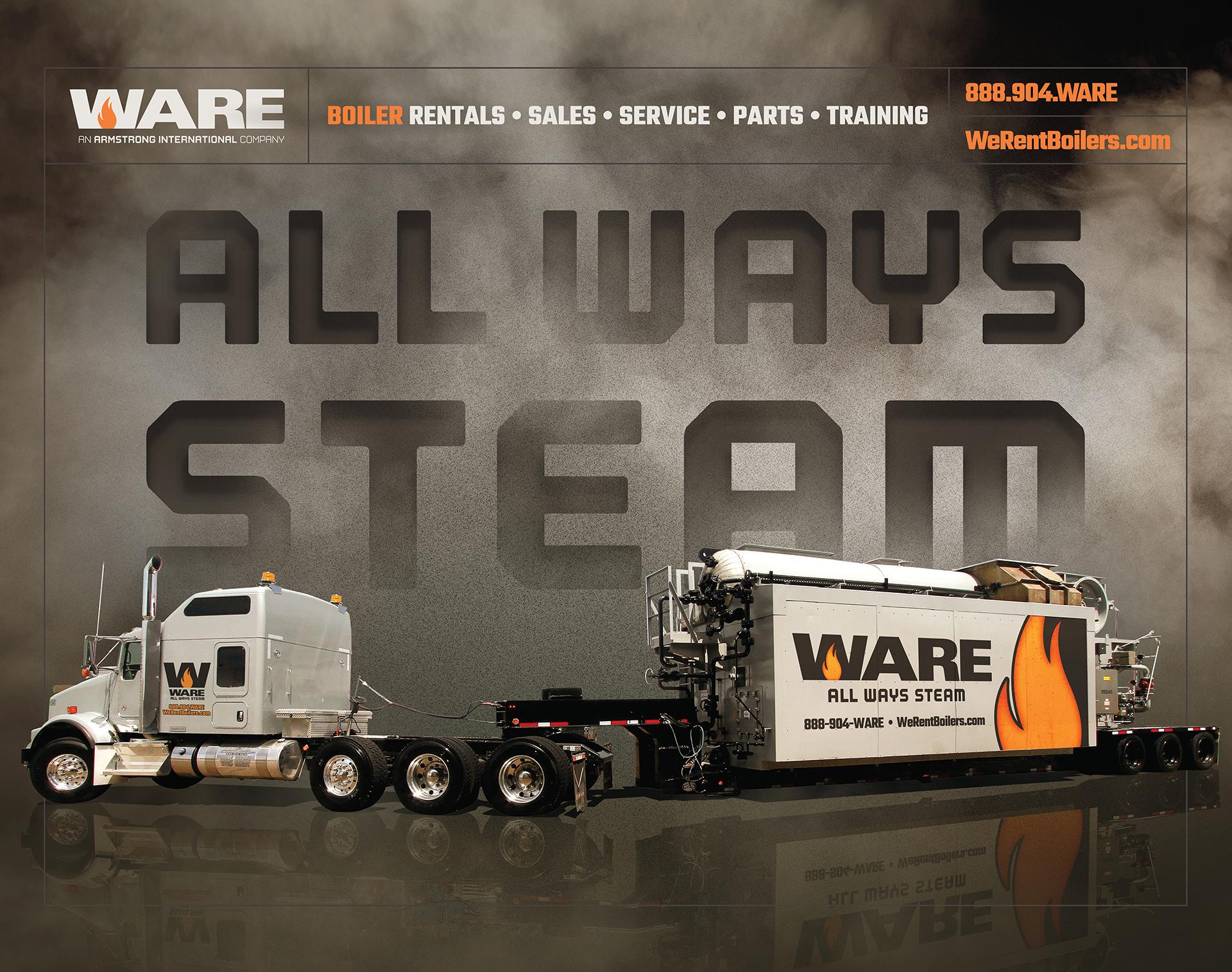
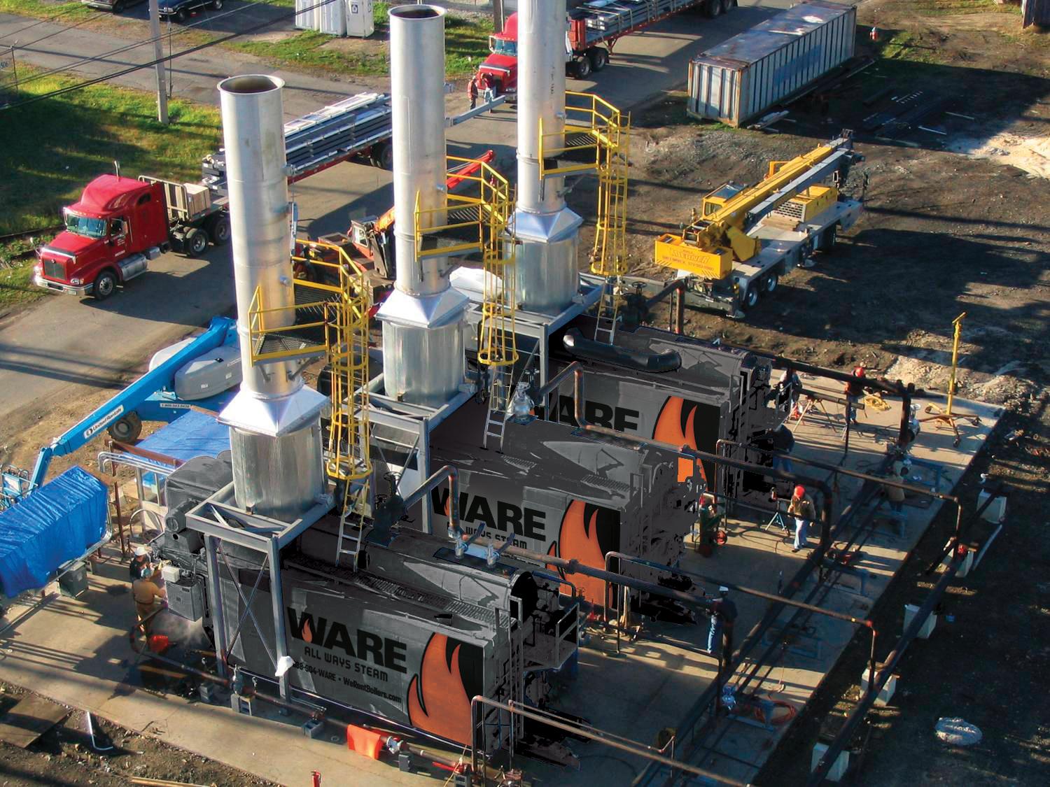
WARE isn’t a brand that lives only on screens or trade show floors. It lives on the street. On the job. In motion. (Literally.)
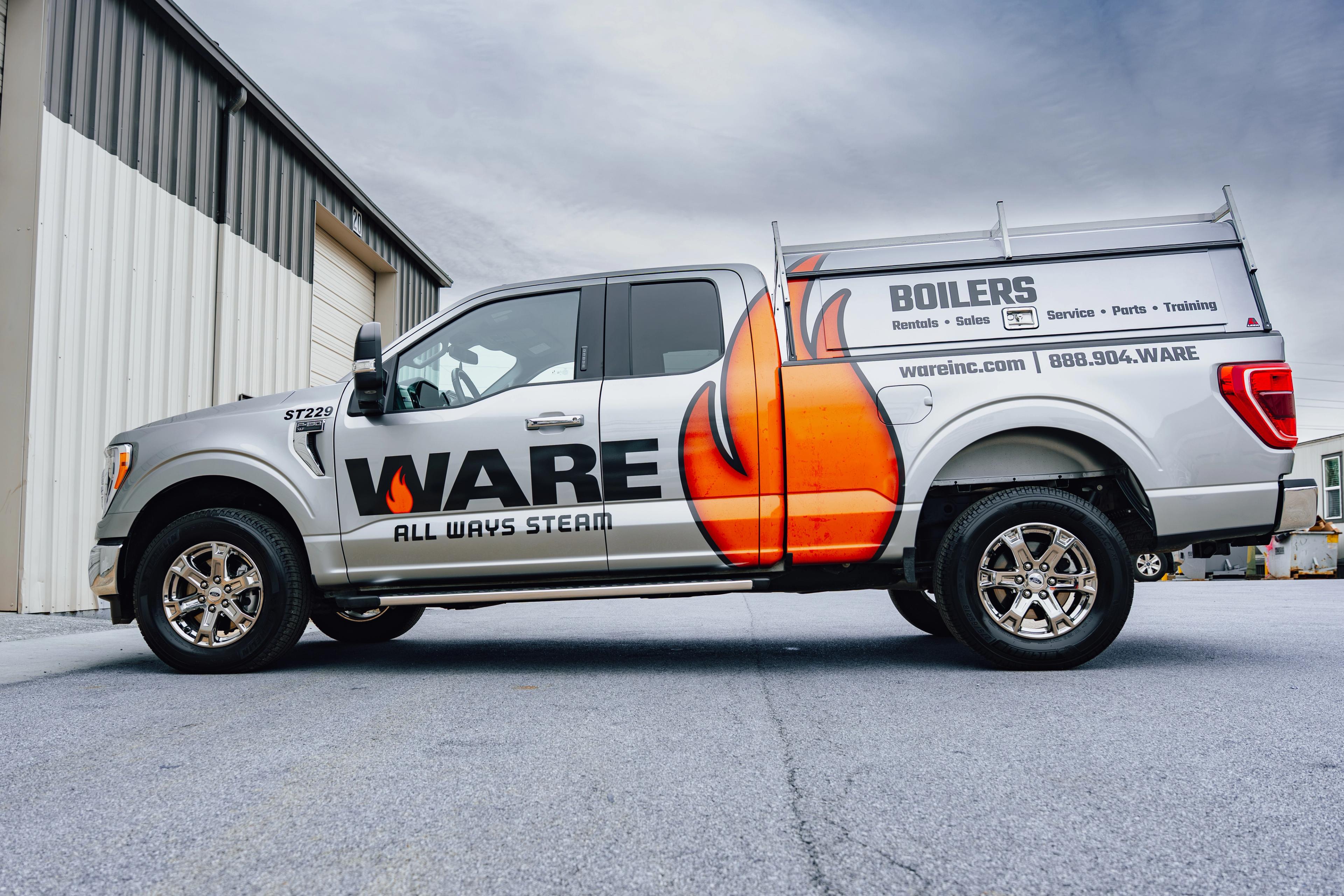
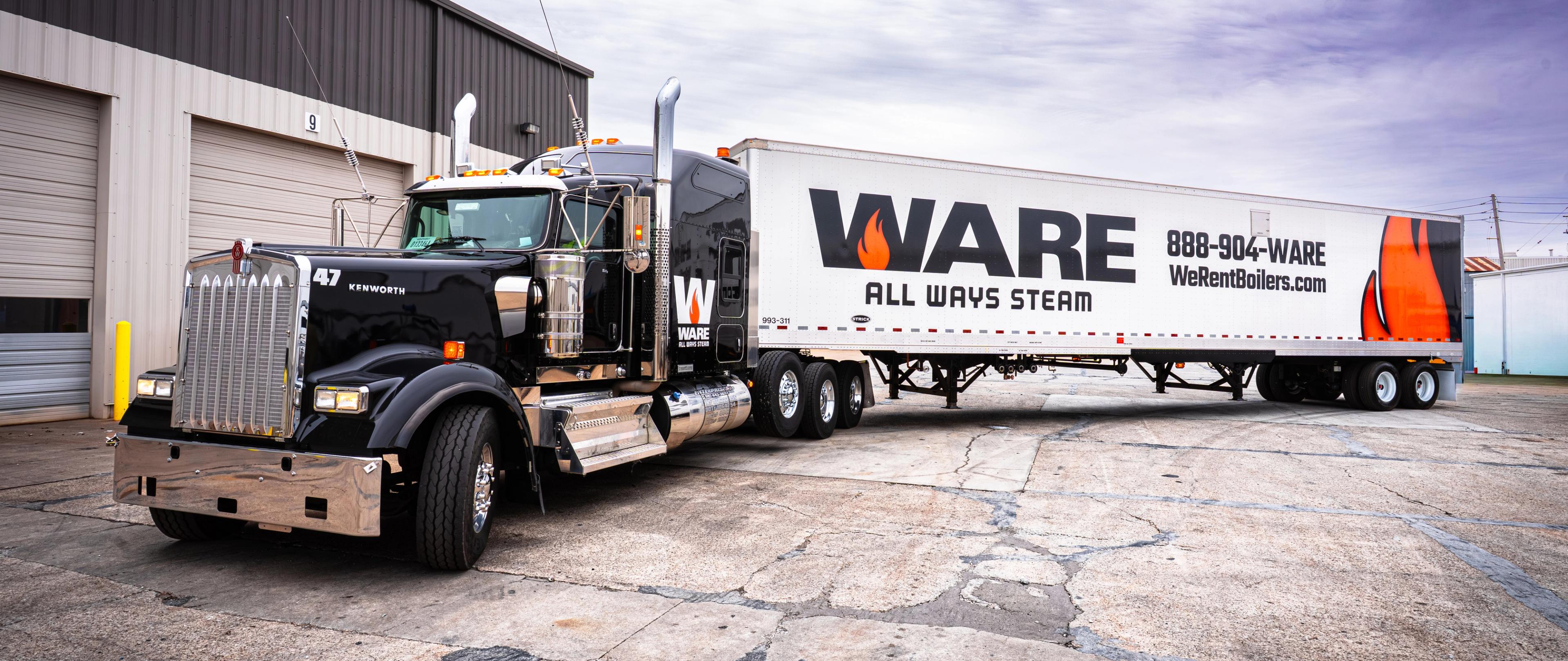
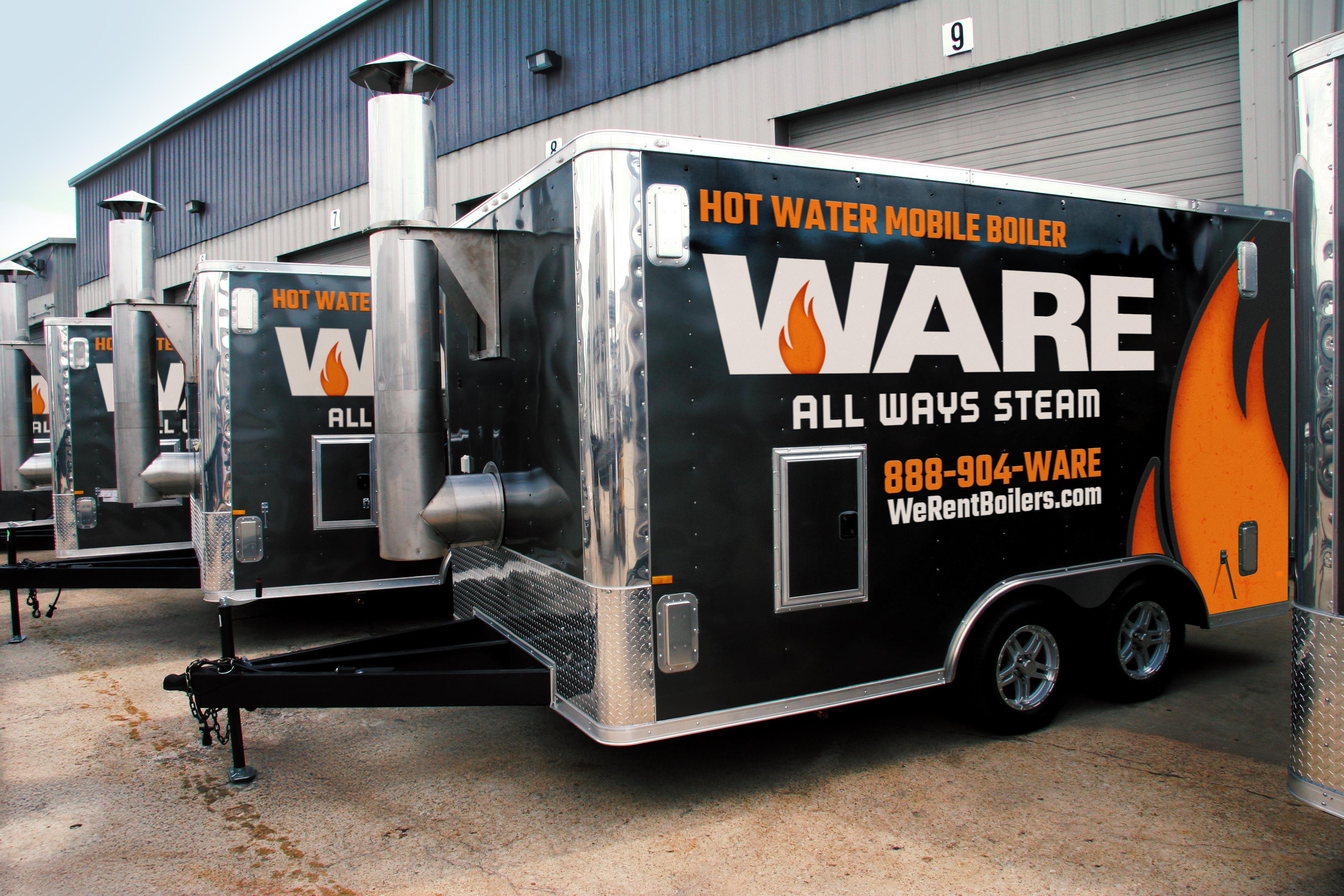
And once the new identity landed, WARE leadership didn’t hesitate. They believed in it enough to put real weight behind it, committing to a full fleet rewrap from top to bottom.
From pickup trucks and trailers to massive rental boilers that require cranes just to move, the brand now shows up everywhere in bold, unmistakable ways. The wordmark leads the charge, while the flame steps out on its own at times, becoming an icon that carries the brand’s heat all by itself.
It’s a system built to move, built to scale, and built to be seen on the job, where WARE does its best work.
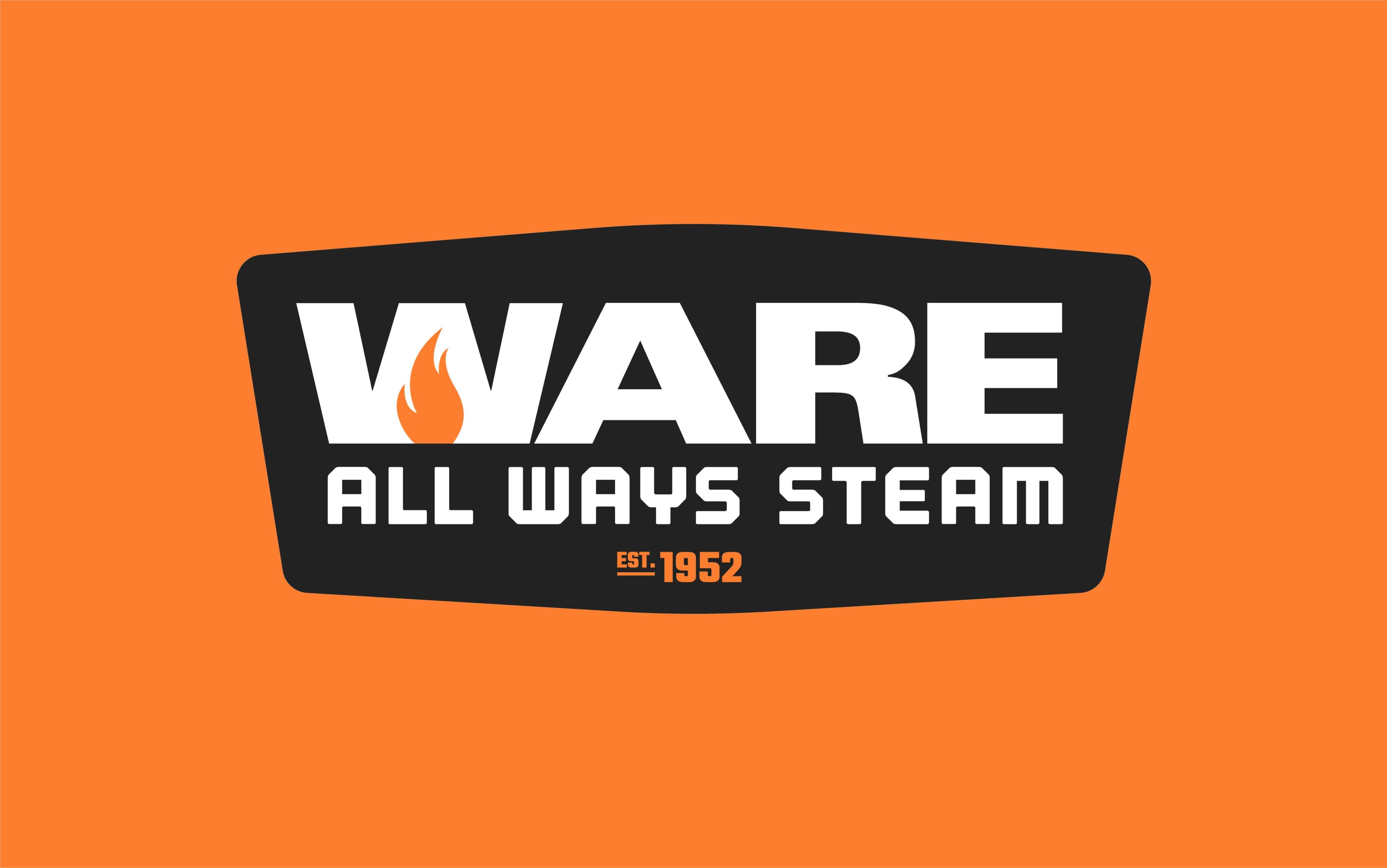
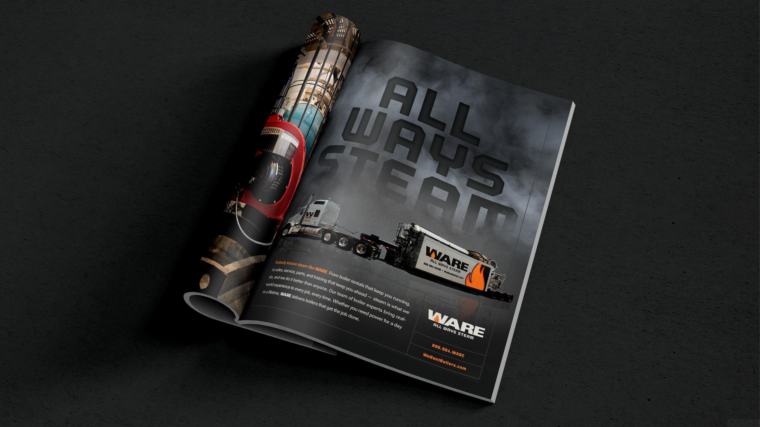
ALL WAYS STEAM
In the end, the WARE rebrand was more than a logo update. It was about aligning a 75-year legacy with where the company is headed next. From fleet graphics to digital platforms, from podcast animations to boiler rooms in the field, the new brand now works as hard as the people behind it.
If your brand is feeling the strain of growth, evolving leadership, or modern channels that demand more flexibility, maybe it’s time to put it under a little pressure too.
Let's Talk
We could not have asked for a better partner to help us evolve our branding. Not only did Tectonic really listen to our needs and make the whole re-brand process enjoyable, they strengthened and modernized our branding to match our company growth, our nationwide presence and our strength in the boiler industry.
